当前位置:网站首页>Three column layout (fixed width on both sides in the middle and fixed width on both sides in the middle)
Three column layout (fixed width on both sides in the middle and fixed width on both sides in the middle)
2022-04-23 03:29:00 【nknmn_】
Catalog
One . Fixed width on both sides and adaptive in the middle
Two . Fixed width in the middle and adaptive on both sides
Three column layout
One . Fixed width on both sides and adaptive in the middle
1.flex Layout
<div class="container">
    <div class="left">left</div>
    <div class="center">center</div>
    <div class="right">right</div>
</div>
<style>
    div{
      height: 100px;
    }
    .container{
      display: flex;
    }
    .center{
      flex: 1;
      background-color: blue;
    }
    .left,.right{
      width: 100px;
      background-color: red;
    }
</style>
2. float + margin
  <div class="container">
    <div class="left">left</div>
    <div class="right">right</div>
    <div class="center">center</div>  <!--  Note that this time center At the back -->
  </div>
  <style>
    div{
      height: 100px;
    }
    .left{
      float: left;
      width: 100px;
      background-color: red;
    }
    .center{
      margin: 0 100px;
      background-color: blue;
    }
    .right{
      float: right;
      width: 100px;
      background-color: red;
    }
  </style>
3. float + calc()
  <div class="container">
    <div class="left">left</div>
    <div class="center">center</div>
    <div class="right">right</div>
  </div>
  <style>
    div {
      height: 100px;
    }

    .left {
      float: left;
      width: 100px;
      background-color: red;
    }

    .center {
      float: left;
      width: calc(100% - 200px);
      background-color: blue;
    }

    .right {
      float: right;
      width: 100px;
      background-color: red;
    }
  </style>
4. location
  <div class="container">
    <div class="left">left</div>
    <div class="center">center</div>
    <div class="right">right</div>
  </div>
  <style>
    div {
      height: 100px;
    }

    .container {
      position: relative;
    }

    .left {
      position: absolute;
      left: 0;
      width: 100px;
      background-color: red;
    }

    .center {
      position: absolute;
      left: 100px;
      width: calc(100% - 200px);
      background-color: blue;
    }

    .right {
      position: absolute;
      right: 0;
      width: 100px;
      background-color: red;
    }
  </style>
5. Table layout
  <div class="container">
    <div class="left">left</div>
    <div class="center">center</div>
    <div class="right">right</div>
  </div>
  <style>
    div{
      height: 100px;
    }
    .container {
      display: table;
      width: 100%;
    }
    .container>div {
      display: table-cell;
    }
    .center{
      background-color: blue;
    }
    .left,.right{
      width: 100px;
      background-color: red;
    }
  </style>
6. Grid layout
  <div class="container">
    <div class="left">left</div>
    <div class="center">center</div>
    <div class="right">right</div>
  </div>
  <style>
    div{
      height: 100px;
    }
    .container {
        display: grid;
        width: 100%;
        grid-template-columns: 100px auto 100px;
    }
    .left,.right{
      background-color: red;
    }
    .center{
      background-color: blue;
    }
  </style>
7. The holy grail layout
  <div class="header"> Head </div>
  <div class="container clearfix">
    <div class="center"> The primary area ( Priority load )</div>
    <div class="left"> Left region </div>
    <div class="right"> Right area </div>
  </div>
  <div class="footer"> Bottom </div>
  <style>
    .clearfix::after{
      content: "";
      display: block;
      clear: both;
    }
    div{
      height: 100px;
    }
    .header,.footer{
      background-color: yellow;
    }
    .container{
      padding: 0 100px;
    }
    .center,.left,.right{
      float: left;
    }
    .center{
      width: 100%;
      background-color: red;
    }
    .left{
      position: relative;
      left: -100px;
      margin-left: -100%;
      width: 100px;
      background-color: blue;
    }
    .right{
      position: relative;
      right: -100px;
      margin-left: -100px;
      width: 100px;
      background-color: green;
    }

  </style>
8. Double wing layout
  <div class="header"> Head </div>
  <div class="container clearfix">
    <div class="wrapper">
      <div class="center"> The primary area ( Priority load )</div>
    </div>
    <div class="left"> Left region </div>
    <div class="right"> Right area </div>
  </div>
  <div class="footer"> Bottom </div>
 <style>
    .clearfix::after {
      content: "";
      display: block;
      clear: both;
    }
    div {
      height: 100px;
    }
    .header,
    .footer {
      background-color: yellow;
    }
    .wrapper{
      width: 100%;
      float: left;
    }
    .center {
      margin: 0 100px;
      background-color: red;
    }
    .left {
      width: 100px;
      float: left;
      margin-left: -100%;
      background-color: blue;
    }
    .right {
      width: 100px;
      float: left;
      margin-left: -100px;
      background-color: green;
    }
  </style>
Two . Fixed width in the middle and adaptive on both sides
1.flex Layout
<div class="container">
    <div class="left"></div>
    <div class="center"></div>
    <div class="right"></div>
</div>
<style>
    div{
       height: 100px;
    }
    .container{
      display: flex;
    }
    .left,right{
      flex: 1;
      background-color: red;
    }
    .center{
      width: 1250px;
      height: 500px;
      background-color: yellow;
    }
</style>
2. Floating layout
  <div class="container">
    <div class="left">left</div>
    <div class="center">center</div>
    <div class="right">right</div>
  </div>
  <style>
    div{
        height:100px
    }
    .center{
      float: left;
      width: 1250px;
      background-color: blue;
    }
    .left,.right{
      float: left;
      width: calc(50% - 625px);
      background-color: red;
    }
  </style>
3.margin negative
  <div class="container">
    <div class="left"></div>
    <div class="center"></div>
    <div class="right"></div>
  </div>
  <style>
   div{
     height: 100px;
   }
    .center {
      width: 1000px;
      float: left;
      background-color: yellow;
    }
    .left {
      float: left;
      width: 50%;
      margin-left: -500px;
      background-color: red;
    }
    .right {
      float: right;
      width: 50%;
      margin-right: -500px;
      background-color: blue;
    }
  </style>
4.display:-webkit-box;
  <div class="container ">
    <div class="left">left</div>
    <div class="center">center</div>
    <div class="right">right</div>
  </div>
  <style>
    div{
        height:100px
    }
    .container{
      display: -webkit-box;
    }
    .left,.right{
      -webkit-box-flex: 1;
      background-color: blue;
    }
    .center{
      width: 1250px;
      background-color: red;
    }
  </style>
版权声明
本文为[nknmn_]所创,转载请带上原文链接,感谢
https://yzsam.com/2022/04/202204220617543505.html
边栏推荐
- 12. < tag linked list and common test site synthesis > - lt.234 palindrome linked list
- Docker pulls MySQL and connects
- Development record of primary sensitive word detection
- MySQL之explain关键字详解
- [microservices] (x) -- Unified gateway
- Redis (17) -- redis cache related problem solving
- Un aperçu des flux d'E / s et des opérations de fichiers de classe de fichiers
- Utgard connection opcserver reported an error caused by: org jinterop. dcom. common. JIRuntimeException: Access is denied. [0x800
- 深度学习笔记(二)——激活函数原理与实现
- Using jsonserialize to realize data type conversion gracefully
猜你喜欢

It can receive multiple data type parameters - variable parameters
![[microservices] (x) -- Unified gateway](/img/f8/0c4516a802086cbe4031183b27a775.jpg)
[microservices] (x) -- Unified gateway

Explanation keyword of MySQL
12. < tag linked list and common test site synthesis > - lt.234 palindrome linked list

AWS from entry to actual combat: creating accounts

Punch in: 4.22 C language chapter - (1) first knowledge of C language - (11) pointer

The principle and solution of not allowing pasting in an English Network
![Super easy to use [general excel import function]](/img/9b/ef18d1b92848976b5a141af5f239b5.jpg)
Super easy to use [general excel import function]
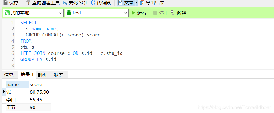
MySql关键字GROUP_CONCAT,组合连接查询
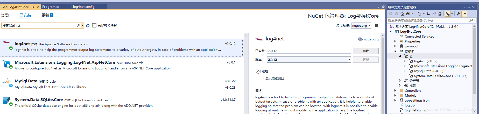
Log4net is in Net core usage
随机推荐
Super easy to use [general excel import function]
2022 group programming ladder simulation l2-1 blind box packaging line (25 points)
JS - accuracy issues
MySql关键字GROUP_CONCAT,组合连接查询
超好用的【通用Excel导入功能】
JS, bind the event for a label with input, and then bind the stand-alone event in the parent element. The event is executed twice and solved
Experiment 5 components and event handling
打卡:4.23 C语言篇 -(1)初识C语言 - (12)结构体
JS changes the words separated by dashes into camel style
JS calculates the display date according to the time
移植tslib时ts_setup: No such file or directory、ts_open: No such file or director
QT dynamic translation of Chinese and English languages
Romantic silhouette of L2-3 of 2022 group programming ladder Simulation Competition (25 points)
MySQL之explain关键字详解
Chapter 8 exception handling, string handling and file operation
The fourth operation
It can receive multiple data type parameters - variable parameters
Idea view history [file history and project history]
"Visual programming" test paper
Identifier and type conversion