当前位置:网站首页>2D conversion (move: translate, rotate: rotate, scale: scale, 2D conversion synthesis)
2D conversion (move: translate, rotate: rotate, scale: scale, 2D conversion synthesis)
2022-04-22 14:06:00 【fruit_ one】
2D transformation
transform yes CSS3 One of the most disruptive features of , Displacement of elements can be achieved 、 rotate 、 Zoom and so on
Move :translate
rotate :rotate
The zoom :scale
2D Conversion is a technique to change the position and shape of a label on a two-dimensional plane

Move :translate
2D Mobile is 2D A function in conversion , You can change the position of the elements , Like positioning
translate It will not affect the position of other elements
translate The percentage unit in is relative to its own element
There is no effect on the label
transform: translate(x,y); Or write separately
transform: translateX(x);
transform: translateY(y);
<!DOCTYPE html>
<html lang="en">
<head>
    <meta charset="UTF-8">
    <meta http-equiv="X-UA-Compatible" content="IE=edge">
    <meta name="viewport" content="width=device-width, initial-scale=1.0">
    <title>Document</title>
    <style>
        div {
            width: 300px;
            height: 300px;
            background-color: #ff0;
            /* xy All axes move  */
            transform: translate(100px,100px);
            /*  Just move x Axis   */
            /* transform: translate(100px,0); */
            /* transform: translateX(100px); */
            /*  Just move y Axis   */
            /* transform: translate(0,100px); */
            /* transform: translateY(100px); */
        }
    </style>
</head>
<body>
    <div></div>
</body>
</html>
The floating effect of e-commerce Commodities
<!DOCTYPE html>
<html lang="en">
<head>
    <meta charset="UTF-8">
    <meta http-equiv="X-UA-Compatible" content="IE=edge">
    <meta name="viewport" content="width=device-width, initial-scale=1.0">
    <title>Document</title>
    <style>
        div {
            width: 300px;
            height: 300px;
            background-color: #ff0;
            transition: all 0.3s;
        }
        div:hover {
            transform: translate(20px,0);
        }
    </style>
</head>
<body>
    <div></div>
</body>
</html>
Horizontal vertical center
<!DOCTYPE html>
<html lang="en">
<head>
    <meta charset="UTF-8">
    <meta http-equiv="X-UA-Compatible" content="IE=edge">
    <meta name="viewport" content="width=device-width, initial-scale=1.0">
    <title>Document</title>
    <style>
        .f {
            position: relative;
            width: 500px;
            height: 500px;
            background-color: #f0f;
        }
        .b {
            position: absolute;
            top: 50%;
            left: 50%;
            width: 100px;
            height: 100px;
            background-color: #0ff;
            transform: translate(-50%,-50%);
        }
    </style>
</head>
<body>
    <div class="f">
        <div class="b"></div>
    </div>
</body>
</html>
rotate :rotate
2D Rotation is to make the element rotate clockwise or counterclockwise in the two-dimensional plane
transform: rotate(45deg);rotate It's degrees inside , The unit is deg
The angle is clockwise , The angle is negative counterclockwise
The default center point of rotation is the center point of the element
<!DOCTYPE html>
<html lang="en">
<head>
    <meta charset="UTF-8">
    <meta http-equiv="X-UA-Compatible" content="IE=edge">
    <meta name="viewport" content="width=device-width, initial-scale=1.0">
    <title>Document</title>
    <style>
        img {
            width: 300px;
            transform: rotate(45deg);
        }
    </style>
</head>
<body>
    <img src=" Samurai girl .jpg" alt="">
</body>
</html>
Change the rotation center point
transform-origin: x y;x y To separate
x y The default conversion center is the center point of the element (50% 50%)
You can give x y Set pixel 、 percentage 、 Position NOUN (top bottem left right center)
<!DOCTYPE html>
<html lang="en">
<head>
    <meta charset="UTF-8">
    <meta http-equiv="X-UA-Compatible" content="IE=edge">
    <meta name="viewport" content="width=device-width, initial-scale=1.0">
    <title>Document</title>
    <style>
        div {
            margin: 100px auto;
            width: 200px;
            height: 200px;
            background-color: #f0f;
            transition: all 0.3s;
            /*  The default is 50% 50% */
            /*  Position NOUN  */
            /* transform-origin: left bottom; */
            /*  Pixels  */
            /* transform-origin: 50px 50px; */
            /*  percentage  */
            transform-origin: 20% 20%;
        }
        div:hover {
            transform: rotate(360deg);
        }
    </style>
</head>
<body>
    <div></div>
</body>
</html>
The zoom :scale
Zoom in and out of elements , You can set the conversion center point transform-origin, The default is to scale at the center point , Scaling does not affect other boxes
x y It's the number. , No unit
transform: scale(x,y);<!DOCTYPE html>
<html lang="en">
<head>
<meta charset="UTF-8">
<meta http-equiv="X-UA-Compatible" content="IE=edge">
<meta name="viewport" content="width=device-width, initial-scale=1.0">
<title>Document</title>
<style>
div {
margin: 200px auto;
width: 300px;
height: 300px;
background-color: #ff0;
transition: all 0.3s;
}
div:hover {
/* x y Zoom ratio */
transform: scale(2,2);
/*transform: scale(1.5,1.5);*/
/* narrow
transform: scale(0.5,0,5);*/
/* Scale equally */
/* transform: scale(2); */
/* transform: scale(0.5); */
}
</style>
</head>
<body>
<div></div>
</body>
</html>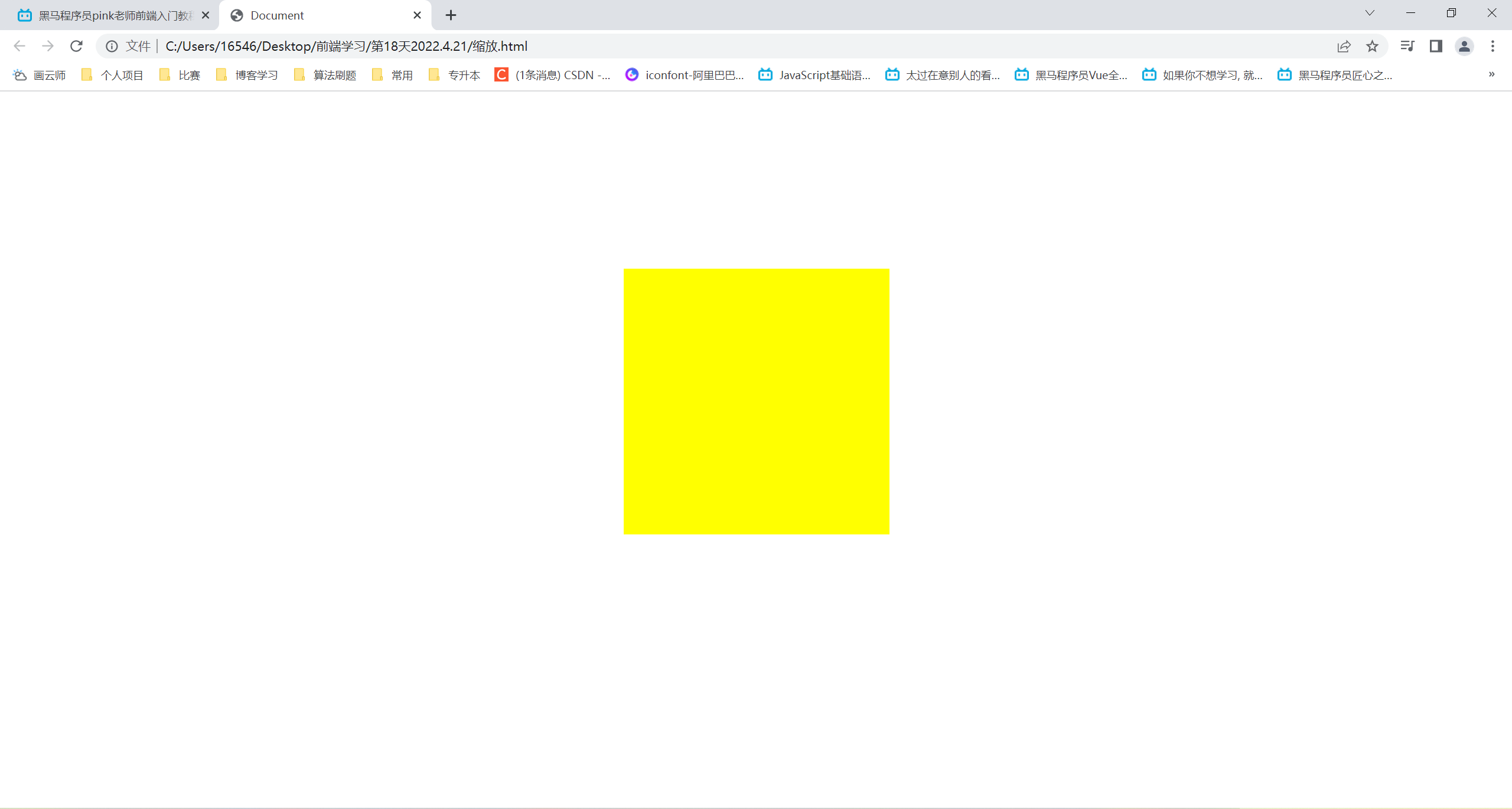

2D Conversion synthesis
Using multiple transformations at the same time , The format is transform: translate() rotate() scale()... etc.
The order will affect the conversion effect ( First, change the direction of the axis )
When we have displacement and other properties at the same time , Put the displacement first
版权声明
本文为[fruit_ one]所创,转载请带上原文链接,感谢
https://yzsam.com/2022/04/202204221402511676.html
边栏推荐
- C Primer Plus --- program list 13.2 reduto c
- 分析电脑使用变慢的七大原因
- 【论文笔记】Vision Transformers for Dense Prediction
- uniapp运行到微信开发者工具中小程序端页面空白的解决办法
- uniapp转微信小程序报错Cannot read property ‘forceUpdate‘ of undefined - 微信开发者工具报错
- A solution to the problem of buying and selling stocks by force deduction
- osgEarth配置地图资源
- LeetCode-3 无重复字符的最长子串
- Sixtool multi-functional multi-in-one generation hanging assistant system source code
- Method of page nesting
猜你喜欢

Actual combat of wechat applet mall project (Part 6: commodity search)

985 official announcement: international ranking is no longer a construction goal!

Redis (VI) - set of common data types of redis

日志脱敏是什么意思?为什么要做日志脱敏?

二月份,我靠这一份PDF文档面试BAT,没想到竟然收到了5个offer

SQL optimized by us in those years

P2b paper reproduction - point cloud learning record
uniapp运行到小程序模拟器的方法 - uniapp开启微信开发者工具预览支持 - HBuilderX

Independent station operation | 6 Facebook promotion tips, do you know?

七年谋“一剑”,站在边缘云的风口,如何加速企业数字化转型?
随机推荐
[summary of Kunpeng migration and practice Posts] the first play~~
Go down and continue to go down. Xiaohui's fund has lost 640000...
CVPR 2022 Oral | 大连理工提出小样本识别DeepBDC,6项基准性能最好
Markdown图标
Genesis public chain gives Dao new vitality
【机器人学习】移动机器人里程计学习记录
LeetCode-3 无重复字符的最长子串
日志脱敏是什么意思?为什么要做日志脱敏?
Mysql数据库转存sql文件
Genesis公链赋予DAO全新生命力
数据库表空间损坏,备份表数据异常如何处理?
TensorFlow-ValueError: ‘images‘ contains no shape
【Zeekr_Tech】ROS/ROS 2介绍
Thoughts on dealing with high concurrency problems
Is it effective to control caching through meta information in HTML files? Is it used much at present?
CPT 104_Lab 09
Brief description of three elements of LAN characteristics
关于半导体的8个奇特事实
Special topic of game partners: breederdao reaches a new height in cooperation with fancy birds
2022年危险化学品经营单位主要负责人考试练习题及答案