当前位置:网站首页>移动Web开发之rem实际开发适配方案
移动Web开发之rem实际开发适配方案
2022-04-21 21:31:00 【黑马程序员官方】
往期内容回顾:
一、rem适配方案
- 让一些不能等比自适应的元素,达到当设备尺寸发何时能改变的时候,等比例适配当前设备。
- 使用媒体查询根据不同设备按比例设置html的字体大小,然后页面元素使用rem做尺寸单位,当html字体大小变化元素尺寸也会发生变化,从而达到等比缩放的适配。
1.1 rem实际开发适配方案
① 按照设计稿与设备宽度的比例,动态计算并设置 html 根标签的 font-size 大小;(媒体查询)
② CSS 中,设计稿元素的宽、高、相对位置等取值,按照同等比例换算为 rem 为单位的值;

1.2 rem适配方案技术使用(市场主流)
技术方案1:
- less
- 媒体查询
- rem
技术方案2(推荐):
- flexile.js
- rem
总结:
两种方案现在都存在,方案2更简单,现阶段大家无需了解里面的js代码。
1.3 rem实际开发适配方案1
rem+媒体查询+less技术

一般情况下,我们以一套或者两套效果图适应发部分的屏幕,放弃极端屏或对其优雅降级,牺牲一些效果,现在基本为750为准。
动态设置 html 标签 font-size 大小
- ① 假设设计稿是750px
- ② 假设我们把整个屏幕划分为15等份(划分标准不一可以是20份也可以是10等份)
- ③ 每一份作为html字体大小,这里就是50px
- ④ 那么在320px设备的时候,字体大小为320/15 就是 21.33px
- ⑤ 用我们页面元素的大小 除以不同的 html 字体大小会发现他们比例还是相同的
- ⑥ 比如我们以 750为标准设计稿
- ⑦ 一个100*100像素的页面元素 在 750屏幕下, 就是 100 / 50 转换为rem 是 2rem * 2 rem 比例是 1比1
- ⑧ 320屏幕下, html 字体大小为 21.33 则2rem = 42.66px 此时宽和高都是 42.66但是宽和高的比例还是 1比1
- ⑨ 但是已经能实现不同屏幕下 页面元素盒子等比例缩放的效果
元素大小取值方法
① 最后的公式: 页面元素的rem值 = 页面元素值(px) / (屏幕宽度 / 划分的份数)
② 屏幕宽度/划分的份数 就是 html font-size 的大小
③ 或者: 页面元素的rem值 = 页面元素值(px) / html font-size 字体大小
二、苏宁网首页案例制作

2.1 技术选型
方案:我们采取单独制作移动页面方案
技术:布局采取rem适配布局(less + rem + 媒体查询)
设计图: 本设计图采用 750px 设计尺寸
2.2 搭建相关文件夹结构

2.3. 设置视口标签以及引入初始化样式
<meta name="viewport" content="width=device-width, user-scalable=no,
initial-scale=1.0, maximum-scale=1.0, minimum-scale=1.0">

<link rel="stylesheet" href="css/normalize.css">2.4. 设置公共common.less文件
1. 新建common.less 设置好最常见的屏幕尺寸,利用媒体查询设置不同的html字体大小,因为除了首页其他页面也需要
2. 我们关心的尺寸有 320px、360px、375px、384px、400px、414px、424px、480px、540px、720px、750px
3. 划分的份数我们定为 15等份
4. 因为我们pc端也可以打开我们苏宁移动端首页,我们默认html字体大小为 50px,注意这句话写到最上面
2.5. 新建index.less文件
1. 新建index.less 这里面写首页的样式
2. 将刚才设置好的 common.less 引入到index.less里面 语法如下:
// 在 index.less 中导入 common.less 文件
@import “common”
3. 生成index.css 引入到 index.html 里面
2.6. body样式
body {
min-width: 320px;
width:15rem;
margin: 0 auto;
line-height: 1.5;
font-family: Arial,Helvetica;
background: #F2F2F2;
}
三、rem适配方案2
2.1 简洁高效的rem适配方案flexible.js
手机淘宝团队出的简洁高效 移动端适配库
我们再也不需要在写不同屏幕的媒体查询,因为里面js做了处理
它的原理是把当前设备划分为10等份,但是不同设备下,比例还是一致的。
我们要做的,就是确定好我们当前设备的html 文字大小就可以了
比如当前设计稿是 750px, 那么我们只需要把 html 文字大小设置为 75px(750px / 10) 就可以
里面页面元素rem值: 页面元素的px 值 / 75
剩余的,让flexible.js来去算
3.2 使用适配方案2制作苏宁移动端首页
1.技术选型
方案:我们采取单独制作移动页面方案
技术:布局采取rem适配布局2(flexible.js + rem)
设计图: 本设计图采用 750px 设计尺寸
2. 搭建相关文件夹结构

3. 设置视口标签以及引入初始化样式还有js文件
<meta name="viewport" content="width=device-width, user-scalable=no,
initial-scale=1.0, maximum-scale=1.0, minimum-scale=1.0">

<link rel="stylesheet" href="css/normalize.css">
<link rel="stylesheet" href="css/index.css">
我们页面需要引入 这个js文件
在 index.html 中 引入 flexible.js 这个文件
<script src=“js/flexible.js”> </script>
4. body样式
body {
min-width: 320px;
width:15rem;
margin: 0 auto;
line-height: 1.5;
font-family: Arial,Helvetica;
background: #F2F2F2;
}
3.3 VSCode px 转换rem 插件 cssrem
这是一个神奇的插件


下面需要设置html字体大小基准值

更多前端内容尽在前端专栏哦,关注再学,好方便~
移动WEB开发之二倍图
欢迎小伙伴们留言哦,期待看到大家的进步。另外此线路图实时更新!需要课后资料的友友们,可以直接告诉我。

版权声明
本文为[黑马程序员官方]所创,转载请带上原文链接,感谢
https://blog.csdn.net/itcast_cn/article/details/124328613
边栏推荐
- The shell finds or deletes files based on their suffixes
- AI+大健康, 是超能机器人的正确打开方式?
- [common English words]
- Bailian4006 小兔子捡金币【模拟】
- Detailed explanation of kubernetes (V) -- core object of kubernetes
- JVM 从入门到放弃之 ZGC 垃圾收集器精讲
- 01_ Cross compile Hello program
- How can urea futures be safe? What are the benefits of urea futures hedging?
- 【SeMask】Semantically Masked Transformers for Semantic Segmentation
- Keil Package常用芯片高速下载地址,含历史版本,快关注我速速收藏
猜你喜欢
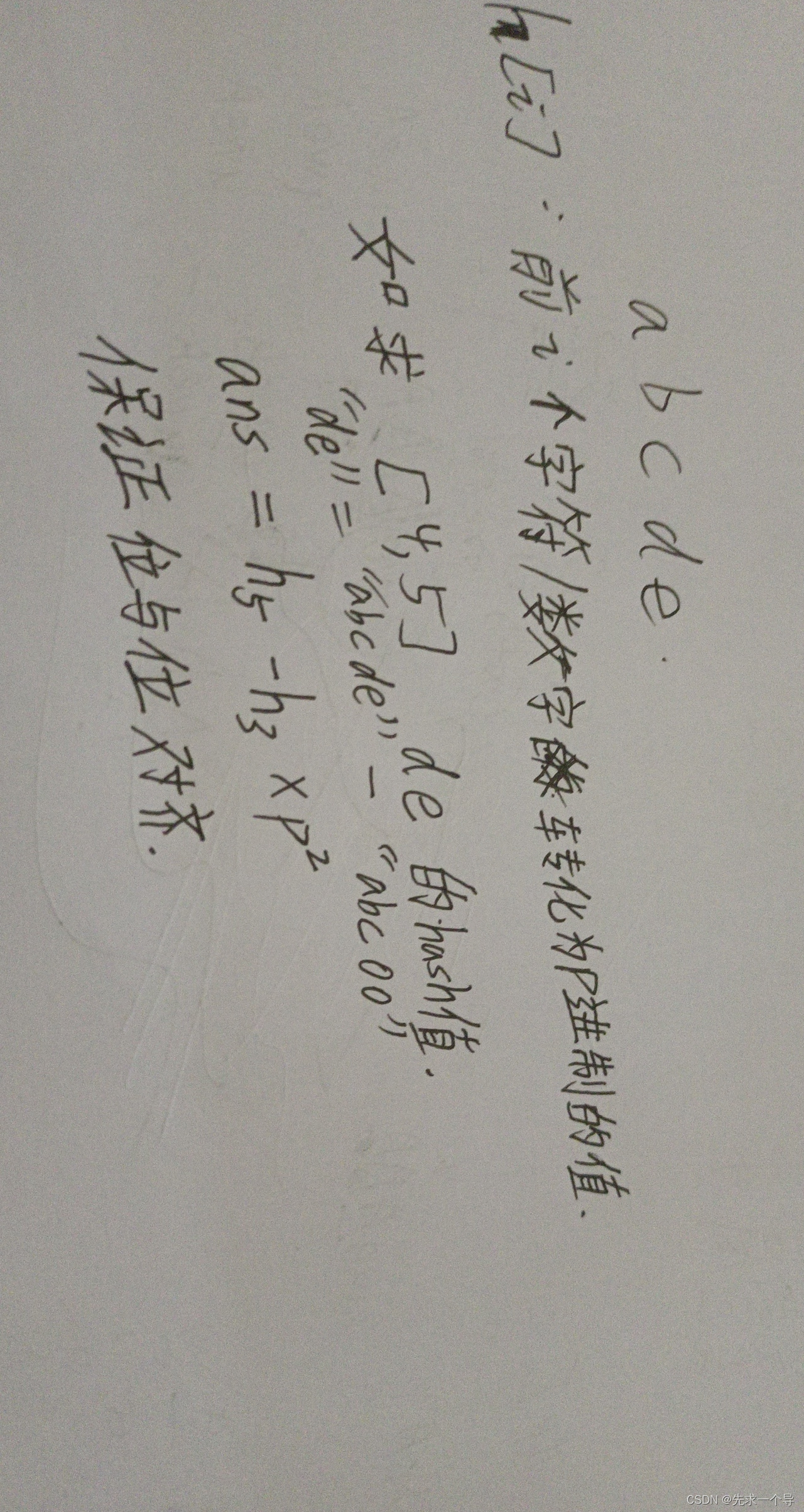
841. 字符串哈希 (字符串哈希模板)
#Reflex WMS研习心得#上架原理

【SeMask】Semantically Masked Transformers for Semantic Segmentation

产品增长框架:从 Web2 到 Web3
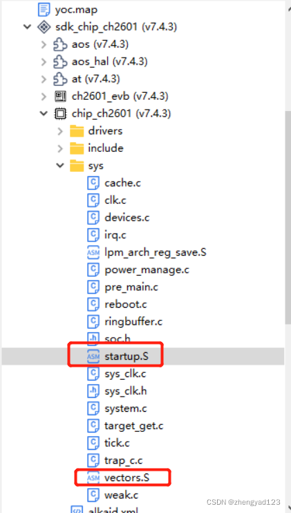
RVB2601之启动流程
![Bailian3726 Xiandao seeking medicine [BFS]](/img/2b/fba0716e39bebceab4d52afc759e2c.png)
Bailian3726 Xiandao seeking medicine [BFS]

(valid for personal test) Oracle can't use backspace key to backspace the command line under Linux, and can't use up and down keys to switch the historical command. There will be garbled code

Cyclone IV E系列介绍
Reflex WMS study experience shelf principle
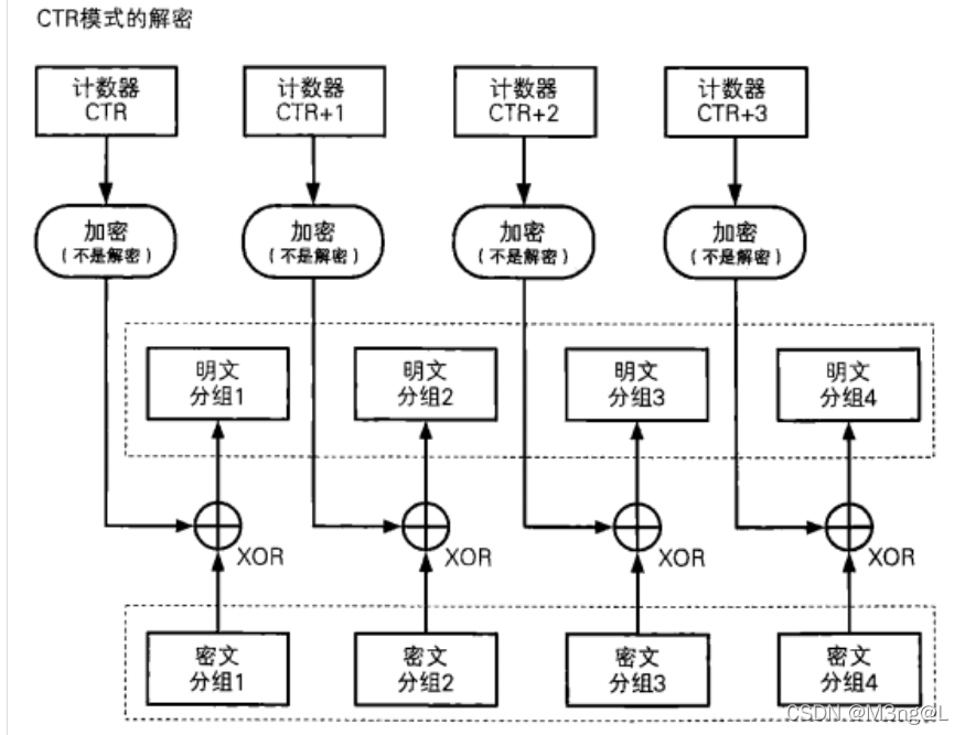
AES topics involved in CTF crypto
随机推荐
Tgip-cn 038 registration | in depth analysis of Apache pulsar source code reading correct posture (I)
Tgip-cn 038 registration | in depth analysis of Apache pulsar source code reading correct posture (I)
Communication between parent and child processes (II) -- four cases of anonymous pipeline communication
Other - use of Supervisor
Qianxin Winter Olympics "zero accident" terminal security sharing meeting: 6641 attacks were successfully solved
Talking about work -- Talking about data post
flutter插件第三方库,给Android程序员的一些面试建议
【Selenium 自学系列】(一)Selenium第一个例子及交互原理
Common network tools 4: SG broadband tools
On the Oracle client of Linux, enter the SQL statement and Oracle not available process ID: 0 session ID: 0 serial number: 0 appears
Use fluent to animate a color filter for photos
Install MySQL 8 for Ubuntu
Flutter plug-in third-party library, some interview suggestions for Android programmers
OA form design case display
【SeMask】Semantically Masked Transformers for Semantic Segmentation
[common shortcut keys]
Redis+Caffeine两级缓存,让访问速度纵享丝滑
Construction of cloud computing platform based on openstack
Bailian3722 factor problem [enumeration]
睿智的目标检测50——Tensorflow2 利用mobilenet系列(v1,v2,v3)搭建yolov4目标检测平台