当前位置:网站首页>几种绘制时间线图的方法
几种绘制时间线图的方法
2022-08-10 05:29:00 【zhouluobo】
前面分享过一篇自动化制作《历史上的今天》时间线图片的文章,小伙伴们普遍反映还不错,尤其是制作时间线的方法,还是非常巧妙的。今天我们再来分享几种不同的制作方法,大家可以自行比较下各种方法的优劣
Matplotlib 制作
Matplotlib 作为 Python 家族最为重要的可视化工具,其基本的 API 以及绘制流程还是需要掌握的。尤其是该库的灵活程度以及作为众多工具的基础,重要性不言而喻
下面我们来看下该如何绘制一个时间线图表
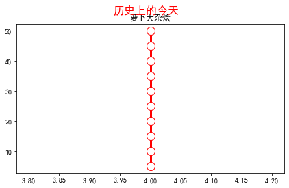
导入库以及设置 XY 轴数据
import matplotlib.pyplot as plt
plt.rcParams['font.sans-serif'] = ['SimHei']
plt.rcParams['axes.unicode_minus'] = False

y1 = [5, 10, 15, 20, 25, 30, 35, 40, 45, 50]
x1 = [4, 4, 4, 4, 4, 4, 4, 4, 4, 4]
因为是通过折线图来实现时间线效果,为了达到一条竖线的情况,这里设置了 X 轴数值都相同,Y 轴数值等差分布
创建画布及标题
fig, ax = plt.subplots(sharey=True, figsize=(7, 4))
ax.plot(x1, y1, label='First line', linewidth=3, color='r', marker='o', markerfacecolor='white', markersize=12)
plt.title('萝卜大杂烩')
plt.suptitle('历史上的今天', fontsize=16, color='red')
此时效果如下
接下来我们设置时间线两边的数据
# 右侧数据
right_y_year = 0.95
right_y_text = 0.9
year_right = 1931
for i in range(5):
    plt.text(0.57, right_y_year, str(year_right+1), fontsize=15, horizontalalignment='center', verticalalignment='center',
             transform=ax.transAxes, color='black')
    plt.text(0.75, right_y_text, "从百草园到三味书屋-鲁迅" + str(i), fontsize=15, horizontalalignment='center', verticalalignment='center',
             transform=ax.transAxes, color='red')
    right_y_year -= 0.2
    right_y_text -= 0.2
    year_right += 1

# 左侧数据
left_y_year = 0.85
left_y_text = 0.8
year_left = 1941
for i in range(5):
    plt.text(0.43, left_y_year, str(year_left+1), fontsize=15, horizontalalignment='center', verticalalignment='center',
             transform=ax.transAxes, color='black')
    plt.text(0.2, left_y_text, "从百草园到三味书屋-鲁迅" + str(i), fontsize=15, horizontalalignment='center', verticalalignment='center',
             transform=ax.transAxes, color='red', url='https://www.baidu.com')
    left_y_year -= 0.2
    left_y_text -= 0.2
    year_left += 1
这里主要使用了 text 函数,为时间线轴两边分别添加数据
如果我们还想要添加个人的其他信息,比如公众号二维码等,可以在指定位置增加图片,同时去掉坐标轴
# 增加图片
img = plt.imread('二维码.png')
ax2 = plt.axes((0.7, 0.1, 0.3, 0.3))
ax2.imshow(img, origin='lower', alpha=0.5)
ax2.axis('off')
ax.axis('off')
plt.show()
最终效果如下

可以看出,由于 text 函数是通过坐标来确定文字显示的位置的,所以我们的时间线轴两边的数据分布还是不是特别完美,不知道是否有其他的更加方便的方法来设置
Plotly 绘制
Plotly 作为 Python 家族另一个非常强大的可视化工具,同样可以完成时间线图的绘制
在绘图之前,完美先处理数据
这里使用的数据是2020年全年的微博热搜数据
import pandas as pd


weibo = pd.read_csv("weibo_2020.csv")
def deal_date(frame):
    tmp = frame.split('-')
    return tmp[0] + '-' + tmp[1]

weibo['new_date'] = weibo['date'].apply(lambda x : deal_date(x))
key_list_right = []
for i in range(1, 12, 2):
    if i < 10:
        mydate = '2020-0%s' % str(i)
    else:
        mydate = '2020-%s' % str(i)
    keyword = weibo[weibo['new_date'] == mydate].sort_values(by='searchCount', ascending=False)['keyword'].tolist()[0]
    searchCount = weibo[weibo['new_date'] == mydate].sort_values(by='searchCount', ascending=False)['searchCount'].tolist()[0]
    mount = str(i) + '月'
    content = ','.join([keyword, str(searchCount) + '搜索量', mount])
    key_list_right.append(content)
print(key_list_right)
Output:
['最新疫情地图,18130201搜索量,1月',
 '肖战工作室道歉,13117531搜索量,3月',
 '何鸿燊去世,15302424搜索量,5月',
 '高考作文,15647446搜索量,7月',
 '乘风破浪的姐姐成团之夜,8226994搜索量,9月',
 '特朗普,7310000搜索量,11月']
可以看到,通过上面的数据处理,我们成功提取了1、3、5、7、9以及11月的当月搜索量最高的热搜标题,同理可以获取到双月份的热搜标题数据
下面开始作图
import plotly.express as px
import plotly.graph_objects as go
from plotly.subplots import make_subplots
import pandas as pd
from plotly.graph_objs import *

layout = Layout(
    paper_bgcolor='rgba(0,0,0,0)',
    plot_bgcolor='rgba(0,0,0,0)',
    title={
    'text': '微博热搜', 'x': 0.5},
    yaxis={
    'title': 'Proportion (%)'}
)
fig = go.Figure(layout=layout)
fig.add_traces([go.Scatter(x=[2,2,2,2,2,2], y=[5, 10, 15, 20, 25, 30], text=key_list_right, textposition="bottom right", mode="lines+text"),
                go.Scatter(x=[2,2,2,2,2,2], y=[5, 10, 15, 20, 25, 30], textposition="top left", mode="lines+text", text=key_list_left)])
fig.update_traces(showlegend=False)
fig.update_layout(xaxis=dict(visible=False), yaxis=dict(visible=False))
fig.show()
通过 Plotly 绘图就相对简单很多了,直接使用 text 参数把我们得到的热搜数据添加上即可
最终效果如下

效果很朴素,是因为我们没有进行过多的样式设置,大家可以自行探索下不同样式啊
Excel 绘制
上面的两种方法都需要有一定的代码基础,下面介绍的 Excel 方法则可以说是人人都能完成,一起来看看吧
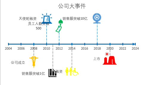
先来看看最终的效果
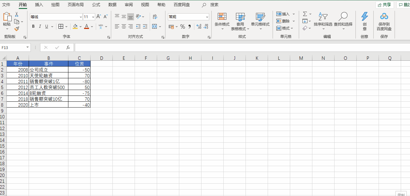
首先准备数据,我们在新建的 Excel 文档中创建如下数据

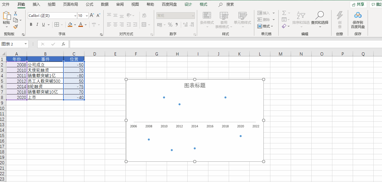
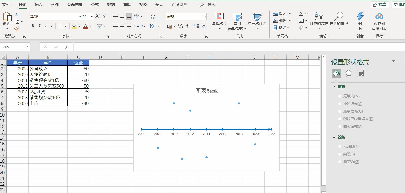
然后插入散点图
先插入一个空白散点图,然后将 X 轴设置为【年份】,Y 轴设置为【位置】,再把 Y 轴和网格线都删除
接下来我们美化一下 X 轴
我们双击 X 轴,调出格式窗口,在坐标轴选项标签中设置【单位】,将【小】改为1,设置【刻度线】,将【主刻度线】设置为交叉。再点击【油漆桶】,选择一个线条的颜色,将宽度调整为2,将【结尾箭头类型】调整为向右箭头
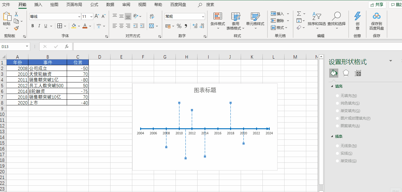
再接下来我们把 X 轴连接起来
首先选择一个散点,添加误差线。然后把横向的误差线设置为无轮廓,再选中竖向的误差线,把【垂直误差线】设置为负偏差,再把误差量设置为100%,最后再给竖向误差线调整样式即可
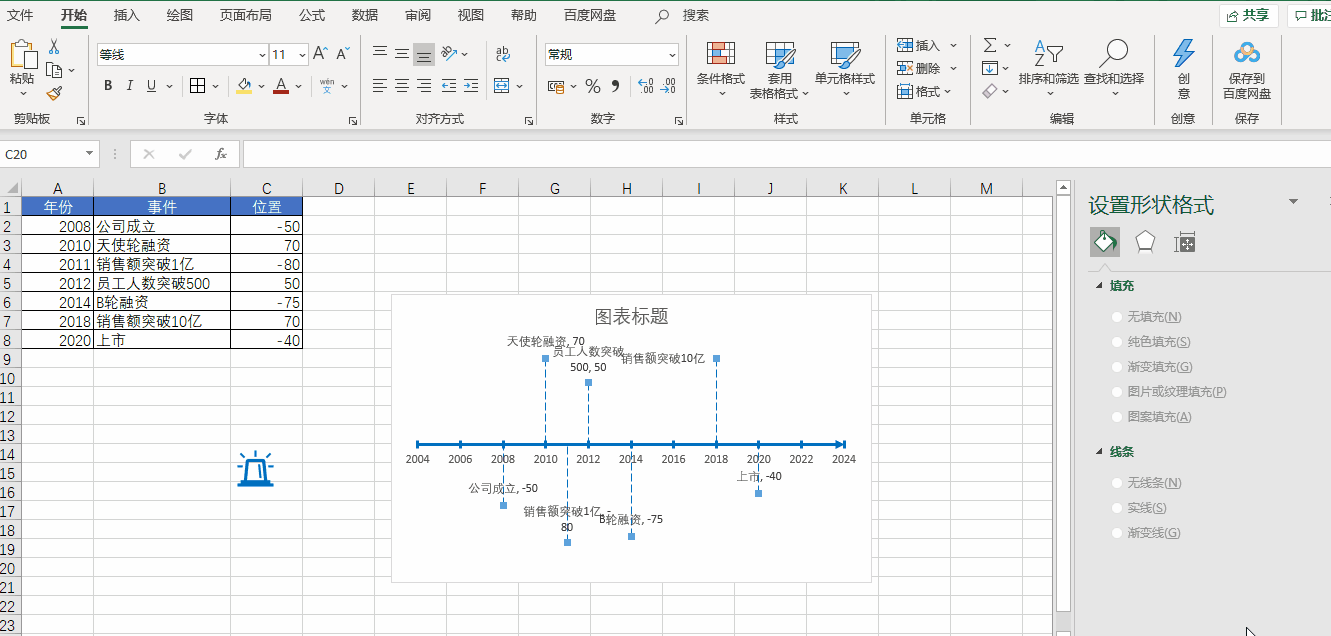
下面开始添加数据
我们把公司的各种大事件添加到数据表当中
向图表中添加【数据标签】,即数据中事件那一列,然后再去掉 Y 值即可
最后我们还可以通过 Excel 自带的各种图标进行美化操作
好了,以上就是今天分享的所有内容,如果对你有帮助,帮忙点赞和在看支持哦~
本文由 mdnice 多平台发布
边栏推荐
- FPGA工程师面试试题集锦11~20
- 聊聊 API 管理-开源版 到 SaaS 版
- 手把手带你写嵌入式物联网的第一个项目
- An article to master the entire JVM, JVM ultra-detailed analysis!!!
- 【裴蜀定理】CF1055C Lucky Days
- FPGA工程师面试试题集锦41~50
- Qiskit官方文档选译之量子傅里叶变换(Quantum Fourier Transform, QFT)
- 基于Qiskit——《量子计算编程实战》读书笔记(三)
- Arduino框架下合宙ESP32C3 +1.8“tft 网络时钟
- SQL database field to append to main table
猜你喜欢

一文带你搞懂OAuth2.0

Kubernetes:(十六)Ingress的概念和原理

MySql之json_extract函数处理json字段

MySQL simple tutorial

Stacks and Queues | Valid parentheses, delete all adjacent elements in a string, reverse Polish expression evaluation, maximum sliding window, top K high frequency elements | leecode brush questions

论文精度 —— 2017 ACM《Globally and Locally Consistent Image Completion》

基于Qiskit——《量子计算编程实战》读书笔记(四)
暑期学前作业
MySQL使用简单教程

如何在报表控件FastReport.NET中连接XLSX 文件作为数据源?
随机推荐
curl命令介绍
Nexus_仓库类型
线性模型中的高级特征选择技术——基于R
mysql常用命令有什么
一篇文章带你搞懂什么是幂等性问题?如何解决幂等性问题?
如何在报表控件FastReport.NET中连接XLSX 文件作为数据源?
canvas canvas drawing clock
SQL Server查询优化
线性代数(四)
【静态代理】
Big guys, mysql cdc (2.2.1 and previous versions) sometimes has this situation since savepoint, is there anything wrong?
反转链表中的第m至第n个节点---leetcode
ThreadPoolExecutor thread pool principle
一文带你搞懂OAuth2.0
k-近邻实现手写数字识别
Read the excerpt notes made by dozens of lightweight target detection papers for literacy
Why are negative numbers in binary represented in two's complement form - binary addition and subtraction
How does flinksql write that the value of redis has only the last field?
Shell编程三剑客之awk
咨询cdc 2.0 for mysql不执行flush with read lock.怎么保证bin