当前位置:网站首页>[WPF] customize combobox
[WPF] customize combobox
2022-04-22 05:18:00 【Pistachio 2021】
One Combobox It consists of the following four parts , Styles can be set separately

Set up ComboBoxItem style
        <Style x:Key="ComboboxItemStyle" TargetType="ComboBoxItem">
            <Setter Property="FontSize" Value="15"/>
            <Setter Property="Foreground" Value="#787878"/>
            <Setter Property="Template">
                <Setter.Value>
                    <ControlTemplate TargetType="ComboBoxItem">
                        <Border x:Name="itemBorder" Height="35" Width="35" Background="Transparent" Margin="8" CornerRadius="3">
                            <ContentPresenter Margin="{TemplateBinding Padding}" HorizontalAlignment="Center" VerticalAlignment="Center"/>
                        </Border>
                        <ControlTemplate.Triggers>
                            <Trigger Property="IsHighlighted" Value="True">
                                <Setter Property="Background" Value="#DBDBDB" TargetName="itemBorder"/>
                            </Trigger>
                        </ControlTemplate.Triggers>
                    </ControlTemplate>
                </Setter.Value>
            </Setter>
        </Style>
ComboBoxItem Properties of IsHighlighted Trigger... When focus is obtained , IsSelected Trigger when selected
Set button style
        <Style x:Key="ComboBoxToggleButtonStyle" TargetType="ToggleButton">
            <Setter Property="IsTabStop" Value="false" />
            <Setter Property="ClickMode" Value="Press" />
            <Setter Property="MinHeight" Value="22"></Setter>
            <Setter Property="MinWidth" Value="80"></Setter>
            <Setter Property="Template">
                <Setter.Value>
                    <ControlTemplate TargetType="ToggleButton">
                        <Grid>
                            <Border CornerRadius="8" BorderThickness="1"  BorderBrush="#787878" Background="White">
                            </Border>
                            <!-- The color of the inverted triangle #0099ff-->
                            <Path Height="5" x:Name="Path1" HorizontalAlignment="Right"
                                VerticalAlignment="Center" Margin="5,0,15,0" Width="8"
                                Fill="#FFA8AAAC" Stretch="Fill" Stroke="#808080"
                                Data="M0.5,0.5 L9.5,0.5 L5.0625,9.5 L5.0625,9.5 z" >
                            </Path>
                        </Grid>
                        <ControlTemplate.Triggers>
                            <Trigger Property="IsMouseOver" Value="False">
                                <!-- Button color when moving in   Pattern color   The background color   Sawtooth color -->
                                <Setter TargetName="Path1" Property="Fill" Value="{DynamicResource {x:Static SystemColors.ControlDarkDarkBrushKey}}"></Setter>
                            </Trigger>
                        </ControlTemplate.Triggers>
                    </ControlTemplate>
                </Setter.Value>
            </Setter>
        </Style>
IsTabStop stay System.Windows.Controls Under the namespace , Gets or sets whether to allow Tab Key to navigate to the control
The control of Focusable Property determines whether the control is allowed to receive keyboard input focus .
By default ,Focusable by true Control for , Its IsTabStop The attribute will also be true.
When Focusable The attribute is true,IsTabStop The attribute is true When , Control can receive keyboard input focus , It can also be done through Tab Key to navigate to the control ;
When Focusable The attribute is true,IsTabStop The attribute is false When , Control can receive keyboard input focus , But not through Tab Key to navigate to the control ;
When Focusable The attribute is false, Control cannot receive keyboard input focus ,IsTabStop Properties will be ignored , No pass Tab Key to navigate to the control ;
If the IsEnabled Property is set to false, Focusable Properties and IsTabStop Properties are ignored . Control cannot receive keyboard input focus , Or through Tab Key to navigate to the control .
ClickMode: Indicates when Click event . Release( Default ): When the mouse is released
Press: When the mouse is pressed Hover: When the mouse is free on the button
Set up Combobox style
        <Style x:Key="DefaultComboBoxStyle" TargetType="ComboBox">
            <Setter Property="Foreground" Value="#FFFFFFFF" />
            <Setter Property="BorderBrush" Value="#B8B8B8" />
            <Setter Property="BorderThickness" Value="1" />
            <Setter Property="ItemContainerStyle" Value="{StaticResource ComboboxItemStyle}"/>
            <Setter Property="Template">
                <Setter.Value>
                    <ControlTemplate TargetType="ComboBox">
                        <Grid x:Name="mainGrid" Background="Transparent">
                            <Popup x:Name="popup" HorizontalOffset="-90" VerticalOffset="1"
                              IsOpen="{TemplateBinding IsDropDownOpen}" Placement="Bottom" AllowsTransparency="True">
                                <Grid>
                                    <Border BorderBrush="#DBDBDB" BorderThickness="1" Background="White" CornerRadius="10 " VerticalAlignment="Top" Margin="0 10 0 0">
                                        <StackPanel Orientation="Horizontal" >
                                            <WrapPanel IsItemsHost="True" />
                                        </StackPanel>
                                    </Border>
                                    <Canvas Background="Transparent" IsHitTestVisible="False" Height="10" Width="10" HorizontalAlignment="Center" Margin="0 1 0 -5" VerticalAlignment="Top">
                                        <Path Stroke="#DBDBDB"  StrokeThickness="1" Fill="White">
                                            <Path.Data>
                                                <PathGeometry Figures="M 0 10
                                                          L 0 10 5 0
                                                          L 5 0 10 10"/>
                                            </Path.Data>
                                        </Path>
                                    </Canvas>
                                </Grid>
                            </Popup>
                            <ToggleButton Style="{StaticResource ComboBoxToggleButtonStyle}"  Background="Transparent"
                              IsChecked="{Binding Path=IsDropDownOpen, Mode=TwoWay, RelativeSource={RelativeSource TemplatedParent}}"  />
                            <TextBlock FontSize="30" Foreground="#56A43D" Margin="20 0 0 0" VerticalAlignment="Center" IsHitTestVisible="False" />
                        </Grid>
                    </ControlTemplate>
                </Setter.Value>
            </Setter>
</Style>Popup:【WPF】Popup_ Pistachio 2021 The blog of -CSDN Blog
IsItemsHost Property is used to indicate when ItemsControl( If you need to deal with the list Combobox、ListBox Control ) Template , Where should the generated elements be placed . If you will StackPanel This property of is set to true, Add to Combobox All items of will go to StackPanel. This property is only valid for Panel Valid type .
Combobox Of Items Default vertical arrangement , This is a horizontal arrangement, and the content needs to be placed in StackPanel or WrapPanel in , And will IsItemsHost Set to true.
Draw the bubble Canvas If it's too big , Penetration required ( IsHitTestVisible Set to false), otherwise Item Will not be able to focus .
complete Style:xmal
         <!--ComboboxItem  style -->
        <Style x:Key="ComboboxItemStyle" TargetType="ComboBoxItem">
            <Setter Property="FontSize" Value="15"/>
            <Setter Property="Foreground" Value="#787878"/>
            <Setter Property="Template">
                <Setter.Value>
                    <ControlTemplate TargetType="ComboBoxItem">
                        <Border x:Name="itemBorder" Height="35" Width="35" Background="Transparent" Margin="8" CornerRadius="3">
                            <ContentPresenter Margin="{TemplateBinding Padding}" HorizontalAlignment="Center" VerticalAlignment="Center"/>
                        </Border>
                        <ControlTemplate.Triggers>
                            <Trigger Property="IsHighlighted" Value="True">
                                <Setter Property="Background" Value="#DBDBDB" TargetName="itemBorder"/>
                            </Trigger>
                        </ControlTemplate.Triggers>
                    </ControlTemplate>
                </Setter.Value>
            </Setter>
        </Style>

        <!--Combobox Middle button style -->
        <Style x:Key="ComboBoxToggleButtonStyle" TargetType="ToggleButton">
            <Setter Property="IsTabStop" Value="false" />
            <Setter Property="ClickMode" Value="Press" />
            <Setter Property="MinHeight" Value="22"></Setter>
            <Setter Property="MinWidth" Value="80"></Setter>
            <Setter Property="Template">
                <Setter.Value>
                    <ControlTemplate TargetType="ToggleButton">
                        <Grid>
                            <Border CornerRadius="8" BorderThickness="1"  BorderBrush="#787878" Background="White">
                            </Border>
                            <!-- The color of the inverted triangle #0099ff-->
                            <Path Height="5" x:Name="Path1" HorizontalAlignment="Right"
                                VerticalAlignment="Center" Margin="5,0,15,0" Width="8"
                                Fill="#FFA8AAAC" Stretch="Fill" Stroke="#808080"
                                Data="M0.5,0.5 L9.5,0.5 L5.0625,9.5 L5.0625,9.5 z" >
                            </Path>
                        </Grid>
                        <ControlTemplate.Triggers>
                            <Trigger Property="IsMouseOver" Value="False">
                                <!-- Button color when moving in  -->
                                <Setter TargetName="Path1" Property="Fill" Value="{DynamicResource {x:Static SystemColors.ControlDarkDarkBrushKey}}"></Setter>
                            </Trigger>
                        </ControlTemplate.Triggers>
                    </ControlTemplate>
                </Setter.Value>
            </Setter>
        </Style>

        <!--Combobox style -->
        <Style x:Key="DefaultComboBoxStyle" TargetType="ComboBox">
            <Setter Property="Foreground" Value="#FFFFFFFF" />
            <Setter Property="BorderBrush" Value="#B8B8B8" />
            <Setter Property="BorderThickness" Value="1" />
            <Setter Property="ItemContainerStyle" Value="{StaticResource ComboboxItemStyle}"/>
            <Setter Property="Template">
                <Setter.Value>
                    <ControlTemplate TargetType="ComboBox">
                        <Grid x:Name="mainGrid" Background="Transparent">
                            <Popup x:Name="popup" HorizontalOffset="-90" VerticalOffset="1"
                              IsOpen="{TemplateBinding IsDropDownOpen}" Placement="Bottom" AllowsTransparency="True">
                                <Grid>
                                    <Border BorderBrush="#DBDBDB" BorderThickness="1" Background="White" CornerRadius="10 " VerticalAlignment="Top" Margin="0 10 0 0">
                                        <StackPanel Orientation="Horizontal" IsItemsHost="True"/>
                                    </Border>
                                    <Canvas Background="Transparent" IsHitTestVisible="False" Height="10" Width="10" HorizontalAlignment="Center" Margin="0 1 0 -5" VerticalAlignment="Top">
                                        <Path Stroke="#DBDBDB"  StrokeThickness="1" Fill="White">
                                            <Path.Data>
                                                <PathGeometry Figures="M 0 10
                                                          L 0 10 5 0
                                                          L 5 0 10 10"/>
                                            </Path.Data>
                                        </Path>
                                    </Canvas>
                                </Grid>
                            </Popup>
                            <ToggleButton Style="{StaticResource ComboBoxToggleButtonStyle}"  Background="Transparent"
                              IsChecked="{Binding Path=IsDropDownOpen, Mode=TwoWay, RelativeSource={RelativeSource TemplatedParent}}"  />
                            <TextBlock FontSize="30" Foreground="#56A43D" Margin="20 0 0 0" VerticalAlignment="Center" IsHitTestVisible="False" />
                        </Grid>
                    </ControlTemplate>
                </Setter.Value>
            </Setter>
        </Style>
front end :
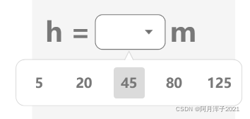
<StackPanel Orientation="Horizontal" Margin="0 10 0 0">
    <Label Content="h =" FontSize="30" Foreground="#787878" VerticalAlignment="Center" FontWeight="DemiBold"/>
    <ComboBox Width="80" Height="40" FontSize="25" Foreground="#56A43D" FontWeight="DemiBold" VerticalAlignment="Center"  HorizontalAlignment="Center"
Style="{StaticResource DefaultComboBoxStyle}">
         <ComboBoxItem Content="5"/>
         <ComboBoxItem Content="20"/>
         <ComboBoxItem Content="45"/>
         <ComboBoxItem Content="80"/>
         <ComboBoxItem Content="125"/>
    </ComboBox>
   <Label Content="m" FontSize="30" Foreground="#787878" VerticalAlignment="Center" FontWeight="DemiBold"/>
</StackPanel>
版权声明
本文为[Pistachio 2021]所创,转载请带上原文链接,感谢
https://yzsam.com/2022/04/202204210625511242.html
边栏推荐
猜你喜欢

Drawing scatter diagram with MATLAB

Go array slice

Security challenges in an increasingly tangled web

How to dynamically load parameters, pictures and background pictures for RDLC printing reports of ReportViewer

Learning C language diary from scratch -- day27 minesweeping

Swagger UI简介

MySQL view character set and proofing rules
![[Reading Notes - > statistics] 07-03 introduction to the concept of discrete probability distribution Poisson distribution](/img/75/ca998bc741ac8029eb0f91f0bf26e8.png)
[Reading Notes - > statistics] 07-03 introduction to the concept of discrete probability distribution Poisson distribution

Clonal map of writing in mind
Generic types in classes and generic types
随机推荐
The SQL backup bak in the batch compression folder is rar, and then delete the RAR 3 days ago
[matlab] draw Zernike polynomials
Error: ER_ NOT_ SUPPORTED_ AUTH_ MODE: Client does not support authentication protocol requested by serv
2021-10-17
Final Cut Pro mosaics in multiple places of the video at the same time
数据库(二)MySQL表的增删改查(基础)
Anti chattering function and throttling function
Temperature control via mqc582tt + PNET
Learn from me: how to release your own plugin or package in China
Nodejs link redis
Empty object mode (3.14-3.20)
Three paging query methods of SQL Server
Socket communication between server and client
MySQL数据库第十一次
Meetup 02 review: Q & A highlights
Event system for ugui source code analysis in unity (9) - input module (2)
Regular expression of shell script
Analyzing redis distributed locks from the perspective of source code
[I. XXX pest detection project] 2. Trying to improve the network structure: resnet50, Se, CBAM, feature fusion
Considerations for importing idea package and calling its methods