当前位置:网站首页>Responsive layout to realize the static page of ghost blog home page
Responsive layout to realize the static page of ghost blog home page
2022-04-21 09:30:00 【Xiaobai, Xiaobai never daybai】
This case is mainly the use of responsive framework bootstrap The framework is built
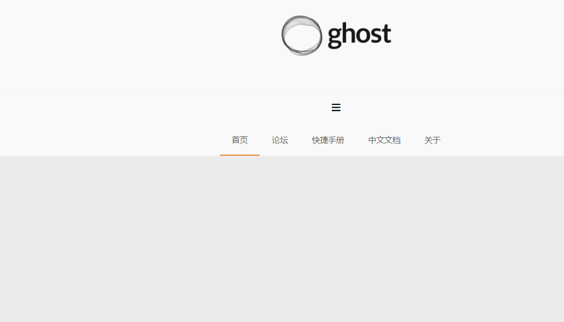
The final effect is as follows :

Implementation of the head region :
Here is mainly a logo picture , Then set the height of the head area to a fixed height and logo The width of the picture is fixed
Reuse elastic layout (flex), And set its justify-content as well as align-items by center, This can be achieved logo The picture is centered horizontally and vertically relative to the head area
header {
  height: 190px;
  background: #fff;
  /* Use flexible layout , Give Way logo Be able to center horizontally and vertically */
  display: flex;
  justify-content: center;
  align-items: center;
}

header a img {
  width: 200px;
}
<!-- Head area -->
<header>
<a href="">
<img src="./img/ghost-logo.png" alt="">
</a>
</header>
Navigation area :
The navigation area is mainly divided into click collapse icon button and navigation content area
The height of navigation is automatically expanded by the content inside
The initial height of the navigation bar, that is, the height under the large screen, is 56px, Reuse elastic layout (flex), And set its justify-content as well as align-items by center, In this way, the folding icon can be centered horizontally and vertically relative to the navigation area
Navigation inside li The height of should also be at the beginning of the navigation bar 56px
Then it is set to control the display and hiding of navigation content when clicking the collapse icon , Here use :checked Property to set , And use label label . The specific way is to use label Label nested collapse icon , Then define a check box , Through the check box :ckecked To control whether it is selected or not , Select to display , On the contrary, hide
And the check box input We're going to set it to display:none; Because this actually has no value to show , It just exists to be able to control the navigation list
Under the mobile terminal : Navigation list (nav-list) It was hidden in the beginning , When you click the collapse button, it will show , Here is the use of :checked Property to complete , When clicked nav-list by block
<!-- Navigation area -->
<nav>
<!-- Navigation icons -->
<div class="nav-bar">
<label for="nav-toggle">
<i class="iconfont icon-zhedie"></i>
</label>
</div>
<input type="checkbox" id="nav-toggle" class="nav-toggle">
<!-- Navigation content area -->
<ul class="nav-list">
<li class="active"><a href=""> home page </a></li>
<li><a href=""> Forum </a></li>
<li><a href=""> Quick manual </a></li>
<li><a href=""> Chinese document </a></li>
<li><a href=""> About </a></li>
</ul>
</nav>/* Navigation area */
nav {
border-top: 1px solid #ebebeb;
border-bottom: 2px solid #ebebeb;
background-color: #fff;
padding: 0 15px;
.nav-bar {
height: 56px;
/* Use flexible layout , Give Way logo Be able to center horizontally and vertically */
display: flex;
justify-content: center;
align-items: center;
i {
cursor: pointer;
}
}
.nav-toggle {
display: none;
&:checked + .nav-list {
display: block;
}
}
.nav-list {
display: none;
li {
height: 56px;
line-height: 56px;
position: relative;
padding: 0 21px;
&.active::after {
content: "";
position: absolute;
left: 0px;
bottom: 0px;
width: 100%;
height: 2px;
background-color: #e67e22;
}
}
}
}Here, the display and hiding of the menu is completed , Then the next thing to do is add a response , Because when the resolution is large , The navigation should be expanded and centered , Here you need to use the grid
/* grid */
.row{
display: grid;
grid-template-columns: repeat(12, 1fr);
}
.row>[class*="col"]{
grid-area: auto/auto/auto/span 12;
}
.row .col-1{
grid-area: auto/auto/auto/span 1;
}
.row .col-2{
grid-area: auto/auto/auto/span 2;
}
.row .col-3{
grid-area: auto/auto/auto/span 3;
}
.row .col-4{
grid-area: auto/auto/auto/span 4;
}
.row .col-5{
grid-area: auto/auto/auto/span 5;
}
.row .col-6{
grid-area: auto/auto/auto/span 6;
}
.row .col-7{
grid-area: auto/auto/auto/span 7;
}
.row .col-8{
grid-area: auto/auto/auto/span 8;
}
.row .col-9{
grid-area: auto/auto/auto/span 9;
}
.row .col-10{
grid-area: auto/auto/auto/span 10;
}
.row .col-11{
grid-area: auto/auto/auto/span 11;
}
.row .col-12{
grid-area: auto/auto/auto/span 12;
}
@media (min-width: 576px){
.row .col-sm-1{
grid-area: auto/auto/auto/span 1;
}
.row .col-sm-2{
grid-area: auto/auto/auto/span 2;
}
.row .col-sm-3{
grid-area: auto/auto/auto/span 3;
}
.row .col-sm-4{
grid-area: auto/auto/auto/span 4;
}
.row .col-sm-5{
grid-area: auto/auto/auto/span 5;
}
.row .col-sm-6{
grid-area: auto/auto/auto/span 6;
}
.row .col-sm-7{
grid-area: auto/auto/auto/span 7;
}
.row .col-sm-8{
grid-area: auto/auto/auto/span 8;
}
.row .col-sm-9{
grid-area: auto/auto/auto/span 9;
}
.row .col-sm-10{
grid-area: auto/auto/auto/span 10;
}
.row .col-sm-11{
grid-area: auto/auto/auto/span 11;
}
.row .col-sm-12{
grid-area: auto/auto/auto/span 12;
}
}
@media (min-width: 768px){
.nav-bar{
display: none;
}
.nav-list{
display: flex !important;
justify-content: center;
justify-items: center;
}
.row .col-md-1{
grid-area: auto/auto/auto/span 1;
}
.row .col-md-2{
grid-area: auto/auto/auto/span 2;
}
.row .col-md-3{
grid-area: auto/auto/auto/span 3;
}
.row .col-md-4{
grid-area: auto/auto/auto/span 4;
}
.row .col-md-5{
grid-area: auto/auto/auto/span 5;
}
.row .col-md-6{
grid-area: auto/auto/auto/span 6;
}
.row .col-md-7{
grid-area: auto/auto/auto/span 7;
}
.row .col-md-8{
grid-area: auto/auto/auto/span 8;
}
.row .col-md-9{
grid-area: auto/auto/auto/span 9;
}
.row .col-md-10{
grid-area: auto/auto/auto/span 10;
}
.row .col-md-11{
grid-area: auto/auto/auto/span 11;
}
.row .col-md-12{
grid-area: auto/auto/auto/span 12;
}
}
@media (min-width: 992px){
:root{
--container: 940px;
}
.row>[class*="col"]{
padding: 0 15px;
}
.row .col-lg-1{
grid-area: auto/auto/auto/span 1;
}
.row .col-lg-2{
grid-area: auto/auto/auto/span 2;
}
.row .col-lg-3{
grid-area: auto/auto/auto/span 3;
}
.row .col-lg-4{
grid-area: auto/auto/auto/span 4;
}
.row .col-lg-5{
grid-area: auto/auto/auto/span 5;
}
.row .col-lg-6{
grid-area: auto/auto/auto/span 6;
}
.row .col-lg-7{
grid-area: auto/auto/auto/span 7;
}
.row .col-lg-8{
grid-area: auto/auto/auto/span 8;
}
.row .col-lg-9{
grid-area: auto/auto/auto/span 9;
}
.row .col-lg-10{
grid-area: auto/auto/auto/span 10;
}
.row .col-lg-11{
grid-area: auto/auto/auto/span 11;
}
.row .col-lg-12{
grid-area: auto/auto/auto/span 12;
}
}
@media (min-width: 1200px){
:root{
--container: 1160px;
}
.row>[class*="col"]{
padding: 0 15px;
}
.row .col-xl-1{
grid-area: auto/auto/auto/span 1;
}
.row .col-xl-2{
grid-area: auto/auto/auto/span 2;
}
.row .col-xl-3{
grid-area: auto/auto/auto/span 3;
}
.row .col-xl-4{
grid-area: auto/auto/auto/span 4;
}
.row .col-xl-5{
grid-area: auto/auto/auto/span 5;
}
.row .col-xl-6{
grid-area: auto/auto/auto/span 6;
}
.row .col-xl-7{
grid-area: auto/auto/auto/span 7;
}
.row .col-xl-8{
grid-area: auto/auto/auto/span 8;
}
.row .col-xl-9{
grid-area: auto/auto/auto/span 9;
}
.row .col-xl-10{
grid-area: auto/auto/auto/span 10;
}
.row .col-xl-11{
grid-area: auto/auto/auto/span 11;
}
.row .col-xl-12{
grid-area: auto/auto/auto/span 12;
}
}
@media (min-width: 1400px){
.row .col-xxl-1{
grid-area: auto/auto/auto/span 1;
}
.row .col-xxl-2{
grid-area: auto/auto/auto/span 2;
}
.row .col-xxl-3{
grid-area: auto/auto/auto/span 3;
}
.row .col-xxl-4{
grid-area: auto/auto/auto/span 4;
}
.row .col-xxl-5{
grid-area: auto/auto/auto/span 5;
}
.row .col-xxl-6{
grid-area: auto/auto/auto/span 6;
}
.row .col-xxl-7{
grid-area: auto/auto/auto/span 7;
}
.row .col-xxl-8{
grid-area: auto/auto/auto/span 8;
}
.row .col-xxl-9{
grid-area: auto/auto/auto/span 9;
}
.row .col-xxl-10{
grid-area: auto/auto/auto/span 10;
}
.row .col-xxl-11{
grid-area: auto/auto/auto/span 11;
}
.row .col-xxl-12{
grid-area: auto/auto/auto/span 12;
}
}
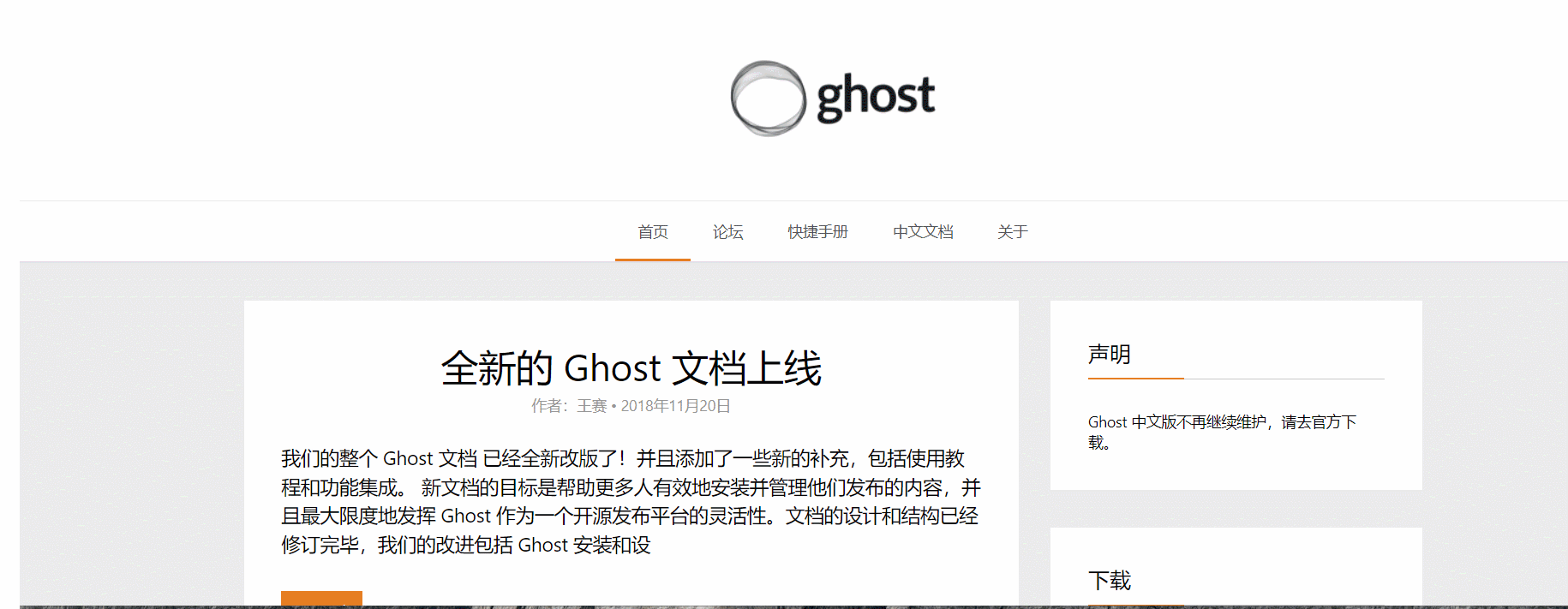
The final effect is as follows :
The article lists ( The main body ) Area :
The structure and style are omitted here , Go straight to the code
<!-- The list of articles is the main content part -->
<main>
<div class="main-article">
<h2>
all-new Ghost The document is online
</h2>
<div>
<span> author : Wang Sai </span> • <span>2018 year 11 month 20 Japan </span>
</div>
<p>
Our whole Ghost file It has been completely revised ! And added some new additions , Including tutorials and feature integration . The goal of the new document is to help more people install and manage their published content effectively , And maximize Ghost Flexibility as an open source publishing platform . The design and structure of the document have been revised , Our improvements include Ghost Installation and installation
</p>
<button> Read the whole passage </button>
<section>
<i class="iconfont icon-wenjianjia"></i>
<a href="#">Android</a>,
<a href="#"> client </a>
</section>
</div>
</main>/* The list of articles is the main content part */
main {
padding: 0 15px;
}
main .main-article {
margin-top: 35px;
background-color: #fff;
padding: 35px;
line-height: 1.5;
}
main .main-article h2 {
font-size: 35px;
text-align: center;
font-weight: 400;
}
main .main-article div {
text-align: center;
line-height: 30px;
color: #959595;
}
main .main-article p {
font-size: 18px;
margin-top: 25px;
}
main .main-article button {
border: none;
background-color: #e67e22;
color: #fff;
padding: 10px;
cursor: pointer;
margin: 30px 0;
}
main .main-article section {
border-top: 1px solid #ebebeb;
padding-top: 20px;
}
main .main-article section i {
margin-right: 10px;
}Write here , The main part of the article is over , But at this time, it is not responsive , That is, when it is greater than a certain value, it should occupy a part of the grid rather than the whole row
Here we will directly use the grid written above
<main class="row">
<div class="col-lg-8">
Article content
</div>
</main>.....
The footers area :
<!-- The footers area -->
<div class="foot">
<div class="foot-wrapper row">
<div class="foot-item col-lg-4">
<h3> Friend chain </h3>
<div>
<a href="#">Bootstrap Chinese net </a>
<a href="#">React</a>
<a href="#">Vue.js</a>
<a href="#">Svelte</a>
<a href="#">Preact</a>
<a href="#">Babel</a>
<a href="#">Webpack</a>
<a href="#">Rollup.js</a>
<a href="#">Bootstrap Chinese net </a>
<a href="#">React</a>
<a href="#">Vue.js</a>
<a href="#">Svelte</a>
<a href="#">Preact</a>
<a href="#">Babel</a>
<a href="#">Webpack</a>
<a href="#">Rollup.js</a>
</div>
</div>
<div class="foot-item col-lg-4">
<h3> Tag cloud </h3>
<div>
<a href="#"> client </a>
<a href="#">Android</a>
<a href="#">jQuery</a>
<a href="#">Ghost 0.7 edition </a>
<a href="#"> Open source </a>
<a href="#"> Helper functions </a>
<a href="#"> client </a>
<a href="#"> client </a>
<a href="#">Android</a>
<a href="#">jQuery</a>
<a href="#">Ghost 0.7 edition </a>
<a href="#"> Open source </a>
<a href="#"> Helper functions </a>
<a href="#"> client </a>
</div>
</div>
<div class="foot-item col-lg-4">
<h3> partners </h3>
<div>
<a href="#"> tencent </a>
<a href="#"> Alibaba </a>
<a href="#"> Baidu </a>
</div>
</div>
</div>
</div>
<div class="copyright">
<p>Copyright Ghost Chinese net | Beijing ICP To prepare 11008151 Number -11 | Beijing public network security 11010802014853</p>
</div>/* The footers area */
.foot {
background-color: #202020;
margin-top: 35px;
padding-top: 35px;
overflow: hidden;
.foot-wrapper {
width: $container;
margin: 0 auto;
.foot-item {
padding: 0 30px;
margin-bottom: 30px;
h3 {
color: #fff;
font-size: 22px;
padding-bottom: 10px;
border-bottom: 1px #ccc solid;
position: relative;
&::after {
position: absolute;
left: 0;
bottom: -1px;
content: "";
width: 90px;
height: 1px;
background-color: #e67e22;
}
}
div {
margin-top: 20px;
a {
margin: 10px;
display: inline-block;
color: #959595;
}
}
}
}
}
.copyright {
background-color: #111;
display: flex;
justify-content: center;
align-items: center;
height: 80px;
color: #555;
}design sketch :
Source code :
<!DOCTYPE html>
<html lang="en">
<head>
<meta charset="UTF-8">
<meta http-equiv="X-UA-Compatible" content="IE=edge">
<meta name="viewport" content="width=device-width, initial-scale=1.0">
<title>Document</title>
<link rel="stylesheet" href="./css/reset.css">
<link rel="stylesheet" href="./iconfont/iconfont.css">
<link rel="stylesheet" href="css/index.css">
</head>
<body>
    <!--  Head area  -->
    <header>
        <a href="">
            <img src="./img/ghost-logo.png" alt="">
        </a>
    </header>
    <!--  Navigation area  -->
    <nav>
        <!--  Navigation icons  -->
        <div class="nav-bar">
            <label for="nav-toggle">
                <i class="iconfont icon-zhedie"></i>
            </label>
        </div>
        <input type="checkbox" id="nav-toggle" class="nav-toggle">

        <!--  Navigation content area  -->
        <ul class="nav-list">
            <li class="active"><a href=""> home page </a></li>
            <li><a href=""> Forum </a></li>
            <li><a href=""> Quick manual </a></li>
            <li><a href=""> Chinese document </a></li>
            <li><a href=""> About </a></li>
        </ul>
    </nav>
<!-- The list of articles is the main content part -->
<main class="row">
<div class="col-lg-8">
<div class="main-article">
<h2>
all-new Ghost The document is online
</h2>
<div>
<span> author : Wang Sai </span> • <span>2018 year 11 month 20 Japan </span>
</div>
<p>
Our whole Ghost file It has been completely revised ! And added some new additions , Including tutorials and feature integration . The goal of the new document is to help more people install and manage their published content effectively , And maximize Ghost Flexibility as an open source publishing platform . The design and structure of the document have been revised , Our improvements include Ghost Installation and installation
</p>
<button> Read the whole passage </button>
<section>
<i class="iconfont icon-wenjianjia"></i>
<a href="#">Android</a>,
<a href="#"> client </a>
</section>
</div>
</div>
<!-- Sidebar -->
<div class="col-lg-4">
<div class="main-aside">
<h3> Statement </h3>
<p>Ghost The Chinese version will no longer be maintained , Please go to the official download .</p>
</div>
<div class="main-aside">
<h3> download </h3>
<button>Ghost The latest version </button>
</div>
<div class="main-aside">
<h3> Tag cloud </h3>
<div>
<a href="#"> client </a>
<a href="#">Android</a>
<a href="#">jQuery</a>
<a href="#">Ghost 0.7 edition </a>
<a href="#"> Open source </a>
<a href="#"> Helper functions </a>
<a href="#"> client </a>
<a href="#"> client </a>
<a href="#">Android</a>
<a href="#">jQuery</a>
<a href="#">Ghost 0.7 edition </a>
<a href="#"> Open source </a>
<a href="#"> Helper functions </a>
<a href="#"> client </a>
</div>
</div>
</div>
</main>
    <!--  The footers area  -->
    <div class="foot">
        <div class="foot-wrapper row">
            <div class="foot-item col-lg-4">
                <h3> Friend chain </h3>
                <div>
                    <a href="#">Bootstrap Chinese net </a>
                    <a href="#">React</a>
                    <a href="#">Vue.js</a>
                    <a href="#">Svelte</a>
                    <a href="#">Preact</a>
                    <a href="#">Babel</a>
                    <a href="#">Webpack</a>
                    <a href="#">Rollup.js</a>
                </div>
            </div>
            <div class="foot-item col-lg-4">
                <h3> Tag cloud </h3>
                <div>
                    <a href="#"> client </a>
                    <a href="#">Android</a>
                    <a href="#">jQuery</a>
                    <a href="#">Ghost 0.7  edition </a>
                    <a href="#"> Open source </a>
                    <a href="#"> Helper functions </a>
                    <a href="#"> client </a>
                    <a href="#"> client </a>
                    <a href="#">Android</a>
                    <a href="#">jQuery</a>
                    <a href="#">Ghost 0.7  edition </a>
                    <a href="#"> Open source </a>
                    <a href="#"> Helper functions </a>
                    <a href="#"> client </a>
                </div>
            </div>
            <div class="foot-item col-lg-4">
                <h3> partners </h3>
                <div>
                    <a href="#"> tencent </a>
                    <a href="#"> Alibaba </a>
                    <a href="#"> Baidu </a>
                </div>
            </div>
        </div>
    </div>
    <div class="copyright">
        <p>Copyright  Ghost Chinese net  |  Beijing ICP To prepare 11008151 Number -11 |  Beijing public network security 11010802014853</p>
    </div>
</body>
</html>@charset "utf-8";
/* -------------------- Reset style -------------------------------- */
body,
h1,
h2,
h3,
h4,
h5,
h6,
hr,
p,
blockquote,
dl,
dt,
dd,
ul,
ol,
li,
button,
input,
textarea,
th,
td {
margin : 0;
padding: 0
}
/* Set default font */
body {
font-size : 14px;
font-style : normal;
font-family: -apple-system, BlinkMacSystemFont, segoe ui, Roboto, helvetica neue, Arial, noto sans, sans-serif, apple color emoji, segoe ui emoji, segoe ui symbol, noto color emoji;
}
/* The font is too small, the user's physical examination is not good , Give Way small recovery 12px*/
small {
font-size: 12px
}
h1 {
font-size: 18px
}
h2 {
font-size: 16px
}
h3 {
font-size: 14px
}
h4,
h5,
h6 {
font-size: 100%
}
ul,
ol {
list-style: none
}
a {
text-decoration : none;
background-color: transparent
}
a:hover,
a:active {
outline-width : 0;
text-decoration: none
}
/* Reset table */
table {
border-collapse: collapse;
border-spacing : 0
}
/* Reset hr*/
hr {
border: 0;
height: 1px
}
/* Graphics pictures */
img {
border-style: none
}
img:not([src]) {
display: none
}
svg:not(:root) {
overflow: hidden
}
/* The following operations are for html5 Page layout preparation , I won't support it ie6~8 And other lower versions of browsers */
html {
/* Disable the system default menu */
-webkit-touch-callout : none;
/* close iphone & Android The browser automatically adjusts the font size in vertical and horizontal modes */
-webkit-text-size-adjust: 100%
}
input,
textarea,
button,
a {
/* The form or a When the tag is clicked by the mobile phone, a border or a colored background area will appear , It means to remove the click background box */
-webkit-tap-highlight-color: rgba(0, 0, 0, 0)
}
/* Reset html5 Default style for elements */
article,
aside,
details,
figcaption,
figure,
footer,
header,
main,
menu,
nav,
section,
summary {
display: block
}
audio,
canvas,
progress,
video {
display: inline-block
}
audio:not([controls]),
video:not([controls]) {
display: none;
height : 0
}
progress {
vertical-align: baseline
}
mark {
background-color: #ff0;
color : #000
}
sub,
sup {
position : relative;
font-size : 75%;
line-height : 0;
vertical-align: baseline
}
sub {
bottom: -0.25em
}
sup {
top: -0.5em
}
button,
input,
select,
textarea {
font-size: 100%;
outline : 0
}
button,
input {
overflow: visible
}
button,
select {
text-transform: none
}
textarea {
overflow: auto
}
button,
html [type="button"],
[type="reset"],
[type="submit"] {
-webkit-appearance: button
}
button::-moz-focus-inner,
[type="button"]::-moz-focus-inner,
[type="reset"]::-moz-focus-inner,
[type="submit"]::-moz-focus-inner {
border-style: none;
padding : 0
}
button:-moz-focusring,
[type="button"]:-moz-focusring,
[type="reset"]:-moz-focusring,
[type="submit"]:-moz-focusring {
outline: 1px dotted ButtonText
}
[type="checkbox"],
[type="radio"] {
box-sizing: border-box;
padding : 0
}
[type="number"]::-webkit-inner-spin-button,
[type="number"]::-webkit-outer-spin-button {
height: auto
}
[type="search"] {
-webkit-appearance: textfield;
outline-offset : -2px
}
[type="search"]::-webkit-search-cancel-button,
[type="search"]::-webkit-search-decoration {
-webkit-appearance: none
}
::-webkit-input-placeholder {
color : inherit;
opacity: .54
}
::-webkit-file-upload-button {
-webkit-appearance: button;
font : inherit
}@charset "UTF-8";
body {
background-color: #ebebeb;
}
a {
color: #505050;
}
/* grid */
.row {
display: grid;
grid-template-columns: repeat(12, 1fr);
}
.row > [class*="col"] {
grid-area: auto/auto/auto/span 12;
}
.row .col-1 {
grid-area: auto/auto/auto/span 1;
}
.row .col-2 {
grid-area: auto/auto/auto/span 2;
}
.row .col-3 {
grid-area: auto/auto/auto/span 3;
}
.row .col-4 {
grid-area: auto/auto/auto/span 4;
}
.row .col-5 {
grid-area: auto/auto/auto/span 5;
}
.row .col-6 {
grid-area: auto/auto/auto/span 6;
}
.row .col-7 {
grid-area: auto/auto/auto/span 7;
}
.row .col-8 {
grid-area: auto/auto/auto/span 8;
}
.row .col-9 {
grid-area: auto/auto/auto/span 9;
}
.row .col-10 {
grid-area: auto/auto/auto/span 10;
}
.row .col-11 {
grid-area: auto/auto/auto/span 11;
}
.row .col-12 {
grid-area: auto/auto/auto/span 12;
}
@media (min-width: 576px) {
.row .col-sm-1 {
grid-area: auto/auto/auto/span 1;
}
.row .col-sm-2 {
grid-area: auto/auto/auto/span 2;
}
.row .col-sm-3 {
grid-area: auto/auto/auto/span 3;
}
.row .col-sm-4 {
grid-area: auto/auto/auto/span 4;
}
.row .col-sm-5 {
grid-area: auto/auto/auto/span 5;
}
.row .col-sm-6 {
grid-area: auto/auto/auto/span 6;
}
.row .col-sm-7 {
grid-area: auto/auto/auto/span 7;
}
.row .col-sm-8 {
grid-area: auto/auto/auto/span 8;
}
.row .col-sm-9 {
grid-area: auto/auto/auto/span 9;
}
.row .col-sm-10 {
grid-area: auto/auto/auto/span 10;
}
.row .col-sm-11 {
grid-area: auto/auto/auto/span 11;
}
.row .col-sm-12 {
grid-area: auto/auto/auto/span 12;
}
}
@media (min-width: 768px) {
.nav-bar {
display: none;
}
.nav-list {
display: flex !important;
justify-content: center;
justify-items: center;
}
.row .col-md-1 {
grid-area: auto/auto/auto/span 1;
}
.row .col-md-2 {
grid-area: auto/auto/auto/span 2;
}
.row .col-md-3 {
grid-area: auto/auto/auto/span 3;
}
.row .col-md-4 {
grid-area: auto/auto/auto/span 4;
}
.row .col-md-5 {
grid-area: auto/auto/auto/span 5;
}
.row .col-md-6 {
grid-area: auto/auto/auto/span 6;
}
.row .col-md-7 {
grid-area: auto/auto/auto/span 7;
}
.row .col-md-8 {
grid-area: auto/auto/auto/span 8;
}
.row .col-md-9 {
grid-area: auto/auto/auto/span 9;
}
.row .col-md-10 {
grid-area: auto/auto/auto/span 10;
}
.row .col-md-11 {
grid-area: auto/auto/auto/span 11;
}
.row .col-md-12 {
grid-area: auto/auto/auto/span 12;
}
}
@media (min-width: 992px) {
.row > [class*="col"] {
padding: 0 15px;
}
.row .col-lg-1 {
grid-area: auto/auto/auto/span 1;
}
.row .col-lg-2 {
grid-area: auto/auto/auto/span 2;
}
.row .col-lg-3 {
grid-area: auto/auto/auto/span 3;
}
.row .col-lg-4 {
grid-area: auto/auto/auto/span 4;
}
.row .col-lg-5 {
grid-area: auto/auto/auto/span 5;
}
.row .col-lg-6 {
grid-area: auto/auto/auto/span 6;
}
.row .col-lg-7 {
grid-area: auto/auto/auto/span 7;
}
.row .col-lg-8 {
grid-area: auto/auto/auto/span 8;
}
.row .col-lg-9 {
grid-area: auto/auto/auto/span 9;
}
.row .col-lg-10 {
grid-area: auto/auto/auto/span 10;
}
.row .col-lg-11 {
grid-area: auto/auto/auto/span 11;
}
.row .col-lg-12 {
grid-area: auto/auto/auto/span 12;
}
}
@media (min-width: 1200px) {
.row > [class*="col"] {
padding: 0 15px;
}
.row .col-xl-1 {
grid-area: auto/auto/auto/span 1;
}
.row .col-xl-2 {
grid-area: auto/auto/auto/span 2;
}
.row .col-xl-3 {
grid-area: auto/auto/auto/span 3;
}
.row .col-xl-4 {
grid-area: auto/auto/auto/span 4;
}
.row .col-xl-5 {
grid-area: auto/auto/auto/span 5;
}
.row .col-xl-6 {
grid-area: auto/auto/auto/span 6;
}
.row .col-xl-7 {
grid-area: auto/auto/auto/span 7;
}
.row .col-xl-8 {
grid-area: auto/auto/auto/span 8;
}
.row .col-xl-9 {
grid-area: auto/auto/auto/span 9;
}
.row .col-xl-10 {
grid-area: auto/auto/auto/span 10;
}
.row .col-xl-11 {
grid-area: auto/auto/auto/span 11;
}
.row .col-xl-12 {
grid-area: auto/auto/auto/span 12;
}
}
@media (min-width: 1400px) {
.row .col-xxl-1 {
grid-area: auto/auto/auto/span 1;
}
.row .col-xxl-2 {
grid-area: auto/auto/auto/span 2;
}
.row .col-xxl-3 {
grid-area: auto/auto/auto/span 3;
}
.row .col-xxl-4 {
grid-area: auto/auto/auto/span 4;
}
.row .col-xxl-5 {
grid-area: auto/auto/auto/span 5;
}
.row .col-xxl-6 {
grid-area: auto/auto/auto/span 6;
}
.row .col-xxl-7 {
grid-area: auto/auto/auto/span 7;
}
.row .col-xxl-8 {
grid-area: auto/auto/auto/span 8;
}
.row .col-xxl-9 {
grid-area: auto/auto/auto/span 9;
}
.row .col-xxl-10 {
grid-area: auto/auto/auto/span 10;
}
.row .col-xxl-11 {
grid-area: auto/auto/auto/span 11;
}
.row .col-xxl-12 {
grid-area: auto/auto/auto/span 12;
}
}
/* Head area */
header {
height: 190px;
background: #fff;
/* Use flexible layout , Give Way logo Be able to center horizontally and vertically */
display: flex;
justify-content: center;
align-items: center;
}
header a img {
width: 200px;
}
/* Navigation area */
nav {
border-top: 1px solid #ebebeb;
border-bottom: 2px solid #ebebeb;
background-color: #fff;
padding: 0 15px;
}
nav .nav-bar {
height: 56px;
/* Use flexible layout , Let the navigation center horizontally and vertically */
display: flex;
justify-content: center;
align-items: center;
}
nav .nav-bar i {
cursor: pointer;
}
nav .nav-toggle {
display: none;
}
nav .nav-toggle:checked + .nav-list {
display: block;
}
nav .nav-list {
display: none;
}
nav .nav-list li {
height: 56px;
line-height: 56px;
padding: 0 21px;
position: relative;
}
nav .nav-list li.active::after {
content: "";
position: absolute;
left: 0px;
bottom: 0px;
width: 100%;
height: 2px;
background-color: #e67e22;
}
/* The list of articles is the main content part */
main {
padding: 0 15px;
width: 100%;
margin: 0 auto;
box-sizing: border-box;
/* Sidebar */
}
main .main-article {
margin-top: 35px;
background-color: #fff;
padding: 35px;
line-height: 1.5;
}
main .main-article h2 {
font-size: 35px;
text-align: center;
font-weight: 400;
}
main .main-article div {
text-align: center;
line-height: 30px;
color: #959595;
}
main .main-article p {
font-size: 18px;
margin-top: 25px;
}
main .main-article button {
border: none;
background-color: #e67e22;
color: #fff;
padding: 10px;
cursor: pointer;
margin: 30px 0;
}
main .main-article section {
border-top: 1px solid #ebebeb;
padding-top: 20px;
}
main .main-article section i {
margin-right: 10px;
}
main .main-aside {
margin-top: 35px;
padding: 35px;
background-color: #fff;
}
main .main-aside h3 {
font-size: 20px;
font-weight: 400;
padding-bottom: 10px;
border-bottom: 1px solid #ccc;
position: relative;
}
main .main-aside h3::after {
content: "";
position: absolute;
left: 0;
bottom: -1px;
width: 90px;
height: 1px;
background-color: #e67e22;
}
main .main-aside p {
margin-top: 30px;
}
main .main-aside button {
width: 100%;
border: none;
background: #e67e22;
color: #fff;
padding: 10px;
cursor: pointer;
margin-top: 30px;
}
main .main-aside div {
margin-top: 20px;
}
main .main-aside div a {
border: 1px solid #ebebeb;
display: inline-block;
margin: 11px 7px 0 0;
padding: 5px 10px;
}
/* The footers area */
.foot {
background-color: #202020;
margin-top: 35px;
padding-top: 35px;
overflow: hidden;
}
.foot .foot-wrapper {
width: 100%;
margin: 0 auto;
}
.foot .foot-wrapper .foot-item {
padding: 0 30px;
margin-bottom: 30px;
}
.foot .foot-wrapper .foot-item h3 {
color: #fff;
font-size: 22px;
padding-bottom: 10px;
border-bottom: 1px #ccc solid;
position: relative;
}
.foot .foot-wrapper .foot-item h3::after {
position: absolute;
left: 0;
bottom: -1px;
content: "";
width: 90px;
height: 1px;
background-color: #e67e22;
}
.foot .foot-wrapper .foot-item div {
margin-top: 20px;
}
.foot .foot-wrapper .foot-item div a {
margin: 10px;
display: inline-block;
color: #959595;
}
.copyright {
background-color: #111;
display: flex;
justify-content: center;
align-items: center;
height: 80px;
color: #555;
}
:root{
--container: 100%;
}
body{
background: #ebebeb;
}
a{
color: #505050;
}
.head{
height: 190px;
background: white;
display: flex;
justify-content: center;
align-items: center;
}
.head-logo{
width: 200px;
}
.nav{
border-top: 1px #ebebeb solid;
border-bottom: 2px #e1e1e1 solid;
background: white;
padding: 0 15px;
}
.nav-bar{
height: 56px;
display: flex;
justify-content: center;
align-items: center;
}
.nav-bar i{
cursor: pointer;
}
.nav-list{
display: none;
}
.nav-list li{
height: 56px;
line-height: 56px;
position: relative;
padding:0 21px;
}
.nav-list li.active::after{
content: "";
position: absolute;
left:0;
bottom:0;
width: 100%;
height: 2px;
background: #e67e22;
}
.nav-toggle{
display: none;
}
.nav-toggle:checked + .nav-list{
display: block;
}
.main{
padding: 0 15px;
width: var(--container);
margin: 0 auto;
box-sizing: border-box;
}
.main-article{
margin-top: 35px;
background: white;
padding: 35px;
line-height: 1.5;
}
.main-article h2{
font-size: 35px;
text-align: center;
font-weight: 400;
}
.main-article div{
text-align: center;
color: #959595;
}
.main-article p{
margin-top:25px;
font-size:18px;
}
.main-article button{
border:none;
background: #e67e22;
color: white;
padding:10px;
cursor: pointer;
margin: 30px 0;
}
.main-article section{
border-top:1px #ebebeb solid;
padding-top:20px;
}
.main-article section i{
margin-right: 10px;
}
.main-aside{
background: white;
padding:35px;
margin-top:35px;
}
.main-aside h3{
font-size: 20px;
font-weight: 400;
padding-bottom: 10px;
border-bottom: 1px #cccccc solid;
position: relative;
}
.main-aside h3::after{
content:"";
position: absolute;
left:0;
bottom:-1px;
width: 90px;
height: 1px;
background: #e67e22;
}
.main-aside p{
margin-top:30px;
}
.main-aside button{
border:none;
background: #e67e22;
color: white;
padding:10px;
cursor: pointer;
margin-top: 30px;
width: 100%;
}
.main-aside div {
margin-top: 20px;
}
.main-aside div a{
border:1px #ebebeb solid;
display: inline-block;
margin:11px 7px 0 0;
padding:5px 10px;
}
.foot{
margin-top: 35px;
padding-top:35px;
background: #202020;
overflow: hidden;
}
.foot-wrapper{
width: var(--container);
margin: 0 auto;
}
.foot-item{
padding:0 30px;
margin-bottom: 30px;
}
.foot-item h3{
color: white;
font-size: 22px;
font-weight: 400;
padding-bottom: 10px;
border-bottom: 1px #cccccc solid;
position: relative;
}
.foot-item h3::after{
content:"";
position: absolute;
left:0;
bottom:-1px;
width: 90px;
height: 1px;
background: #e67e22;
}
.foot-item div{
margin-top: 20px;
}
.foot-item div a{
margin:10px;
display: inline-block;
color: #959595;
}
.copyright{
background: #111111;
display: flex;
justify-content: center;
align-items: center;
height: 80px;
color: #555555;
}
.row{
display: grid;
grid-template-columns: repeat(12, 1fr);
}
.row>[class*="col"]{
grid-area: auto/auto/auto/span 12;
}
.row .col-1{
grid-area: auto/auto/auto/span 1;
}
.row .col-2{
grid-area: auto/auto/auto/span 2;
}
.row .col-3{
grid-area: auto/auto/auto/span 3;
}
.row .col-4{
grid-area: auto/auto/auto/span 4;
}
.row .col-5{
grid-area: auto/auto/auto/span 5;
}
.row .col-6{
grid-area: auto/auto/auto/span 6;
}
.row .col-7{
grid-area: auto/auto/auto/span 7;
}
.row .col-8{
grid-area: auto/auto/auto/span 8;
}
.row .col-9{
grid-area: auto/auto/auto/span 9;
}
.row .col-10{
grid-area: auto/auto/auto/span 10;
}
.row .col-11{
grid-area: auto/auto/auto/span 11;
}
.row .col-12{
grid-area: auto/auto/auto/span 12;
}
@media (min-width: 576px){
.row .col-sm-1{
grid-area: auto/auto/auto/span 1;
}
.row .col-sm-2{
grid-area: auto/auto/auto/span 2;
}
.row .col-sm-3{
grid-area: auto/auto/auto/span 3;
}
.row .col-sm-4{
grid-area: auto/auto/auto/span 4;
}
.row .col-sm-5{
grid-area: auto/auto/auto/span 5;
}
.row .col-sm-6{
grid-area: auto/auto/auto/span 6;
}
.row .col-sm-7{
grid-area: auto/auto/auto/span 7;
}
.row .col-sm-8{
grid-area: auto/auto/auto/span 8;
}
.row .col-sm-9{
grid-area: auto/auto/auto/span 9;
}
.row .col-sm-10{
grid-area: auto/auto/auto/span 10;
}
.row .col-sm-11{
grid-area: auto/auto/auto/span 11;
}
.row .col-sm-12{
grid-area: auto/auto/auto/span 12;
}
}
@media (min-width: 768px){
.nav-bar{
display: none;
}
.nav-list{
display: flex !important;
justify-content: center;
justify-items: center;
}
.row .col-md-1{
grid-area: auto/auto/auto/span 1;
}
.row .col-md-2{
grid-area: auto/auto/auto/span 2;
}
.row .col-md-3{
grid-area: auto/auto/auto/span 3;
}
.row .col-md-4{
grid-area: auto/auto/auto/span 4;
}
.row .col-md-5{
grid-area: auto/auto/auto/span 5;
}
.row .col-md-6{
grid-area: auto/auto/auto/span 6;
}
.row .col-md-7{
grid-area: auto/auto/auto/span 7;
}
.row .col-md-8{
grid-area: auto/auto/auto/span 8;
}
.row .col-md-9{
grid-area: auto/auto/auto/span 9;
}
.row .col-md-10{
grid-area: auto/auto/auto/span 10;
}
.row .col-md-11{
grid-area: auto/auto/auto/span 11;
}
.row .col-md-12{
grid-area: auto/auto/auto/span 12;
}
}
@media (min-width: 992px){
:root{
--container: 940px;
}
.row>[class*="col"]{
padding: 0 15px;
}
.row .col-lg-1{
grid-area: auto/auto/auto/span 1;
}
.row .col-lg-2{
grid-area: auto/auto/auto/span 2;
}
.row .col-lg-3{
grid-area: auto/auto/auto/span 3;
}
.row .col-lg-4{
grid-area: auto/auto/auto/span 4;
}
.row .col-lg-5{
grid-area: auto/auto/auto/span 5;
}
.row .col-lg-6{
grid-area: auto/auto/auto/span 6;
}
.row .col-lg-7{
grid-area: auto/auto/auto/span 7;
}
.row .col-lg-8{
grid-area: auto/auto/auto/span 8;
}
.row .col-lg-9{
grid-area: auto/auto/auto/span 9;
}
.row .col-lg-10{
grid-area: auto/auto/auto/span 10;
}
.row .col-lg-11{
grid-area: auto/auto/auto/span 11;
}
.row .col-lg-12{
grid-area: auto/auto/auto/span 12;
}
}
@media (min-width: 1200px){
:root{
--container: 1160px;
}
.row>[class*="col"]{
padding: 0 15px;
}
.row .col-xl-1{
grid-area: auto/auto/auto/span 1;
}
.row .col-xl-2{
grid-area: auto/auto/auto/span 2;
}
.row .col-xl-3{
grid-area: auto/auto/auto/span 3;
}
.row .col-xl-4{
grid-area: auto/auto/auto/span 4;
}
.row .col-xl-5{
grid-area: auto/auto/auto/span 5;
}
.row .col-xl-6{
grid-area: auto/auto/auto/span 6;
}
.row .col-xl-7{
grid-area: auto/auto/auto/span 7;
}
.row .col-xl-8{
grid-area: auto/auto/auto/span 8;
}
.row .col-xl-9{
grid-area: auto/auto/auto/span 9;
}
.row .col-xl-10{
grid-area: auto/auto/auto/span 10;
}
.row .col-xl-11{
grid-area: auto/auto/auto/span 11;
}
.row .col-xl-12{
grid-area: auto/auto/auto/span 12;
}
}
@media (min-width: 1400px){
.row .col-xxl-1{
grid-area: auto/auto/auto/span 1;
}
.row .col-xxl-2{
grid-area: auto/auto/auto/span 2;
}
.row .col-xxl-3{
grid-area: auto/auto/auto/span 3;
}
.row .col-xxl-4{
grid-area: auto/auto/auto/span 4;
}
.row .col-xxl-5{
grid-area: auto/auto/auto/span 5;
}
.row .col-xxl-6{
grid-area: auto/auto/auto/span 6;
}
.row .col-xxl-7{
grid-area: auto/auto/auto/span 7;
}
.row .col-xxl-8{
grid-area: auto/auto/auto/span 8;
}
.row .col-xxl-9{
grid-area: auto/auto/auto/span 9;
}
.row .col-xxl-10{
grid-area: auto/auto/auto/span 10;
}
.row .col-xxl-11{
grid-area: auto/auto/auto/span 11;
}
.row .col-xxl-12{
grid-area: auto/auto/auto/span 12;
}
}版权声明
本文为[Xiaobai, Xiaobai never daybai]所创,转载请带上原文链接,感谢
https://yzsam.com/2022/04/202204210921391761.html
边栏推荐
- 某小厂面试题:什么是虚假唤醒?
- Netease blog is going to be closed. My article!
- 当uniapp遇上滚动穿透,巧妙的解决方式~
- 1168: 账单(指针专题)
- 又涨了,4月全国程序员薪资出炉,竟成行业薪资天花板?看完我心动了
- 批量处理数据对比(<foreach>标签和sqlsession)
- 基于WebSocket实现一个简易的群聊功能
- CC10000.CloudJenkins—————————————
- Surfaceview high performance rendering (IV) code practice - drawing multiple pictures
- 2022危险化学品经营单位主要负责人上岗证题库及模拟考试
猜你喜欢

Interview question of a small factory: what is false awakening?

ESP32 寻迹模块测试

二叉树知识

CC00000. CloudJenkins—————————————

Download the first analysis report on China's database industry!
Getting started with object detection FAQs (deep learning / image classification)

Advanced C language - dynamic memory management
Open3d reads and writes ply point cloud files

【每日一题】跳石板--动态规划

Transaction isolation level and mvcc

随机推荐
当uniapp遇上滚动穿透,巧妙的解决方式~
Redisson introduction and integration
1167: 逆转数(指针专题)
Opencv -- separate color channel, image contrast, brightness adjustment, discrete Fourier transform (10)
【笔记】.launch文件语法记录
1165: 实数的小数部分(指针专题)
【云驻共创】华为云数据库之数据库原理及应用课程11、数据库系统控制
CC00043. CloudJenkins—————————————
[跟着官方文档学Junit5][一][Overview][学习笔记]
VR panorama is suitable for those industries
复旦大学-华盛顿大学EMBA校友:将"她力量"变成"我们的力量"
【Flutter 专题】124 日常问题小结 (三) 自定义 Dialog 二三事
Serviceworker cache and HTTP cache
#全网首发#SixTool-多功能多合一代挂助手,支持Bilibili,运动步数等功能,可运营版本开源发布!!!-星泽V社
CC00026. CloudJenkins—————————————
Pipy mqtt agent (III) logging
又涨了,4月全国程序员薪资出炉,竟成行业薪资天花板?看完我心动了
ZABBIX 5.4 server installation
I use ehcache local cache to improve the query performance by 100 times. It's really fragrant!
My blog navigation directory (constantly sorting and updating...)