当前位置:网站首页>Excel draws statistical graphs
Excel draws statistical graphs
2022-08-10 09:36:00 【Wolves_YY】
本文借鉴了数学建模清风老师的课件与思路,可以点击查看链接查看清风老师视频讲解:清风数学建模:https://www.bilibili.com/video/BV1DW411s7wi
前言
一、饼图
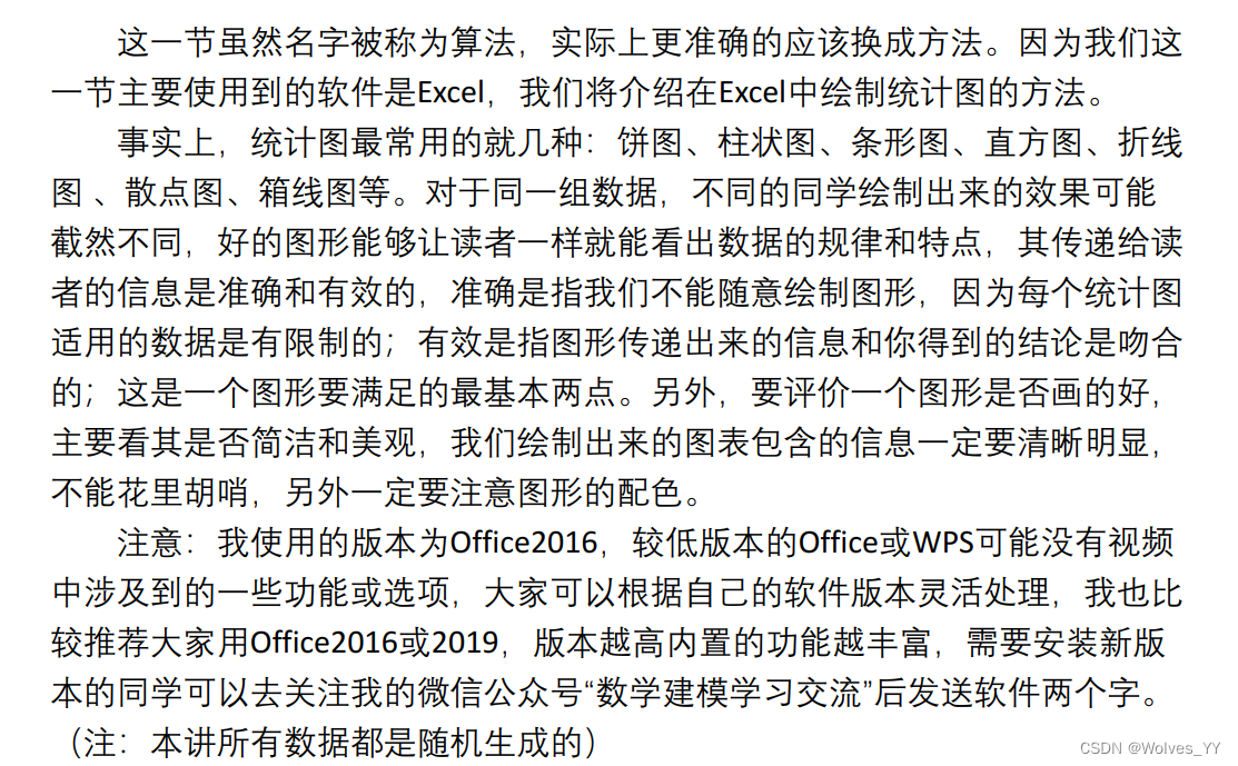
1.1 Regular Pie Chart

要求:untitled,Monochrome for coloring(方便打印,有区分度,Available in black and white),Label the data and zoom in appropriately,Put the legend to the right and zoom in appropriately,边框为无线条.
分析:The highest sales in the fourth quarter,Lowest in the third quarter.
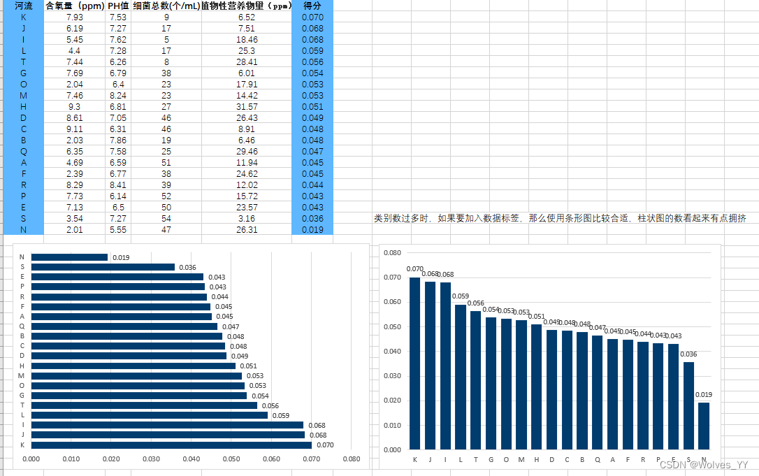
1.2 类别太多

Category too much in the histogram.
1.3 too few categories

Don't draw when there are too few categories,direct text description,Unless it can be drawn as a picture of World of Warcraft or the problem of raising dragons,But the national competition doesn't like fancy pictures either..
1.4 Category is not complete
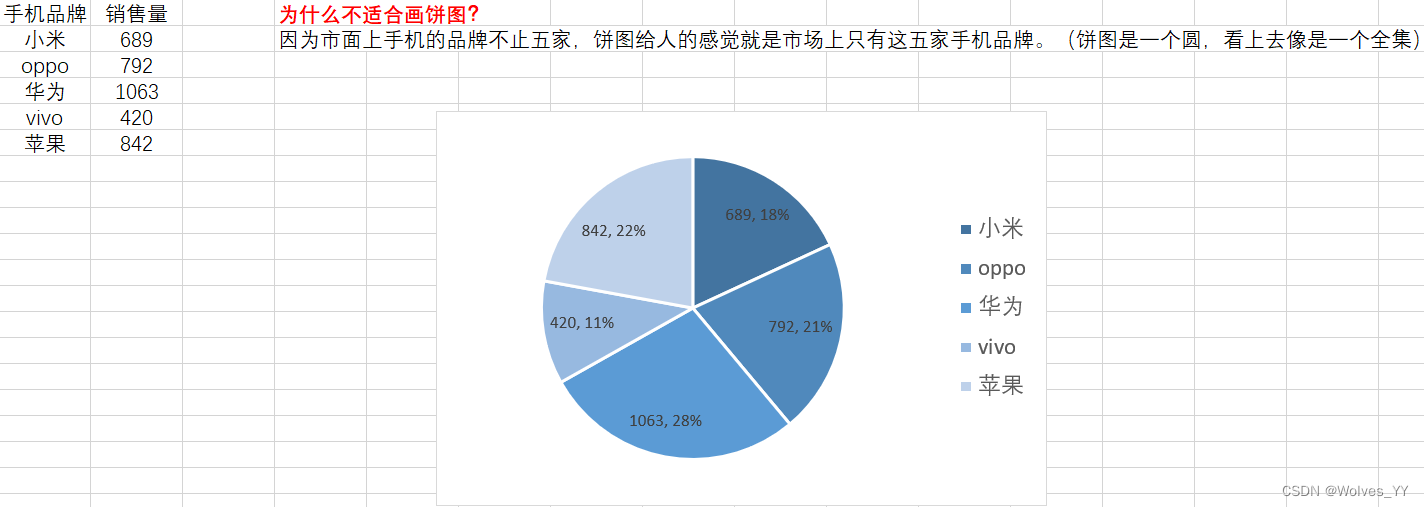
Pie chart looks like a complete set,But the data is not a complete set,There are other brands that don't show.The data above is the complete set,Can be used to draw pie charts.
1.5 Sort first then draw pie chart

Pie chart before sorting.

After sorting the pie chart,Is it more layered?.
1.6 复合饼图
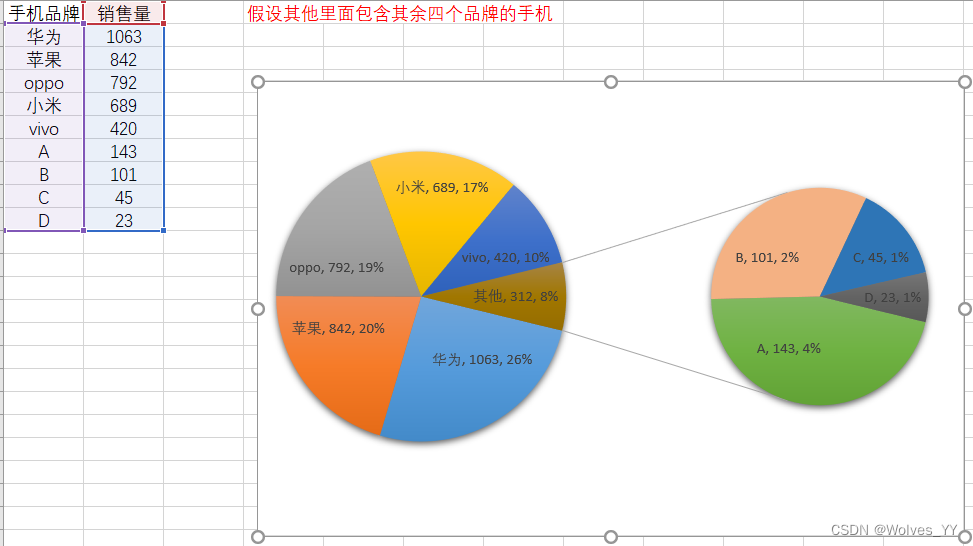
See the video for details25:40.
分析:The best seller is Huawei,The second good is a apple,The other four categories account for the overall8%,The top two selling brands accounted for the total50%.
1.7 Pie Chart Summary

二、柱状图
2.1 Histogram with only one column of data

2.2 Histogram with multiple columns of data
2.3 Three types of bar chart

At this time, ordinary histograms are generally not used.,Use a Stacked Column Chart or a Percent Stacked Column Chart.
图形意义:Compare the sales volume of different brands in each quarter.
2.4 Column chart switching between rows and columns

图形意义: Compare the sales volume of various brands in different quarters.
The meaning of analysis after switching ranks is different.
2.5 柱状图总结


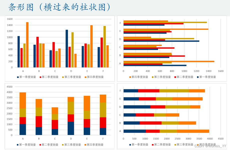
三、条形图(bar chart sideways)
3.1 regular bar chart

3.2 TopsisDrawing of final score bar graph
3.3 双向条形图

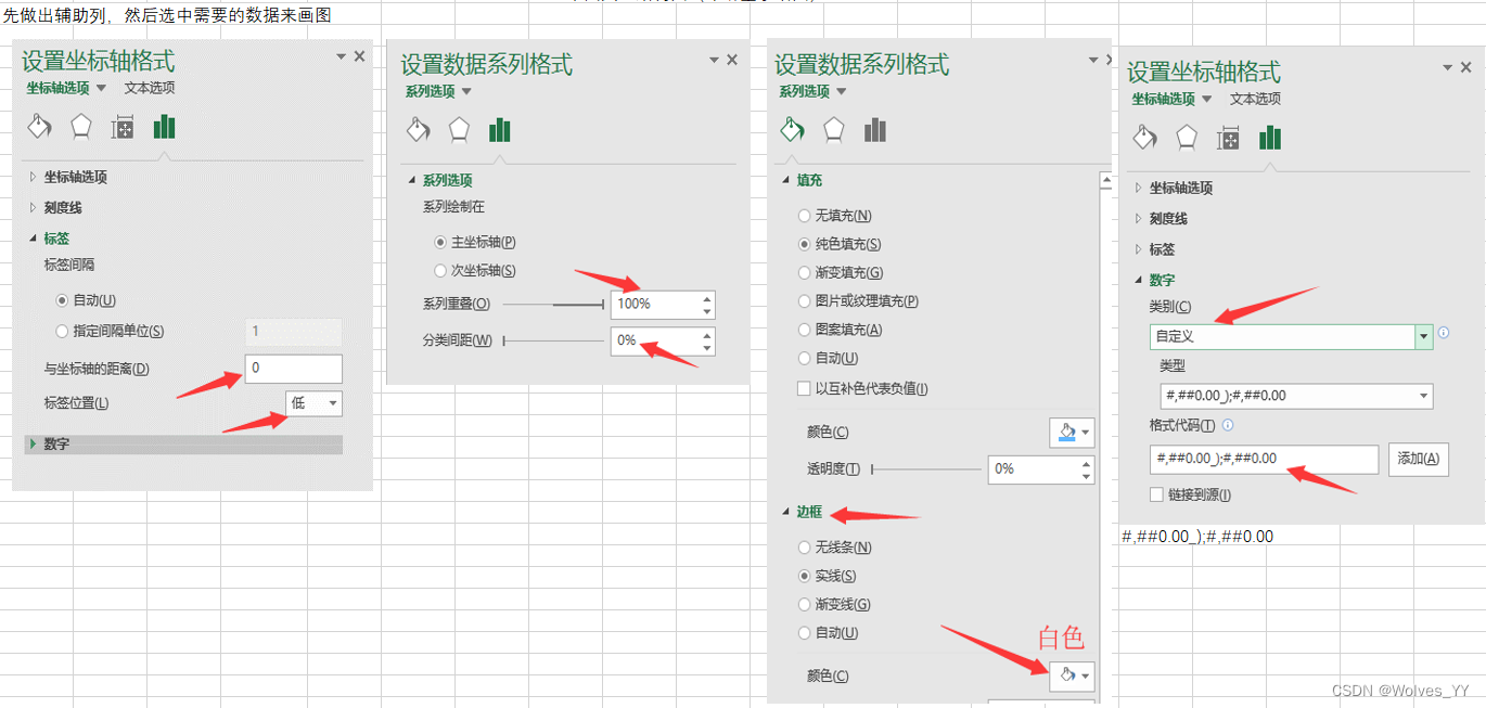
详见视频21:40.
3.4 Histogram visualization of regression results

For the specific visualization process, please refer to the video32:0.
 3.5 Bar Chart Summary


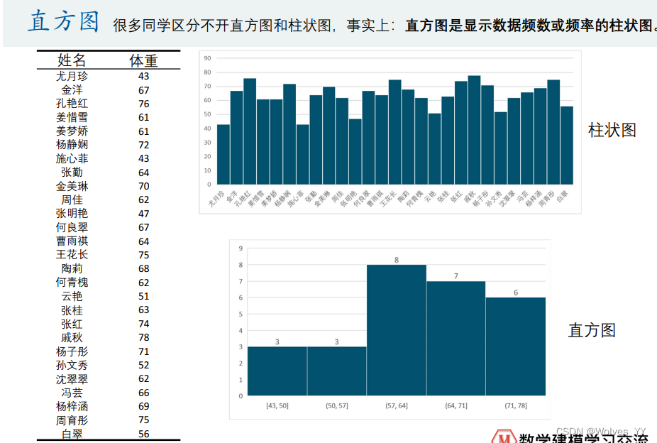
四、直方图
4.1 频数分布直方图

See the video for changing the number of columns5:20.
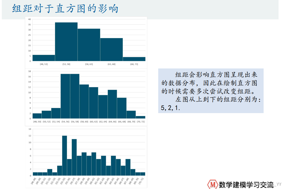
4.2 The effect of group distance on the histogram
4.3 频率分布直方图

Plot frequency histogram see video12:00.
4.4 直方图总结


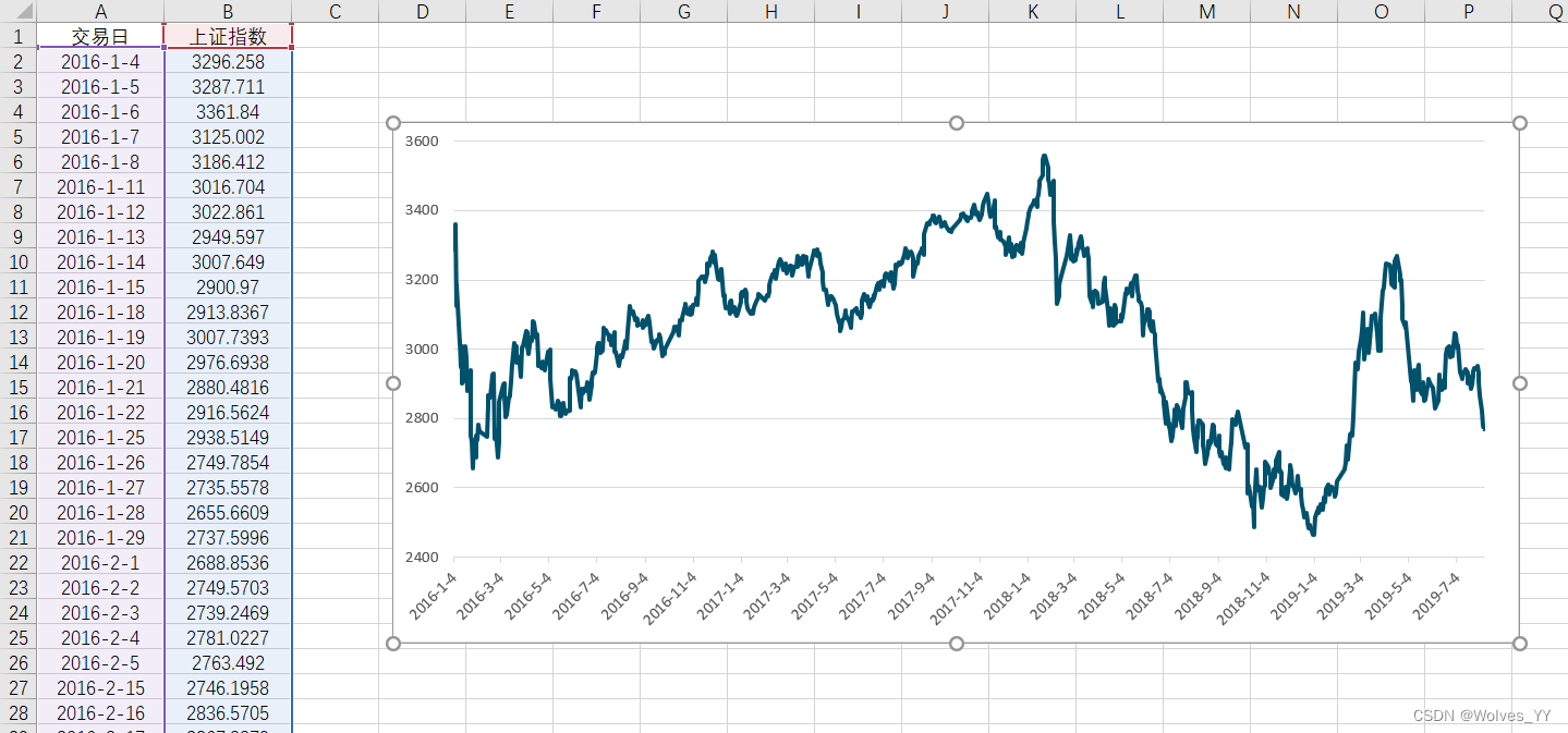
五、折线图(时间序列变量)
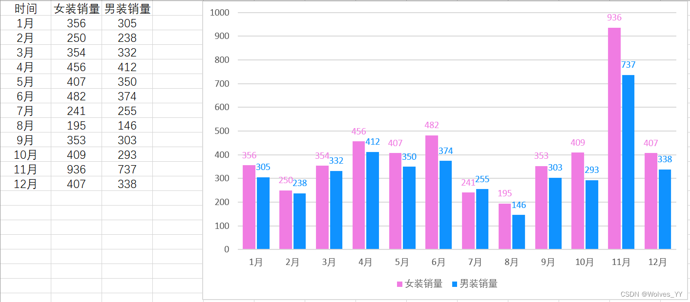
5.1 Comparison of line and column charts

5.2 Very long time series diagram(折线图)
5.3 Two-axis line chart
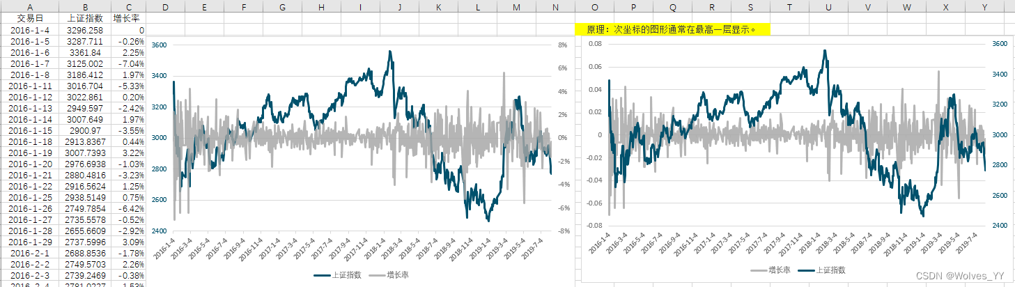
See the video for drawing a two-coordinate line chart15:20.
5.4 Line chart at the top of a column chart

See the video for drawing a line chart at the top of a column chart21:00.
5.5 Line chart summary

六、散点图(描述相关性)

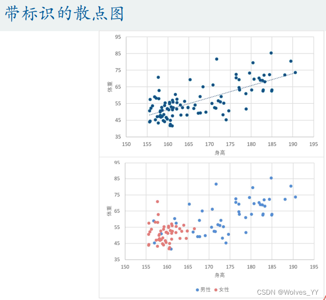
See the video for scatterplots with logos4:30.
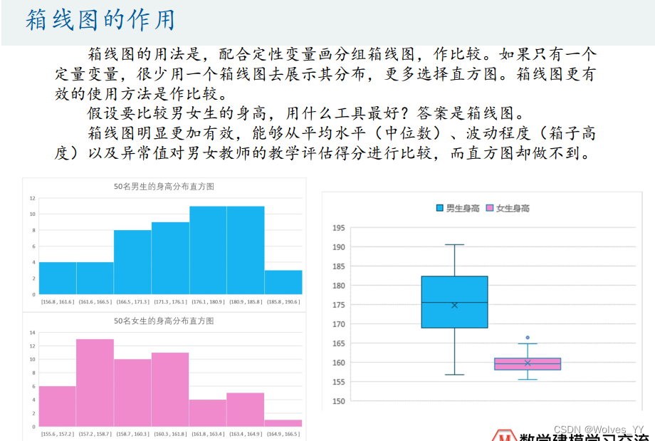
七、箱线图(Comparing two qualitative variables)
7.1 Comparison of histogram and boxplot

The histogram can't tell the difference,The boxplot can be a good way to show the difference between the two.
7.2 Boxplots for multiple categories

7.2 Boxplot summary

八、其他
饼图、柱状图、Line chart is sorted first and then plotted,unless it is time series data.
边栏推荐
猜你喜欢


随机推荐
腾讯发布四足机器人 Max 二代版本,梅花桩上完成跳跃、空翻
凭借这份阿里架构师的万字面试手册,逆风翻盘,斩获阿里offer
J9 Digital Theory: What kind of sparks will Web3.0+ Internet e-commerce cause?
dayjs-----time format
绘制温度曲线图;QChart,
Spotify expresses its architectural design using the C4 model
线程池的基本概念、结构、类
消息队列概述
【数据仓库】什么是 Azure Synapse,它与 Azure Data Bricks 有何不同?
设计分享|基于单片机的从左到右流水灯
【数据库架构】OLTP 和 OLAP:实际比较
DAY25:逻辑漏洞复现
浅析JWT安全问题
「技术选型」工作流引擎哪家强?首席架构帮你挑
10 【异步组件 组合式函数(hooks)】
初识Flink 完整使用 (第一章)
DeepFake换脸诈骗怎么破?让他侧个身
【REST架构】OData、JsonAPI、GraphQL 有什么区别?
关于镜像源的一些记录
Defending risks with technology and escorting cloud native | Tongchuang Yongyi X Boyun held a joint product launch conference