Software Galaxies
This repository combines visualizations of major software package managers.
All visualizations are available here: http://anvaka.github.io/pm/#/
Please read operating manual - it is short and describes basic navigation principles.
Repository was create for my talk at CascadiaJS 2015
After conference update - video - slides
Friends, you are awesome! I can't express how much I appreciate all your kind words and warm feedback. It really means a world for me. Thank you!
Individual Visualizations
Each graph is indexed individually, and data is pushed to gh-pages branch of galactic-data.
Bower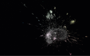 indexer | demo |
PHP Composer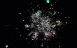 indexer | demo |
Ruby gems indexer | demo |
npm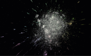 indexer | demo |
Go indexer | demo |
R language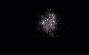 indexer | demo |
Debian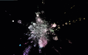 indexer | demo |
Arch Linux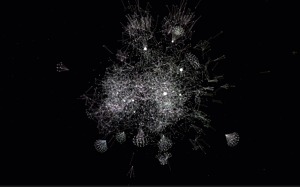 indexer | demo |
Arch Linux + AUR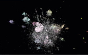 indexer | demo |
NuGet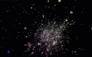 indexer | demo |
Homebrew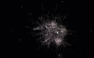 indexer | demo |
PyPI indexer | demo |
Fedora indexer | demo |
Rust Crates indexer | demo |
Elm indexer | demo |
local development
git clone https://github.com/anvaka/pm
cd pm
npm i
npm start
This will start local development sever with auto-rebuild.
Your own graphs
This section has detailed instructions about how to use the tool with your own graphs. Before you read any further, if your graph is smaller than 10k nodes, consider using ngraph.pixel or VivaGraph both should be able to provide interactive layout.
If you have an interesting graph but don't have JavaScript experience, please feel free to reach out to me and I'll try to make visualization for you (my email is [email protected]).
Otherwise, if you want to hack on your own, please keep reading.
Graph
First, you will need a graph in ngraph.graph format. The ngraph.graph has detailed documentation about how to create graph, but it also has several loaders from popular graph formats (e.g. dot, gexf)
Layout
Now that you have a graph we need to compute the layout.
If your graph is smaller than 200k nodes, consider using ngraph.offline.layout. This module was created exactly for the purpose of the pm project, it is well documented, and should be easy to get started with. You can also read layout.js of all[gems|go|bower] packages to see more examples.
If your graph is much larger than 200k nodes, then consider using ngraph.native - this module is harder to work with (as it requires C++ knowledge), but it is much faster.
The secret GitHub visualization is using ngraph.native.
Data format
Once layout is computed, we are ready to visualize. Just save the graph using ngraph.tobinary and store it along with latest positions file (produced by layout) into a folder.
The folder structure should look like this:
.
└── my-pm-data-server
    └── my-graph
        ├── manifest.json
        └── version-1
            ├── labels.json         /* this file is produced by ngraph.tobinary */
            ├── links.bin           /* this file is produced by ngraph.tobinary */
            └── positions.bin       /* this file is produced by ngraph.native   */
The file manifest.json describes what version of the graph are available and has the following content:
{
  "all": ["version-1"],
  "last": "version-1"
}
Inside my-pm-data-server we launch a web server. I personally prefer http-server. Once it is installed globally (npm i http-server -g), you can launch it like this:
http-server --cors -p 9090
This will start a local data server at http://127.0.0.1:9090/
Update the config.js in this repository to point to your data server, and your graph should be accessible at
http://127.0.0.1:8081/#/galaxy/my-graph
Note
The galactic-data follows the same data structure as described above. Use it for the reference if you need an example
The secret visualization
The last shown visualization was secret GitHub followers visualization. It shows all GitHub users who has more than two followers.
The visualization has more than 1,100,000 nodes, and renders at 60 fps when flying around. The FPS drops when you hover-over nodes to 20-30, This is because we are doing hit-testing, to find what's under cursor.
With this many nodes, it runs well in the browser. Unfortunately it requires more than 1GB of RAM. Which may or may not crash your phone browser - sorry about this.
With all warnings said, here are the links:
Feedback
Please do not hesitate to provide your feedback or bug fixes. Even if it is something small like fixing a typo - I'd be glad to hear from you!

 1.1k Jan 03, 2023
 2 Nov 15, 2021
 4k Jan 08, 2023
 9.2k Dec 30, 2022
 102 Dec 24, 2022
 304 Dec 27, 2022
 23 Jan 06, 2023
 4 Aug 02, 2022
 9 Sep 19, 2022
 11 Jul 05, 2022
 16.7k Jan 08, 2023
 50 Jul 17, 2022
 51 Nov 06, 2022
 564 Jan 03, 2023
 15 Dec 10, 2022
 2.7k Dec 30, 2022
 246 Dec 08, 2022
 1 Jan 10, 2022
 0 May 04, 2022
 1.8k Dec 29, 2022