当前位置:网站首页>HarmonyOS - 基于ArkUI (JS) 实现图片旋转验证

HarmonyOS - 基于ArkUI (JS) 实现图片旋转验证

2022-08-09 16:57:00 51CTO

作者:王少丽

前言

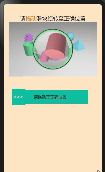
通过学习其他人的slider滑块组件衍生出的小组件, 本文主要结合HarmonyOS官网上的相关组件以及通用API,来实现一个图片的旋转验证 – 需拖动滑块将图片旋转还原为正确,方可验证通过。

效果演示

HarmonyOS - 基于ArkUI (JS) 实现图片旋转验证_ArkUI

实现原理

  1. 触发条件

    基于HarmonyOS通用事件touchstart和touchmove,touchend,通过手指刚触摸屏幕时触发、手指触摸屏幕后移动时触发事件,手指触摸屏幕后结束时触发事件;

  2. 实现slider滑块效果

    通过touches触摸事件的属性集合,返回屏幕触摸点的信息数组,拿到localX距离被触摸组件左上角横向距离,动态计算出子元素的宽度来实现slider滑块效果。

  3. 实现图片旋转效果

    初始化随机生成360°以内的角度,设置图片原点,360°除以100就得到圆的步长比上滑动距离除滑块总长度,最后加上图片原点就等于旋转后的角度。

使用到的官方API

通用方法

getBoundingClientRect()

获取元素的大小及其相对于窗口的位置。

属性类型描述
widthnumber该元素的宽度。
heightnumber该元素的高度。
leftnumber该元素左边界距离窗口的偏移。
topnumber该元素上边界距离窗口的偏移。

通用事件

名称参数描述是否支持冒泡
touchstart TouchEvent手指刚触摸屏幕时触发该事件。是5+
touchmove TouchEvent手指触摸屏幕后移动时触发该事件。是5+
touchend TouchEvent手指触摸屏幕后结束时触发该事件。是5+
属性类型说明
touchesArray<TouchInfo>触摸事件时的属性集合,包含屏幕触摸点的信息数组。
属性类型说明
globalXnumber距离屏幕左上角(不包括状态栏)横向距离。屏幕的左上角为原点。
globalYnumber距离屏幕左上角(不包括状态栏)纵向距离。屏幕的左上角为原点。
localXnumber距离被触摸组件左上角横向距离。组件的左上角为原点。
localYnumber距离被触摸组件左上角纵向距离。组件的左上角为原点。

实现过程

1. htm部分

<div class="slider-wrapper" style="flex-direction: column;">
    <div style="width: 100%;padding-top: 40px;">
        <text class="title" >
            <span></span>
            <span style="color: #F56A00;">
                拖动
            </span>
            <span>滑块旋转至正确位置</span>
        </text>
    </div>
    <div for="{{ item in imagesArr }}" tid="id" class="imagesArr">
        <div class="img">
            <image src="{{ item.src }}"></image>
       </div>
        <div class="pic">
            <image src="{{item.duan}}" style="transform: rotate({{numdeg}});" id="rotatepic"></image>
        </div>
    </div>
    <div class="content" style="width: 300px;flex-direction: row;" >
        <div id="slider" @touchstart="boxChoose" @touchmove="boxChoose" @touchend="Chooseend" style="width: 280px;background-color: #0fbda0;">
            <div class="slider-main" style="width: {{ width }};background-color: #73E9C5;" ></div>
            <text class="text" show="{{ done }}">
                请拖动至正确位置
            </text>
            <text class="success text" show="{{ success }}">
               验证通过
            </text>
            <text class="fail text" show="{{ fail }}">
                验证失败,请重试
            </text>
        </div>
        <div class="dot" style ="left : {{dotLeft}};background-color: #0fbda0;height: 60px;" show="{{ textblock }}" >
            <text style="color: white;font-size: 20px;">
                >>>
            </text>
        </div>
        <div class="dot" style ="left : {{dotLeft}};height: 60px;background-color: #10A68D;" show="{{ textblock2 }}">
            <text style="color: white;font-size: 20px;">
                >>>
            </text>
        </div>
        <div show="{{ imageblock }}" class="imageblock" >
            <image src="../../common/images/succes.jpg"></image>
        </div>
    </div>

</div>


  • 1.
  • 2.
  • 3.
  • 4.
  • 5.
  • 6.
  • 7.
  • 8.
  • 9.
  • 10.
  • 11.
  • 12.
  • 13.
  • 14.
  • 15.
  • 16.
  • 17.
  • 18.
  • 19.
  • 20.
  • 21.
  • 22.
  • 23.
  • 24.
  • 25.
  • 26.
  • 27.
  • 28.
  • 29.
  • 30.
  • 31.
  • 32.
  • 33.
  • 34.
  • 35.
  • 36.
  • 37.
  • 38.
  • 39.
  • 40.
  • 41.
  • 42.
  • 43.
  • 44.
  • 45.
  • 46.
  • 47.
  • 48.
  • 49.

2. css部分

.slider-wrapper {
    width: 100%;
    display: flex;
    align-items: center;
    flex-direction: column;
    background-color: bisque;
    position: relative;
}
.title{
    width: 100%;
    font-size: 20px;
    text-align: center;
}
.imagesArr{
    width: 90%;
}

.img{
    height: 200px;
}
.pic{
    height: 200px;
    width: 200px;
    position: absolute;
    left: 62px;
    top: 0;
}
.content{
    width: 360px;
    display: flex;
    align-items: center;
    flex-direction: row;
    position: relative;
    margin-top: 50px;
    position: relative;
}
#slider {
    width: 300px;
    height: 50px;
    background-color: #0fbda0;
    display: flex;
    justify-content: center;
}
.text{
    font-size: 15px;
}
.fail{
    color: red;
}
.success{
    color: black;
}
.slider-main {
    background-color: #73E9C5;
    width: 0;
    height: 100%;
    position: absolute;
    left: 0;
    top: 0;
    border: 1px solid #d9f3ef;
}
.dot{
    width: 50px;
    height: 50px;
    background-color: #0fbda0;
    position: absolute;
    bottom: -5px;
    border-radius: 5px;

}
.dot text{
    text-align: center;
    padding-left: 5px;
    color:#A69E9E;
}
.imageblock{
    height: 50px;
    width: 50px;
    position: absolute;
    right: 10px;
}


  • 1.
  • 2.
  • 3.
  • 4.
  • 5.
  • 6.
  • 7.
  • 8.
  • 9.
  • 10.
  • 11.
  • 12.
  • 13.
  • 14.
  • 15.
  • 16.
  • 17.
  • 18.
  • 19.
  • 20.
  • 21.
  • 22.
  • 23.
  • 24.
  • 25.
  • 26.
  • 27.
  • 28.
  • 29.
  • 30.
  • 31.
  • 32.
  • 33.
  • 34.
  • 35.
  • 36.
  • 37.
  • 38.
  • 39.
  • 40.
  • 41.
  • 42.
  • 43.
  • 44.
  • 45.
  • 46.
  • 47.
  • 48.
  • 49.
  • 50.
  • 51.
  • 52.
  • 53.
  • 54.
  • 55.
  • 56.
  • 57.
  • 58.
  • 59.
  • 60.
  • 61.
  • 62.
  • 63.
  • 64.
  • 65.
  • 66.
  • 67.
  • 68.
  • 69.
  • 70.
  • 71.
  • 72.
  • 73.
  • 74.
  • 75.
  • 76.
  • 77.
  • 78.
  • 79.
  • 80.
  • 81.
  • 82.

3. js部分

export default {
    data: {
        progress:0,
        width: 0,
        step1: 1,
        dotLeft:0,
        img:'../../common/images/succes.jpg',
        imageblock:false,
        textblock:true,
        success:false,
        fail:false,
        done:true,
        numdeg:Math.round(Math.random()*360),// 初始化的随机角度
        startNumdeg: 0,
        textblock2:false,
        imagesArr:[
            {src:'common/images/ro.jpg',duan:'common/images/ro.png'},
        ],

    },
    onInit(){
        this.startNumdeg = this.numdeg;
    },
    //控制点击结束后的样式
    Chooseend( ){
        if(this.success && this.imageblock) {
            return
        }
        if (!this.textblock ) {
            this.disable = true
        }
        console.log('Chooseend==this.startNumdeg ==' + this.startNumdeg + '===this.numdeg===' + this.numdeg)
        if (this.width &&Math.abs(this.numdeg-360)<=5) {
            this.width = 240;
            this.progress = 100;
            this.textblock = false;
            this.fail = false;
            this.success =true;
            this.done =false;
            this.textblock2 =false;
            this.dotLeft = 0;
            this.numdeg = 0
            this.imageblock = true;
        }else{
            this.width = 0;
            this.progress = 0;
            this.fail = true;
            this.success =false;
            this.done =false;
            this.textblock2 = true;
            this.textblock = false
            this.dotLeft =0
            this.numdeg = this.startNumdeg + (360/100) * (this.width / 240)*100


        }
    },
    boxChoose(e) {
        if(this.success && this.imageblock) {
            return
        }
        let slider = this.$element('slider')
        let width = e.touches[0].localX // 获取点击时距离容器左边位置
        this.dotLeft = width
        let elementWidth = slider.getBoundingClientRect().width //元素的宽度
        // 正方形的偏移量临界值
        if ( this.dotLeft >= elementWidth ) {
            this.dotLeft = 240
        }
        let compare = elementWidth / (100 / this.step1) // 根据步长计算每一步宽度 2.4
        this.width = Math.ceil(width / compare) * compare   //滑动距离
        this.width = this.width < 0 ? 0 : (this.width > 240 ? 240 : this.width)
        this.numdeg = this.startNumdeg + 360 * (this.width / 240) //图像处理
        this.progress = Math.abs(this.width / elementWidth *100)   //slider滑块
        if (this.width>0) {
            this.fail = false;
            this.done = true
        }
        if (this.width>=240) {
            this.width = 280
        }
    },
}


  • 1.
  • 2.
  • 3.
  • 4.
  • 5.
  • 6.
  • 7.
  • 8.
  • 9.
  • 10.
  • 11.
  • 12.
  • 13.
  • 14.
  • 15.
  • 16.
  • 17.
  • 18.
  • 19.
  • 20.
  • 21.
  • 22.
  • 23.
  • 24.
  • 25.
  • 26.
  • 27.
  • 28.
  • 29.
  • 30.
  • 31.
  • 32.
  • 33.
  • 34.
  • 35.
  • 36.
  • 37.
  • 38.
  • 39.
  • 40.
  • 41.
  • 42.
  • 43.
  • 44.
  • 45.
  • 46.
  • 47.
  • 48.
  • 49.
  • 50.
  • 51.
  • 52.
  • 53.
  • 54.
  • 55.
  • 56.
  • 57.
  • 58.
  • 59.
  • 60.
  • 61.
  • 62.
  • 63.
  • 64.
  • 65.
  • 66.
  • 67.
  • 68.
  • 69.
  • 70.
  • 71.
  • 72.
  • 73.
  • 74.
  • 75.
  • 76.
  • 77.
  • 78.
  • 79.
  • 80.
  • 81.
  • 82.
  • 83.
  • 84.

总结

这篇文章是我通过对slider滑块的一个延伸练习,也算是一个比较常用的组件,后续部分功能还需完善,比如在样式、功能及代码优化方面等等,还有很多不足之处,大家有想法的可以提出来,我们一起学习,共同进步!

更多原创内容请关注: 中软国际 HarmonyOS 技术团队

入门到精通、技巧到案例,系统化分享HarmonyOS开发技术,欢迎投稿和订阅,让我们一起携手前行共建鸿蒙生态。

 想了解更多关于开源的内容,请访问:

 51CTO 开源基础软件社区

 https://ost.51cto.com/#bkwz

原网站

版权声明
本文为[51CTO]所创,转载请带上原文链接,感谢
https://blog.51cto.com/harmonyos/5559011