当前位置:网站首页>案例案例案例
案例案例案例
2022-04-22 06:20:00 【nknmn_】
-
鼠标悬停在矩形上可以看到坐标,移出失去坐标
<div id="coordiv" style="width:199px;height:99px;border: 1px solid #666;"
    onmousemove="getfocus(event)"
    onmouseleave="clearfocus()">
    </div>
   <div id="text"></div>
   <script>
       function getfocus(e){
           x=e.clientX;
           y=e.clientY;
           document.getElementById("text").innerHTML="focus("+x+","+y+")"
       }
       function clearfocus(){
           document.getElementById("text").innerHTML=""
       }
</script>-
对点击按钮的次数进行计数
<body>
<button onclick="clickCounter()">点击</button>
<div id="result"></div>
<script>
function clickCounter(){
  if(typeof(Storage)!=="undefined"){
    if(sessionStorage.clickcount){
      sessionStorage.clickcount=Number(sessionStorage.clickcount)+1;
    }else {
            sessionStorage.clickcount = 1;
    }
    document.getElementById("result").innerHTML="您已经点击了:  "+sessionStorage.clickcount+"次";
  }else{
    document.getElementById("result").innerHTML="浏览器不支持web storage"
  }
};
</script>
</body>
-
单行文本超出部分如何用省略号显示
white-space: nowrap; /*white-space:normal|nowrap|pre 如何处理文本中的空白符号(空格和换行符)*/ /*normal 默认。空白会被浏览器忽略。 pre 空白会被浏览器保留。其行为方式类似 HTML 中的 <pre> 标签。 nowrap 文本不会换行,文本会在同一行上继续,直到遇到 <br> 标签为止。*/ overflow: hidden; /*超出部分隐藏*/ text-overflow: ellipsis; /*文字超出部分用省略号显示*/ /*clip 不显示省略标记 直接裁切 ellipsis 省略号*/ -
多行文本超出部分如何用省略号显示
-
文本在块元素中水平居中
text-align: center; -
文本在块元素中垂直居中
height: 100px;
line-height: 100px;
<head> <style> .box { height: 40px; background-color: lightblue; } .box::after { content: ""; height: 100%; display: inline-block; vertical-align: middle; } </style> </head> <body> <div class="box"> hello world </div> </body> -
盒子在容器中水平居中
margin: 0 auto;.content{ width: 100px; height: 100px; background-color: lightblue; position: relative; margin-left: 50%; left: -50px; } -
盒子在容器中垂直居中
        .container{
            width: 200px;
            height: 200px;
            background-color: lightpink;
            box-sizing: border-box;
            padding: 50px;
        }
        .content{
            width: 100px;
            height: 100px;
            background-color: lightblue;
        }
.container{ width: 200px; height: 200px; background-color: lightpink; overflow: auto; } .content{ width: 100px; height: 100px; background-color: lightblue; margin: 50px; } -
如何解决子元素添加margin-top影响父元素位置的问题
.container{
    width: 200px;
    height: 200px;
    background-color: lightpink;
}
.container .content{
    width: 100px;
    height: 100px;
    background-color: lightblue;
    margin: 50px;
}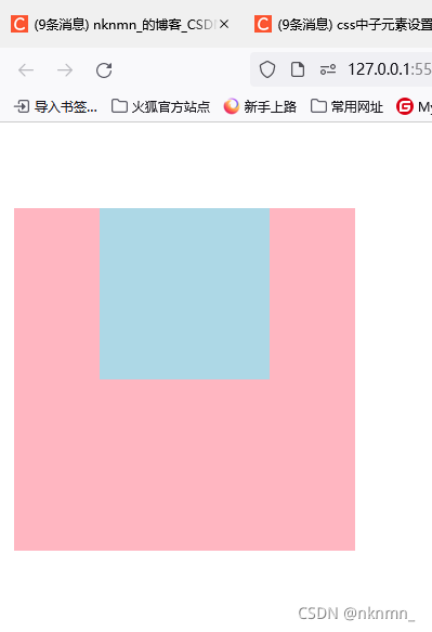
解决方法:
-
给父元素添加非空内容
<style>
    body{
        margin:0;
        padding:0;
    }
    .container {
        width: 200px;
        height: 200px;
        background-color: lightpink;
    }

    .container .content {
        width: 100px;
        height: 100px;
        background-color: lightblue;
        margin: 50px;
    }
</style>
</head>

<body>
    <div class="container"> 给父元素添加非空内容
        <div class="content"></div>
    </div>
</body>
-
给父元素添加padding样式
    <style>
        body {
            margin: 0;
            padding: 0;
        }

        .container {
            width: 200px;
            height: 200px;
            background-color: lightpink;
            box-sizing: border-box;
            padding: 20px;
        }

        .container .content {
            width: 100px;
            height: 100px;
            background-color: lightblue;
            margin: 30px;
        }
    </style>
</head>

<body>
    <div class="container">
        <div class="content"></div>
    </div>
</body>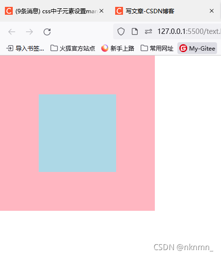
-
给父元素添加边框样式
        .container {
            width: 200px;
            height: 200px;
            background-color: lightpink;
            border: 1px solid lightpink;
        }

        .container .content {
            width: 100px;
            height: 100px;
            background-color: lightblue;
            margin: 30px;
        }
-
给父元素设置overflow:hidden, auto、scroll、overlay
body{
    margin: 0;
    padding: 0;
}
.container {
    width: 200px;
    height: 200px;
    background-color: lightpink;
    overflow: hidden;
}
.container .content {
    width: 100px;
    height: 100px;
    background-color: lightblue;
    margin: 50px;
}
-
父元素或子元素使用浮动布局或绝对定位
-
媒体查询(响应式布局)
<!DOCTYPE html> <html lang="en"> <head> <meta charset="UTF-8"> <meta http-equiv="X-UA-Compatible" content="IE=edge"> <meta name="viewport" content="width=device-width, initial-scale=1.0"> <title>媒体查询</title> <style> body {margin: 0;} .container { background-color: lightblue; height: 100px; } /* 屏幕 900px ~ 1200px */ @media screen and (min-width:900px) and (max-width:1200px) { .container { background-color: lightpink; } } /* 屏幕 > 1200px */ @media screen and (min-width:1200px) { .container { background-color: lightseagreen; } } </style> </head> <body> <div class="container"> </div> </body> </html> -
模态框
<!DOCTYPE html> <html lang="en"> <head> <meta charset="UTF-8"> <meta http-equiv="X-UA-Compatible" content="IE=edge"> <meta name="viewport" content="width=device-width, initial-scale=1.0"> <title>模态框</title> <style> .content { min-height: 1500px; position: relative; } .content:hover { cursor: pointer; background-color: lightblue; } .content .dialog_container { width: 100%; display: none; position: fixed; top: 100px; bottom: 100px; background-color: rgb(0, 0, 0, .5); } .dialog_container .dialog { position: absolute; top: 200px; width: 400px; background-color: #eee; left: 50%; margin-left: -200px; min-height: 300px; } .content:hover>.dialog_container { display: block } </style> </head> <body> <div class="container"> <div class="header">头部</div> <div class="content"> <div class="dialog_container"> <div class="dialog"> <div class="dialog_header">dialog_header</div> <div class="dialog_content">dialog_content</div> <div class="dialog_footer">dialog_footer</div> </div> </div> </div> <div class="footer">底部</div> </div> </body> </html> -
二级栏目
<!DOCTYPE html> <html lang="en"> <head> <meta charset="UTF-8"> <meta http-equiv="X-UA-Compatible" content="IE=edge"> <meta name="viewport" content="width=device-width, initial-scale=1.0"> <title>二级栏目</title> <style> html { font: 30px '微软雅黑'; } body, ul { margin: 0; padding: 0; } ul { list-style: none; } .header { background-color: lightseagreen; width: 1200px; margin: 0 auto; position: relative; } .header ul.menu li.menu_item { float: left; margin-left: 50px; } .header ul.menu::after { display: block; content: ''; clear: both; } .header .menu .menu_item .sub_menu { display: none; } .header ul.menu li.menu_item:hover { cursor: pointer; } .header ul.menu li.menu_item:hover>.sub_menu { display: block; background-color: lightblue; position: absolute; width: 100%; left: 0; text-align: center; } .content { min-height: 500px; background-color: lightpink; } </style> </head> <body> <div class="header"> <ul class="menu"> <li class="menu_item">一级栏目 <div class="sub_menu"> <ul> <li>二级栏目</li> <li>二级栏目</li> <li>二级栏目</li> <li>二级栏目</li> <li>二级栏目</li> </ul> </div> </li> <li class="menu_item">一级栏目</li> <li class="menu_item">一级栏目</li> <li class="menu_item">一级栏目</li> <li class="menu_item">一级栏目</li> </ul> </div> <div class="content"> </div> </body> </html> -
呼吸灯
<!DOCTYPE html> <html lang="en"> <head> <meta charset="UTF-8"> <meta http-equiv="X-UA-Compatible" content="IE=edge"> <meta name="viewport" content="width=device-width, initial-scale=1.0"> <title>呼吸灯</title> <style> div { box-sizing: border-box; } .container { width: 300px; height: 500px; margin: 0 auto; background-color: #999; } .box { height: 300px; padding: 30px; background-color: #666; animation: outer_move 6s linear infinite; } .circle { border-radius: 50%; height: 100%; } .outer { border: 5px solid #bbb; padding: 40px; animation: inner_move 6s linear infinite; } .inner { border: 8px solid white; } @keyframes outer_move { 20% { padding: 20px; } 40% { padding: 30px; } } @keyframes inner_move { 20%, 70% { padding: 50px; } 40%, 100% { padding: 40px; } } </style> </head> <body> <div class="container"> <div class="box"> <div class="outer circle"> <div class="inner circle"></div> </div> </div> </div> </body> </html> -
过渡效果
<!DOCTYPE html> <html lang="en"> <head> <meta charset="UTF-8"> <meta http-equiv="X-UA-Compatible" content="IE=edge"> <meta name="viewport" content="width=device-width, initial-scale=1.0"> <title>过渡</title> <style> .box { height: 300px; width: 300px; background-color: lightblue; margin: 50px; transition: transform, background-color 2s, 2s 0s linear; } .box:hover { transform: scale(1.1); /* 缩放 */ /* transform: translate(100px,100px); 平移 以左上角为基准 */ /* transform: rotate(180deg); 旋转 */ /* transform: skew(100deg); 拉伸 */ background-color: lightpink; } </style> </head> <body> <div class="box"></div> </body> </html> -
执行顺序
let fs = require('fs')
console.log('start');//1
setTimeout(function(){
    console.log('timeout')
});//6
Promise.resolve().then(()=>{
    console.log('Promise')
});//5
process.nextTick(()=>{
    console.log('process')
});//4
fs.readFile('./;pg.txt',function(arr,res){
    console.log(res);
});//7
(async function(){
    console.log('async');
})();//2
console.log('end');//3
版权声明
本文为[nknmn_]所创,转载请带上原文链接,感谢
https://blog.csdn.net/qq_50829019/article/details/121244000
边栏推荐
- APC(一)
- A. Weird Flecks, But OK (计算几何&三维最小圆覆盖)(2021年度训练联盟热身训练赛第一场)
- XSS漏洞(一)
- 1005 Monopoly 同余求解(2021中国大学生程序设计竞赛CCPC-网络选拔赛重赛)
- D. Determine the photo position (simply find the substring) (2021 Niuke summer multi school training camp 1)
- L2-002 linked list weight removal (pit of test point 1)
- 系统日志文件过大优化
- D. Determine the Photo Position (简单找子串)(2021牛客暑期多校训练营1)
- 信息安全数学基础
- Failed to update PIP all the time? Most of them are network problems!
猜你喜欢

深入理解MySQL(5):详谈MySQL锁算法

278 · draw fill

L2-002 链表去重(测试点1的坑)

H. Happy number (binary conversion / nth special number) (2021 Niuke summer multi school training camp 9)

Instructions and examples of instanceof
Internal class instructions (static, instance, local)

换根dp(啊啊啊啊啊)

Detailed explanation of linked list exercises

强网杯 2019 随便注
E.Figure Skating (字符串排序/签到) (2021年度训练联盟热身训练赛第五场 )
随机推荐
Android Room数据库Like模糊查询
The system log file is too large
The art of concurrent programming (9): the use and principle of final
并发编程的艺术(6):详解ReentrantLock的原理
Addition, deletion and search of sequence table (find)
Codeforces Round #779 (Div. 2)
System log collection series
D. Determine the Photo Position (简单找子串)(2021牛客暑期多校训练营1)
APC(一)
Codeforces Round #634 (Div. 3)
323 · string game
C.Ducky Debugging(简单判断/签到)(2021年度训练联盟热身训练赛第五场 )
843 · Digital Flip
深入理解MySQL(6):MySQL日志简析
B. Ball dropping (simple geometric calculation / similar triangle) (2021 Niuke summer multi school training camp 1)
384 · longest substring without repeated characters
L2-004 is this a binary search tree? (first order input & judgment search Binary Tree & second order output)
Codeforces Round #588 (Div. 2) C D
Queue (detailed explanation) -- hand tearing queue exercises
L1-071 previous life files (20 points) (similar two points)