当前位置:网站首页>25张炫酷交互图表,一文入门Plotly
25张炫酷交互图表,一文入门Plotly
2022-08-10 05:29:00 【zhouluobo】
Plotly Express 是一个新的高级 Python 可视化库,它是 Plotly.py 的高级封装,为复杂图表提供简单的语法。最主要的是 Plotly 可以与 Pandas 数据类型 DataFrame 完美的结合,对于数据分析、可视化来说实在是太便捷了,而且是完全免费的,非常值得尝试
下面我们使用 Ployly 的几个内置数据集来进行相关图表绘制的演示
数据集
Plotly 内置的所有数据集都是 DataFrame 格式,也即是与 Pandas 深度契合的体现
不同国家历年GDP收入与人均寿命
包含字段:国家、洲、年份、平均寿命、人口数量、GDP、国家简称、国家编号
gap = px.data.gapminder()
gap2007 = gap.query("year==2007")
gap2007
Output

餐馆的订单流水
包含字段:总账单、小费、性别、是否抽烟、星期几、就餐时间、人数
tips = px.data.tips()
tips
Output

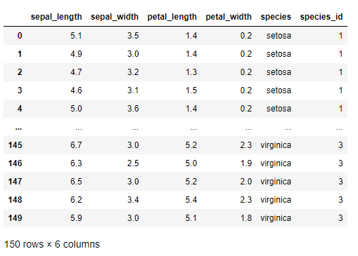
鸢尾花
包含字段:萼片长、萼片宽、花瓣长、花瓣宽、种类、种类编号
iris = px.data.iris()
iris
Output
风力
包含字段:方向、强度、数值
wind = px.data.wind()
wind
Output

2013年蒙特利尔市长选举投票结果
包括字段:区域、Coderre票数、Bergeron票数、Joly票数、总票数、胜者、结果(占比分类)
election = px.data.election()
election
Output

蒙特利尔一个区域中心附近的汽车共享服务的可用性
包括字段:纬度、经度、汽车小时数、高峰小时
carshare = px.data.carshare()
carshare
Output

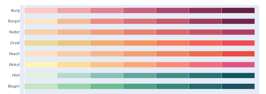
内置调色面板
Plotly 还用于众多色彩高级的调色板,使得我们在绘制图表的时候不再为颜色搭配烦恼
卡通片的色彩和序列
px.colors.carto.swatches()
Output
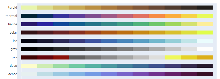
CMOcean项目的色阶
px.colors.cmocean.swatches()
Output
还有其他很多调色板供选择,就不一一展示了,下面只给出代码,具体颜色样式可以自行运行代码查看
ColorBrewer2项目的色阶
px.colors.colorbrewer
周期性色标,适用于具有自然周期结构的连续数据
px.colors.cyclical
分散色标,适用于具有自然中点的连续数据
px.colors.diverging
定性色标,适用于没有自然顺序的数据
px.colors.qualitative
顺序色标,适用于大多数连续数据
px.colors.sequential
Plotly Express 基本绘图
散点图
Plotly 绘制散点图非常容易,一行代码就可以完成
px.scatter(gap2007, x="gdpPercap", y="lifeExp")
Output
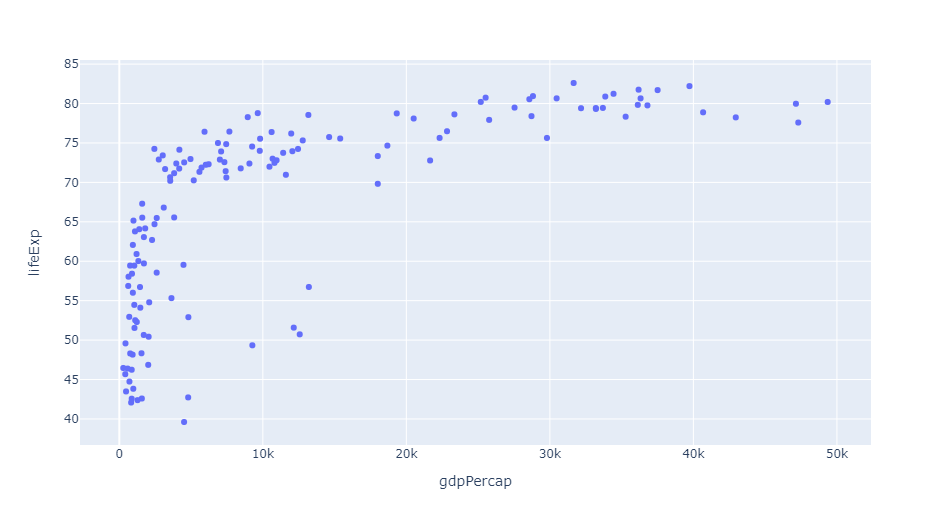
还可以通过参数 color 来区分不同的数据类别
px.scatter(gap2007, x="gdpPercap", y="lifeExp", color="continent")
Output

这里每个点都代表一个国家,不同颜色则代表不同的大洲
还可以使用参数 size 来体现数据的大小情况
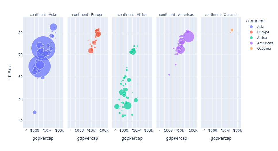
px.scatter(gap2007, x="gdpPercap", y="lifeExp", color="continent", size="pop", size_max=60)
Output

还可以通过参数 hover_name 来指定当鼠标悬浮的时候,展示的信息

还可以根据数据集中不同的数据类型进行图表的拆分
px.scatter(gap2007, x="gdpPercap", y="lifeExp", color="continent", size="pop",
           size_max=60, hover_name="country", facet_col="continent", log_x=True)
Output
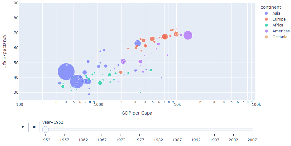
我们当然还可以查看不同年份的数据,生成自动切换的动态图表
px.scatter(gap, x="gdpPercap", y="lifeExp", color="continent", size="pop",
           size_max=60, hover_name="country", animation_frame="year", animation_group="country", log_x=True,
          range_x=[100, 100000], range_y=[25, 90], labels=dict(pop="Population", gdpPercap="GDP per Capa", lifeExp="Life Expectancy"))
Output
地理信息图
Plotly 绘制动态的地理信息图表也是非常方便,通过这种地图的形式,我们也可以清楚的看到数据集中缺少前苏联的相关数据
px.choropleth(gap, locations="iso_alpha", color="lifeExp", hover_name="country", animation_frame="year",
              color_continuous_scale=px.colors.sequential.Plasma, projection="natural earth")
Output

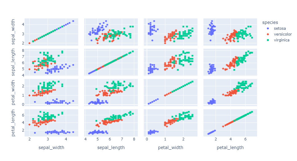
矩阵散点图
px.scatter_matrix(iris, dimensions=['sepal_width', 'sepal_length', 'petal_width', 'petal_length'], color='species', symbol='species')
Output
平行坐标图
px.parallel_coordinates(tips, color='size', color_continuous_scale=px.colors.sequential.Inferno)
Output

三元散点图
px.scatter_ternary(election, a="Joly", b="Coderre", c="Bergeron", color="winner", size="total", hover_name="district",
                   size_max=15, color_discrete_map = {
    "Joly": "blue",
                   "Bergeron": "green", "Coderre":"red"} )
Output

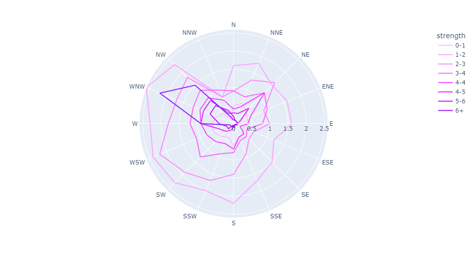
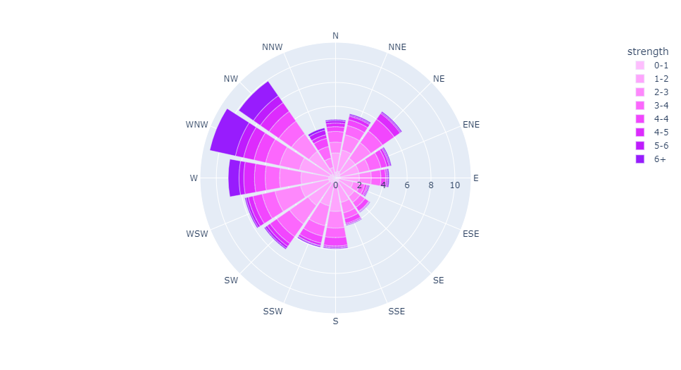
极坐标线条图
px.line_polar(wind, r="frequency", theta="direction", color="strength",
            line_close=True,color_discrete_sequence=px.colors.sequential.Plotly3[-2::-1])
Output
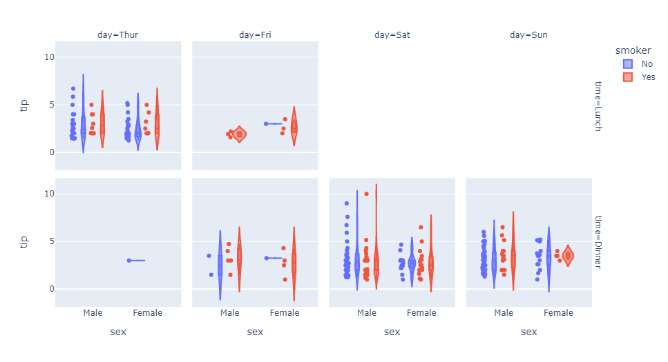
小提琴图
px.violin(tips, y="tip", x="sex", color="smoker", facet_col="day", facet_row="time",box=True, points="all",
          category_orders={
    "day": ["Thur", "Fri", "Sat", "Sun"], "time": ["Lunch", "Dinner"]},
          hover_data=tips.columns)
Output
极坐标条形图
px.bar_polar(wind, r="frequency", theta="direction", color="strength",
            color_discrete_sequence= px.colors.sequential.Plotly3[-2::-1])
Output
并行类别图
px.parallel_categories(tips, color="size", color_continuous_scale=px.
            colors.sequential.Inferno)
Output

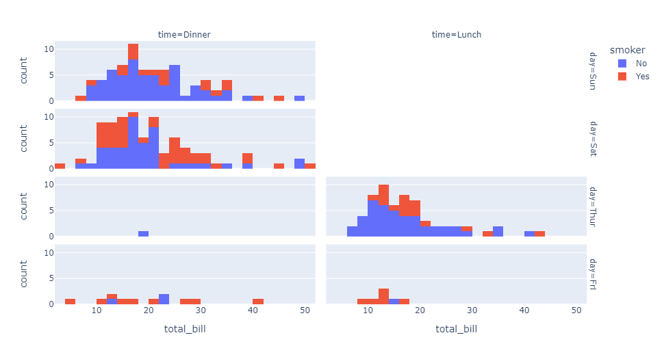
直方图
px.histogram(tips, x="total_bill", color="smoker",facet_row="day", facet_col="time")
Output
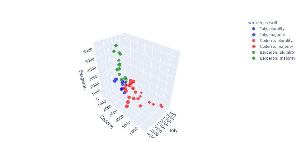
三维散点图
px.scatter_3d(election, x="Joly", y="Coderre", z="Bergeron", color="winner",
              size="total", hover_name="district",symbol="result",
              color_discrete_map = {
    "Joly": "blue", "Bergeron": "green",
              "Coderre":"red"})
Output
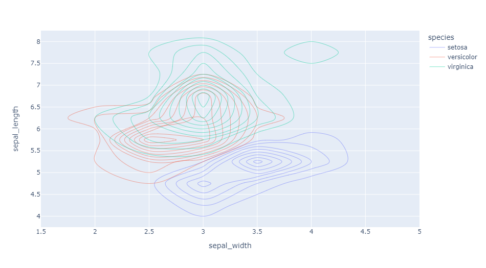
密度等值线图
px.density_contour(iris, x="sepal_width", y="sepal_length", color="species")
Output
箱形图
px.box(tips, x="sex", y="tip", color="smoker", notched=True)
Output

地理坐标线条图
px.line_geo(gap.query("year==2007"), locations="iso_alpha",
            color="continent", projection="orthographic")
Output

条线图
px.line(gap, x="year", y="lifeExp", color="continent",
        line_group="country", hover_name="country",
        line_shape="spline", render_mode="svg")
Output

面积图
px.area(gap, x="year", y="pop", color="continent",
        line_group="country")
Output

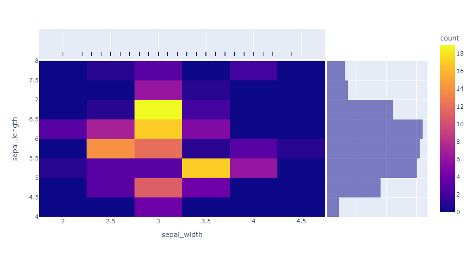
热力图
px.density_heatmap(iris, x="sepal_width", y="sepal_length",
                   marginal_x="rug", marginal_y="histogram")
Output
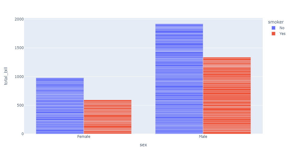
条形图
px.bar(tips, x="sex", y="total_bill", color="smoker", barmode="group")
Output
好啦,这就是今天分享的全部内容,喜欢就点个赞吧~
本文由 mdnice 多平台发布
边栏推荐
- Concurrency tool class - introduction and use of CountDownLatch, CyclicBarrier, Semaphore, Exchanger
- 栈与队列 | 有效的括号、删除字符串中的所有相邻元素、逆波兰表达式求值、滑动窗口的最大值、前K个高频元素 | leecode刷题笔记
- SQLSERVER 2008 parses data in Json format
- aliases节点分析
- Abstract problem methodology
- 在vscode中屏蔽Alt热键
- Joomla vulnerability reproduced
- 接口调试还能这么玩?
- Hezhou ESP32C3 +1.8"tft network clock under Arduino framework
- SQL database field to append to main table
猜你喜欢

Flutter development: error The following assertion was thrown resolving an image codec: Solution for Unable to...

strongest brain (1)

一篇文章带你搞懂什么是幂等性问题?如何解决幂等性问题?

聊聊 API 管理-开源版 到 SaaS 版

mysql常用命令有什么

Qiskit 学习笔记2
What are the common commands of mysql

Order table delete, insert and search operations
基于Qiskit——《量子计算编程实战》读书笔记(一)

Pony语言学习(九)——泛型与模式匹配(终章)
随机推荐
Linear Algebra (4)
SQL Server query optimization
MySql's json_extract function processes json fields
EasyGBS连接mysql数据库提示“can’t connect to mysql server”,该如何解决?
Pulsar中游标的工作原理
动手写prometheus的exporter-02-Counter(计数器)
剑指Offer 033.变位数组
Arduino框架下合宙ESP32C3 +1.8“tft 网络时钟
AVL tree insertion--rotation notes
Shell编程三剑客之awk
FPGA工程师面试试题集锦31~40
awk of the Three Musketeers of Shell Programming
Nexus_Warehouse Type
通过一个案例轻松入门OAuth协议
【Static proxy】
Introduction to curl command
Interface debugging also can play this?
mysql cdc (2.1.1)inital snapshot数据库的时候设置了5个并发度,se
论文精度 —— 2017 ACM《Globally and Locally Consistent Image Completion》
Get started with the OAuth protocol easily with a case