当前位置:网站首页>几种绘制时间线图的方法
几种绘制时间线图的方法
2022-08-09 21:36:00 【周萝卜】
前面分享过一篇自动化制作《历史上的今天》时间线图片的文章,小伙伴们普遍反映还不错,尤其是制作时间线的方法,还是非常巧妙的。今天我们再来分享几种不同的制作方法,大家可以自行比较下各种方法的优劣
Matplotlib 制作
Matplotlib 作为 Python 家族最为重要的可视化工具,其基本的 API 以及绘制流程还是需要掌握的。尤其是该库的灵活程度以及作为众多工具的基础,重要性不言而喻
下面我们来看下该如何绘制一个时间线图表
导入库以及设置 XY 轴数据
import matplotlib.pyplot as plt
plt.rcParams['font.sans-serif'] = ['SimHei']
plt.rcParams['axes.unicode_minus'] = False

y1 = [5, 10, 15, 20, 25, 30, 35, 40, 45, 50]
x1 = [4, 4, 4, 4, 4, 4, 4, 4, 4, 4]
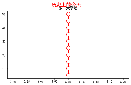
因为是通过折线图来实现时间线效果,为了达到一条竖线的情况,这里设置了 X 轴数值都相同,Y 轴数值等差分布
创建画布及标题
fig, ax = plt.subplots(sharey=True, figsize=(7, 4))
ax.plot(x1, y1, label='First line', linewidth=3, color='r', marker='o', markerfacecolor='white', markersize=12)
plt.title('萝卜大杂烩')
plt.suptitle('历史上的今天', fontsize=16, color='red')
此时效果如下
接下来我们设置时间线两边的数据
# 右侧数据
right_y_year = 0.95
right_y_text = 0.9
year_right = 1931
for i in range(5):
    plt.text(0.57, right_y_year, str(year_right+1), fontsize=15, horizontalalignment='center', verticalalignment='center',
             transform=ax.transAxes, color='black')
    plt.text(0.75, right_y_text, "从百草园到三味书屋-鲁迅" + str(i), fontsize=15, horizontalalignment='center', verticalalignment='center',
             transform=ax.transAxes, color='red')
    right_y_year -= 0.2
    right_y_text -= 0.2
    year_right += 1

# 左侧数据
left_y_year = 0.85
left_y_text = 0.8
year_left = 1941
for i in range(5):
    plt.text(0.43, left_y_year, str(year_left+1), fontsize=15, horizontalalignment='center', verticalalignment='center',
             transform=ax.transAxes, color='black')
    plt.text(0.2, left_y_text, "从百草园到三味书屋-鲁迅" + str(i), fontsize=15, horizontalalignment='center', verticalalignment='center',
             transform=ax.transAxes, color='red', url='https://www.baidu.com')
    left_y_year -= 0.2
    left_y_text -= 0.2
    year_left += 1
这里主要使用了 text 函数,为时间线轴两边分别添加数据
如果我们还想要添加个人的其他信息,比如公众号二维码等,可以在指定位置增加图片,同时去掉坐标轴
# 增加图片
img = plt.imread('二维码.png')
ax2 = plt.axes((0.7, 0.1, 0.3, 0.3))
ax2.imshow(img, origin='lower', alpha=0.5)
ax2.axis('off')
ax.axis('off')
plt.show()
最终效果如下

可以看出,由于 text 函数是通过坐标来确定文字显示的位置的,所以我们的时间线轴两边的数据分布还是不是特别完美,不知道是否有其他的更加方便的方法来设置
Plotly 绘制
Plotly 作为 Python 家族另一个非常强大的可视化工具,同样可以完成时间线图的绘制
在绘图之前,完美先处理数据
这里使用的数据是2020年全年的微博热搜数据
import pandas as pd


weibo = pd.read_csv("weibo_2020.csv")
def deal_date(frame):
    tmp = frame.split('-')
    return tmp[0] + '-' + tmp[1]

weibo['new_date'] = weibo['date'].apply(lambda x : deal_date(x))
key_list_right = []
for i in range(1, 12, 2):
    if i < 10:
        mydate = '2020-0%s' % str(i)
    else:
        mydate = '2020-%s' % str(i)
    keyword = weibo[weibo['new_date'] == mydate].sort_values(by='searchCount', ascending=False)['keyword'].tolist()[0]
    searchCount = weibo[weibo['new_date'] == mydate].sort_values(by='searchCount', ascending=False)['searchCount'].tolist()[0]
    mount = str(i) + '月'
    content = ','.join([keyword, str(searchCount) + '搜索量', mount])
    key_list_right.append(content)
print(key_list_right)
Output:
['最新疫情地图,18130201搜索量,1月',
 '肖战工作室道歉,13117531搜索量,3月',
 '何鸿燊去世,15302424搜索量,5月',
 '高考作文,15647446搜索量,7月',
 '乘风破浪的姐姐成团之夜,8226994搜索量,9月',
 '特朗普,7310000搜索量,11月']
可以看到,通过上面的数据处理,我们成功提取了1、3、5、7、9以及11月的当月搜索量最高的热搜标题,同理可以获取到双月份的热搜标题数据
下面开始作图
import plotly.express as px
import plotly.graph_objects as go
from plotly.subplots import make_subplots
import pandas as pd
from plotly.graph_objs import *

layout = Layout(
    paper_bgcolor='rgba(0,0,0,0)',
    plot_bgcolor='rgba(0,0,0,0)',
    title={'text': '微博热搜', 'x': 0.5},
    yaxis={'title': 'Proportion (%)'}
)
fig = go.Figure(layout=layout)
fig.add_traces([go.Scatter(x=[2,2,2,2,2,2], y=[5, 10, 15, 20, 25, 30], text=key_list_right, textposition="bottom right", mode="lines+text"),
                go.Scatter(x=[2,2,2,2,2,2], y=[5, 10, 15, 20, 25, 30], textposition="top left", mode="lines+text", text=key_list_left)])
fig.update_traces(showlegend=False)
fig.update_layout(xaxis=dict(visible=False), yaxis=dict(visible=False))
fig.show()
通过 Plotly 绘图就相对简单很多了,直接使用 text 参数把我们得到的热搜数据添加上即可
最终效果如下

效果很朴素,是因为我们没有进行过多的样式设置,大家可以自行探索下不同样式啊
Excel 绘制
上面的两种方法都需要有一定的代码基础,下面介绍的 Excel 方法则可以说是人人都能完成,一起来看看吧
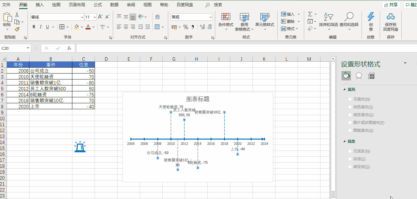
先来看看最终的效果
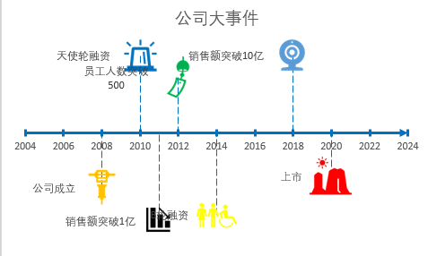
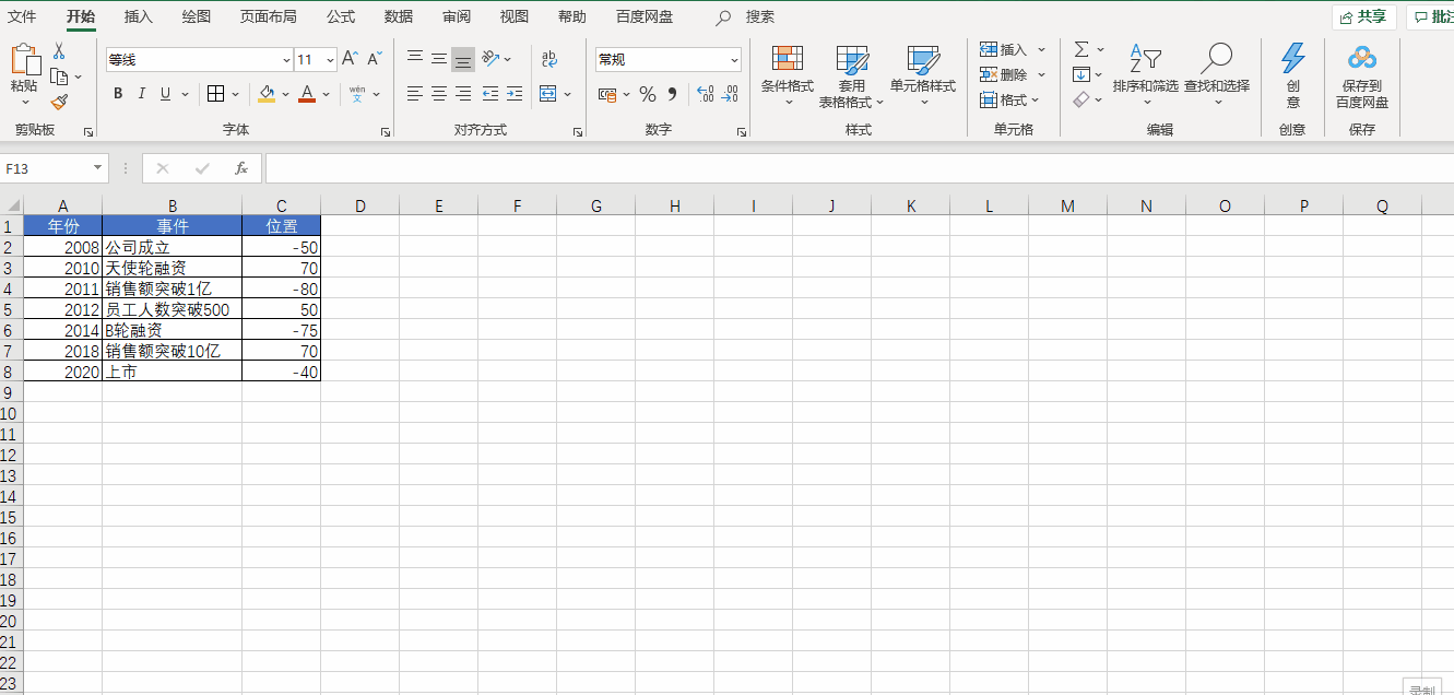
首先准备数据,我们在新建的 Excel 文档中创建如下数据

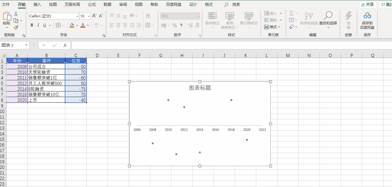
然后插入散点图
先插入一个空白散点图,然后将 X 轴设置为【年份】,Y 轴设置为【位置】,再把 Y 轴和网格线都删除
接下来我们美化一下 X 轴
我们双击 X 轴,调出格式窗口,在坐标轴选项标签中设置【单位】,将【小】改为1,设置【刻度线】,将【主刻度线】设置为交叉。再点击【油漆桶】,选择一个线条的颜色,将宽度调整为2,将【结尾箭头类型】调整为向右箭头
再接下来我们把 X 轴连接起来

首先选择一个散点,添加误差线。然后把横向的误差线设置为无轮廓,再选中竖向的误差线,把【垂直误差线】设置为负偏差,再把误差量设置为100%,最后再给竖向误差线调整样式即可
下面开始添加数据
我们把公司的各种大事件添加到数据表当中
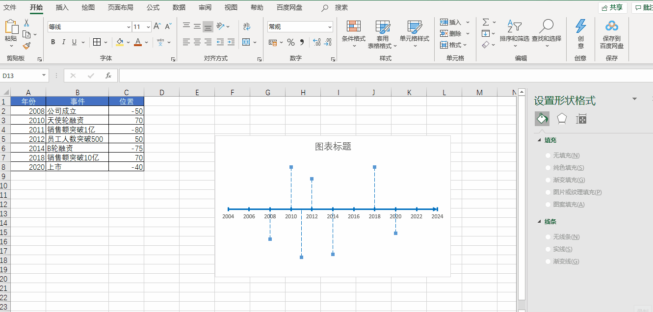
向图表中添加【数据标签】,即数据中事件那一列,然后再去掉 Y 值即可
最后我们还可以通过 Excel 自带的各种图标进行美化操作
好了,以上就是今天分享的所有内容,如果对你有帮助,帮忙点赞和在看支持哦~
边栏推荐
- Application of Acrel5000web Energy Consumption System in a College-Susie Week
- DSPE-PEG-Azide, DSPE-PEG-N3, phospholipid-polyethylene glycol-azide can react directly with DBCO
- 自监督学习 —— MoCo v2
- DSPE-PEG-PDP,DSPE-PEG-OPSS,磷脂-聚乙二醇-巯基吡啶可减少肽的免疫原性
- Endpoint mode for NetCore routing
- 安科瑞支持以太网通讯、profibus通讯嵌入式电能表APM指导性技术要求-Susie 周
- mysql多表左链接查询
- LoRa Basics无线通信技术和应用案例详解
- Don't tell me to play, I'm taking the PMP exam: what you need to know about choosing an institution for the PMP exam
- 【云原生】4.2 DevOps 精讲篇
猜你喜欢

Install Mysql8.0 on windos, and solve the problem of re-login exception ERROR 1045 (28000)

LoRa Basics无线通信技术和应用案例详解
C语言之实现倒置字符串的两种方法
微软Excel表格点击单元格行和列都显示颜色怎么弄?聚光灯效果设置

DSPE-PEG-PDP, DSPE-PEG-OPSS, phospholipid-polyethylene glycol-mercaptopyridine reduce the immunogenicity of peptides

Puyuan Jingdian turned losses into profits in the first half of the year, and high-end products continued to develop!Are you optimistic about "Huawei" in the instrument industry?
DSPE-PEG-Silane, DSPE-PEG-SIL, phospholipid-polyethylene glycol-silane modified silica particles
小黑leetcode清爽雨天之旅,刚吃完宇飞牛肉面、麻辣烫和啤酒:112. 路径总和
Beat the interviewer, the CURD system can also make technical content
Problems with compiling SIP with QGIS
随机推荐
字符串哈希(2014 SERC J题)
Cholesterol-PEG-Thiol,CLS-PEG-SH,胆固醇-聚乙二醇-巯基用于改善溶解度
leetcode: the Kth largest element in the array
[Graphic and textual] How to reinstall Win7 system
10个 Istio 流量管理 最常用的例子,你知道几个?
Characteristics and Development Prospects of Korea's Cyber Security System
Puyuan Jingdian turned losses into profits in the first half of the year, and high-end products continued to develop!Are you optimistic about "Huawei" in the instrument industry?
QGIS编译SIP的问题
AI+医疗:使用神经网络进行医学影像识别分析
SQLi-LABS Page-2 (Adv Injections)
2021(ICPC)亚洲区域赛昆明站(CGHIJLM)
痛击面试官 CURD系统也能做出技术含量
Tensorflow中使用convert_to_tensor去指定数据的类型
蓝牙模块的分类和对应的属性特点
编程语言中,取余和取模的区别
[Deep learning] pix2pix GAN theory and code implementation
消防安全培训|“蓝朋友”,开课了!
linux定时执行sql文件[通俗易懂]
MySQL:错误1153(08S01):得到的数据包大于“ max_allowed_packet”字节
fixed investment fund