当前位置:网站首页>[Data Visualization] Chart Design Principles
[Data Visualization] Chart Design Principles
2022-08-11 00:01:00 【When camellias bloom.】
In our daily work, sometimes we need to display data in a graphical form, which is what we call data visualization.In the process of creating the chart, we need to pay attention to the fact that every redundant element in the chart will increase the cognitive load of the user

We can use the following design principles to make the chart more beautiful and easier for users to understand
Design Principle 1:Remove graphic borders and gridlinesp>
It will make the data more prominent
Design Principle 2:Remove data tags
The line itself can display the data visually, and the data markup will increase the cognitive load of the user
Not to say never use data tags, but use them with purpose
Design Principle 3:Axis Label Handling
1. Avoid using inclined elements, so as not to affect the user's reading speed
2. When the mantissa after the decimal point is 0, remove these mantissas to reduce unnecessary cognitive load of users
Many times, the axis labels generated by the system by default will have extra 0s after the decimal point. These 0s have no reference value, but make the numbers look more complicated than they actually are
Design Principle 4:Remove unnecessary legends
Delete the legend and mark it directly next to the data that needs to be described
Design Principle 5:Keep Colors Consistent
The same color should be used for the data label and the described data, which is helpful to remind the user that the two parts of information are related to each other
Design Principle 6:Alignment
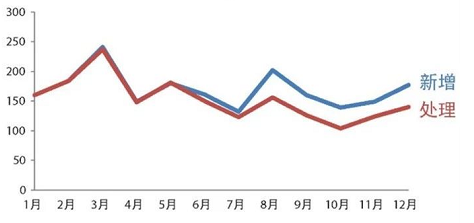
Users typically start at the top left of the page or screen, move their gaze in a "Z" shape and digest the information, as shown below:

Avoid center-aligned text and align text to the top left corner (titles, axis labels, etc.), which helps users see details about how to read the chart first, and then see the data itself
Design Principle 7:Fonts
Chinese:Microsoft Yahei
English and numbers: Arial font
After the above 7 design principles, the line chart is modified, and the results are as follows:
Extended Supplement 1: How to Read Charts
We can start to understand the chart from the 6 elements in the chart
1. Chart title, used to introduce the theme of the chart
2. Horizontal and vertical axis title
3. Category name
4. Legend, using various symbols and colors to represent different categories in the graph
5. Grid lines, easy to see where each element is in the graph
6. Data source, giving data credibility
Note: In order to simplify the chart, the above 6 elements do not have to be used in all

Extended Supplement 2: Notes on Using Tables
One thing to keep in mind when using tables is to let the design blend into the background and let the data take center stage.Don't let heavy borders and shadows compete with the data for the user's attention.Conversely, using narrow borders or removing borders at all can effectively highlight the data

边栏推荐
- 如何利用原生JS实现回到顶部以及吸顶效果
- 学习Apache ShardingSphere解析器源码(一)
- ASIO4ALL是什么
- 2. Dependency management and automatic configuration
- [C Language Chapter] Detailed explanation of bitwise operators (“<<”, “>>”, “&”, “|”, “^”, “~”)
- Kubernetes你不知道的事
- IEEE的论文哪里可以下载?
- Promise in detail
- 11. 自定义转换器
- HGAME 2022 Final Pokemon v2 writeup
猜你喜欢
![[C language] Detailed explanation of data storage](/img/3f/3799a3ba0f2642272e15bd7a3e511f.png)
[C language] Detailed explanation of data storage
如何便捷获取参考文献的引用格式?
11. Custom Converter
u盘数据不小心删除怎么恢复,u盘数据删除如何恢复
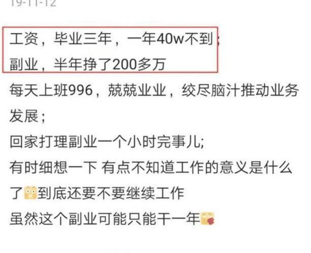
In 22 years, the salary of programmers nationwide in January was released, only to know that there are so many with annual salary of more than 400,000?
多语种翻译-多语种翻译软件免费
SQL injection base - order by injection, limit, wide byte
![[Excel知识技能] 将数值格式数字转换为文本格式](/img/fb/79d6928456f090d47f0fe7a5074979.png)
[Excel知识技能] 将数值格式数字转换为文本格式
14. Thymeleaf
SQL注入基础---order by \ limit \ 宽字节注入
随机推荐
9. Rest 风格请求处理
The Missing Semester of Your CS Education
C语言%(%d,%c...)
SQL注入基础
How to recover data from accidentally deleted U disk, how to recover deleted data from U disk
[C language articles] Expression evaluation (implicit type conversion, arithmetic conversion)
基于SSM实现手机销售商城系统
宝塔实测-搭建PHP在线模拟考试系统
How to recover deleted files from the recycle bin, two methods of recovering files from the recycle bin
【C语言】猜数字游戏的实现
HGAME 2022 Final writeup
Talking about cors
软件测试证书(1)—— 软件评测师
15. 拦截器-HandlerInterceptor
Design and Realization of Employment Management System in Colleges and Universities
2022下半年软考「高项」易混淆知识点汇总(2)
缓存知识总结
[C Language Chapter] Detailed explanation of bitwise operators (“<<”, “>>”, “&”, “|”, “^”, “~”)
Google Chrome73~81版本浏览器的跨域问题解决方案
excel英文自动翻译成中文教程