Mohr's Circle Calculator
This is a really small personal project done for Department of Civil Engineering, Delhi Technological University (formerly, Delhi College of Engineering) for a course in Mechanics of Solid (Course Code - CE202).
It is a simple program using Python, NumPy and Matplotlibwhich helps a user to plot Mohr's Cirle when given the two-dimensional state of stress.
Documentation
Introduction
In Mechanics, the mechanics of deformable bodies is termed as Strength of Materials, Mechanics of Materials, or in its more advanced form, as Solid Mechanics. Mechanics of Materials deals with stresses, in their simple one-dimensional states, or at a slightly advanced level, a two-dimensional state of stress; a general three-dimensional state of stress is also possible, and involves advanced mathematical methods for its analysis.
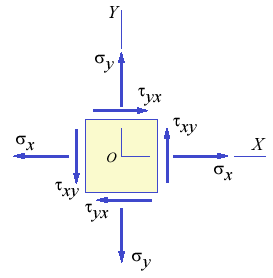
A two-dimensional state of stress is characterized by a two-dimensional geometry with two axes, x and y. Stress components are typically represented by their rectangular components, σx, σy and τxy, which are shown in figure below. Here, the stresses σx and σy are the normal stress components and τxy is the shear stress component. The figure below shows an elemental area, with the rectangular components of stress being labeled.
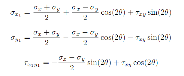
If the axes x and y get transformed, then, these stress components also get transformed accordingly, and the equations for their transformation are given below, where θ is the angle by which the elemental area is rotated.
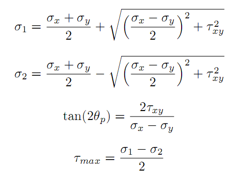
There exists a certain angle of the transformed axes for which the stress components are maximum, and the corresponding stress components are termed as the Principal Stresses, σ1 and σ2. These Principal Stresses can be computed by the following formulae. The formula for the angle θp at which these Principal Stresses occur is also given below. Principal Stresses play an important part in the Theories of Failure characterizing engineering materials. The shear stress also takes on a maximum value τmax at its corresponding angle.
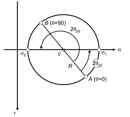
The Principal Stresses have a nice graphical representation, first devised by Otto Mohr, and this is called as Mohr's Circle. Mohr's Circle is drawn with the normal stress components being represented on the x-axis and the shear stress component on the y-axis. Figure shows a typical Mohr's Circle for a two-dimensional state of stress. It can be noted that the horizontal axis represents the normal stress σ and the vertical axis (pointing downwards in the positive direction) represents the shear stress τ. Every point on the Mohr's Circle represents a transformed state of stress depending on the angle of orientation θ of the area element.
The objective of this program is to draw the Mohr's Circle on the screen, given the rectangular components of stress.
Features of the Program
This program allows the user to specify the three rectangular stress components in a two-dimensional state of stress, σx, σy and τxy and the angle (in degrees) of plane's axis from x-axis; and view the corresponding values of the Principal Stresses and angles, and the maximum shear stress, and also view the Mohr's Circle.
Overview of the Code
Important Variables - The rectangular stress components given as input are stored in three variables σx, σy and τxy. The principal stresses are stored as σ1 and σ2, and the maximum shear stress as τmax. The direction of planes at which principal stresses σ1 and σ2 occur are stored in φ1 and φ2 respectively. The direction of plane at which maximum shear stress τmax occurs is stored in α. The radius of Mohr's Circle is stored in the variable R and the angle of the plane's axis from the x-axis is stored in the variable w. The average stress which acts at the centre of Mohr's circle is stored in the variable σavg.
Outline - drawMohrsCircle(): The program has only this function. This function is used to compute all the values and print them on the screen. It takes user values for rectangular stress components σx, σy and τxy as well as the angle of plane's axis from the x-axis; w. It then performs mathematical operations on all those values based on some pre-defined formulae. It then uses the both the user defined values as well as computed values to plot the Mohr's Circle using the Matplotlib's Pyplot module.

 1 Jan 05, 2022
 26 Dec 17, 2022
 2 Nov 21, 2021
 97 Dec 25, 2022
 3.4k Dec 29, 2022
 16.7k Jan 08, 2023
 17 Dec 08, 2022
 395 Dec 29, 2022
 16 Sep 15, 2022
 2 Jun 15, 2022
 237 Dec 18, 2022
 1 Jan 11, 2022
 7 Jul 06, 2022
 3 Dec 13, 2022
 5 Aug 28, 2022
 48 Dec 05, 2022
 50 Dec 30, 2022
 22 Oct 31, 2022
 27.5k Dec 30, 2022
 5 Sep 16, 2022