当前位置:网站首页>Solutions to common problems in visualization (VII) solutions to drawing scale setting
Solutions to common problems in visualization (VII) solutions to drawing scale setting
2022-04-23 07:37:00 【The big pig of the little pig family】
Scale setting problem
1. Preface
When we visualize data, we usually encounter an acceptance problem , We want to make X Axis or Y The axis represents more intuitive information , But obviously matplotlib The default scale of the library cannot meet our requirements . The default scale is shown in the figure below :
Although this icon can also express the quarterly income , But the diagram is not intuitive . The biggest problem is the scale of the abscissa and ordinate , It has nothing to do with the data you want to respond to .
2. Solution
2.1 Solution 1
We use set_xticks Method to clean up meaningless scales , The method parameters are as follows :
Parameter description :
set_xticks(self, ticks, minor=False)
Parameters 1:ticks: Specify where the scale appears
Parameters 2:minor: Specifies whether it is a minor scale
Return value 1: contain XTick List of instances
Parameters, :
- Although the official document states ticks The parameter must be a list , However, according to the blogger's experiment, any iterative sequence can be passed to this parameter .
- minor Parameters are very important , It is used to specify the minor scale , The so-called secondary scale is the scale without scale label , They have only one short stick on the picture , Won't have a label , therefore set_xticklabels Methods cannot label them by default .
- Bear in mind set_xticklabels Method by default, the number of labels can be set to be the number of non secondary scales , Not the sum of minor and non minor scales .
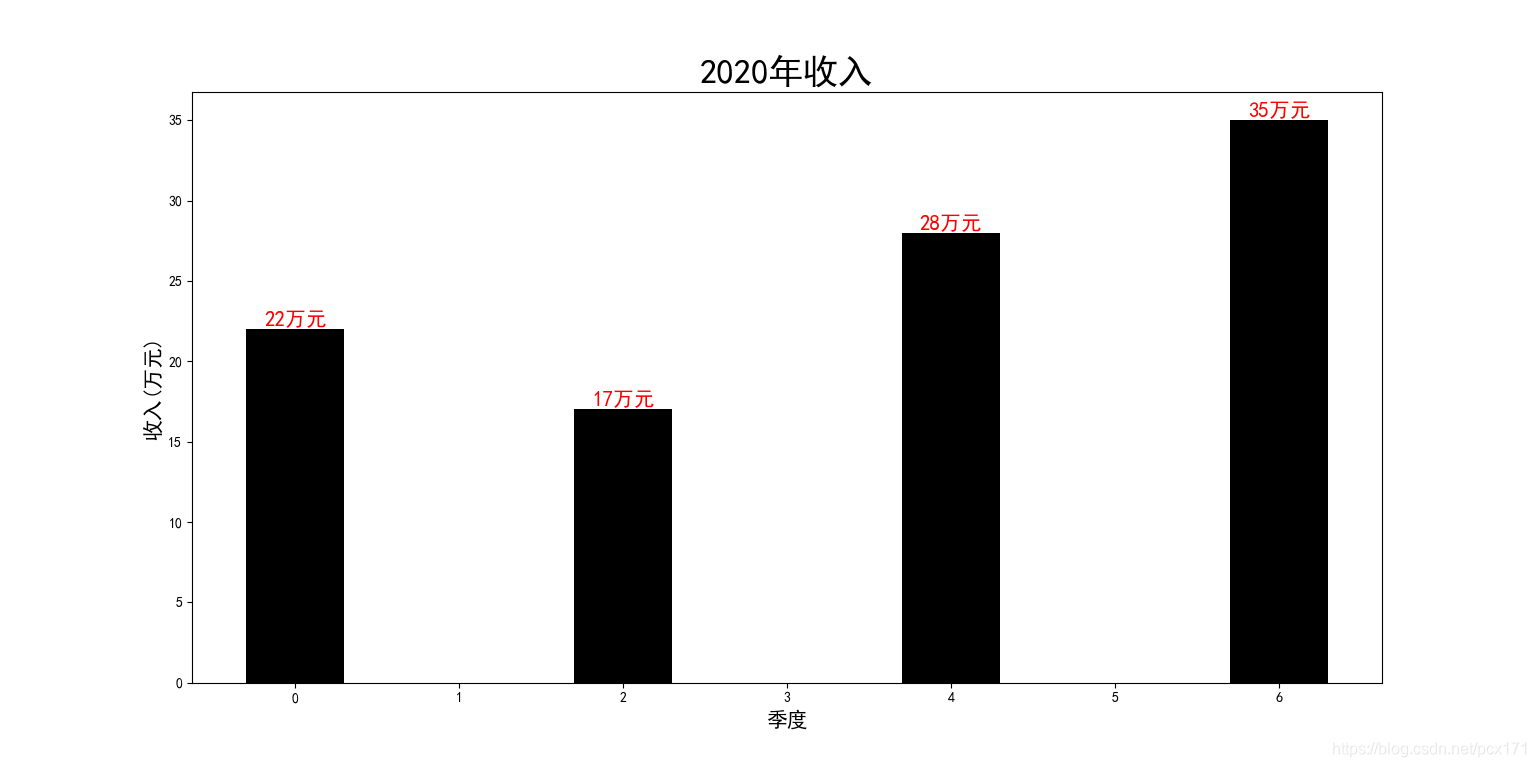
The sample program for deleting meaningless scale is as follows :
# Import necessary Libraries
import matplotlib.pyplot as plt
import numpy as np
plt.rcParams['font.sans-serif'] = ['SimHei']  #  Settings support Chinese

# Initialize data and frame
height = np.random.randint(10, 40, 4)
figure, ax = plt.subplots()
X = [0, 2, 4, 6]
width = 0.6

rectangle = ax.bar(X, height, width=width, color='#000000')
texts_list = plt.bar_label(rectangle, fmt='%d Ten thousand yuan ')

# Set font and other properties
for text in texts_list:
    text.set_fontsize(15)
    text.set_color('#FF0000')

ax.set_xticks(X)    # Delete meaningless scale

ax.set_title('2020 Annual income ', fontsize=25)
ax.set_xlabel(' quarter ', fontsize=15)
ax.set_ylabel(' income ( Ten thousand yuan )', fontsize=15)
plt.show()
The result is as follows :
 Now we have deleted the meaningless scale , For the existing scale, we also hope that he will express the meaning of quarter , We need to use set_xticklabels Method , This method is used to set the scale label , Its parameters are as follows :
Parameter description :
set_xticklabels(self, labels, fontdict=None, minor=False, **kwargs)
Parameters 1:labels: Specify the scale name
Parameters 2:fontdict: Dictionary type , Specify font properties
Parameters 3:minor: Specifies whether it is a minor scale label
Return value 1: contain Text List of instances
Parameters, :
- By default minor=False, So you can only set the label of non minor scale , We can pass on minor=True, This sets the secondary scale label .
- fontdict Parameters pass a dictionary , Used for global settings , But the general practice of bloggers is to return from this method Text Instance to set properties , So as to accurately set the properties .
- Use only set_ticks Method after fixing the scale position , This method should be used . otherwise , The label may appear in an unexpected position .
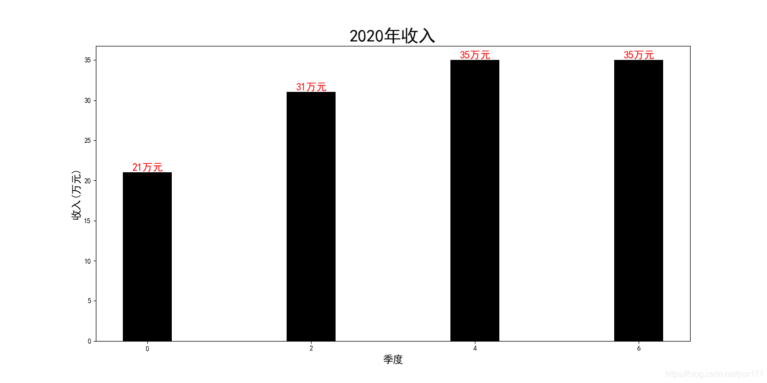
The sample program for adding scale labels is as follows :
# Import necessary Libraries
import matplotlib.pyplot as plt
import numpy as np
plt.rcParams['font.sans-serif'] = ['SimHei']  #  Settings support Chinese

# Initialize data and frame
height = np.random.randint(10, 40, 4)
figure, ax = plt.subplots()
X = [0, 2, 4, 6]    # initialization X coordinate
width = 0.6 # Initialize the column width
xtick_label = [' quarter 1', ' quarter 2', ' quarter 3', ' quarter 4']  # initialization x Axis scale label
xtickcolors_list = ['red', 'blue', 'green', 'purple']   # initialization x Axis scale label color

rectangle = ax.bar(X, height, width=width, color='#000000') # drawing
texts_list = plt.bar_label(rectangle, fmt='%d Ten thousand yuan ')   # Set bar chart labels

ax.set_xticks(X)    # Delete meaningless scale
ticklabels_list = ax.set_xticklabels(xtick_label, fontdict=dict(fontsize=15), rotation=30) # Add calibration label

# Set the scale label color
for ticklabel, color in zip(ticklabels_list, xtickcolors_list):
    ticklabel.set_color(color)

# Set attributes such as the font size of the histogram annotation
for text, color in zip(texts_list, xtickcolors_list):
    text.set_fontsize(15)
    text.set_color(color)

ax.set_title('2020 Annual income ', fontsize=35)    # Set title
ax.set_ylabel(' income ( Ten thousand yuan )', fontsize=20)    # Set up y Axis labels
plt.show()
The result is as follows :

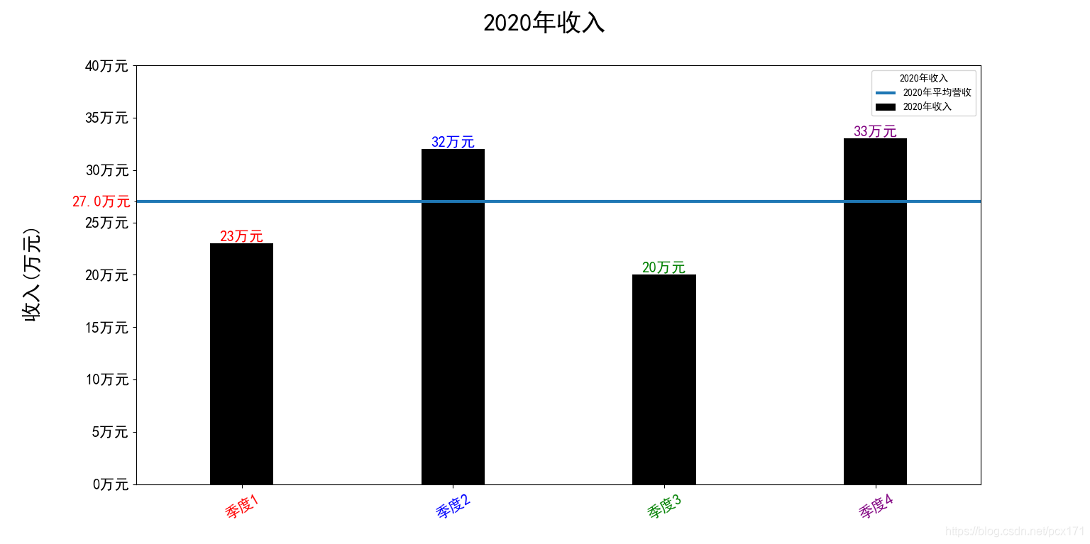
Similarly, we can also set y Axis for better visualization , The method used is consistent . The example program is as follows :
# Import necessary Libraries
import matplotlib.pyplot as plt
import numpy as np
plt.rcParams['font.sans-serif'] = ['SimHei']  #  Settings support Chinese

figure, ax = plt.subplots()

# Initialization data
height = np.random.randint(10, 40, 4)   # Initialize column height data
data_mean = height.mean()
X = [0, 2, 4, 6]    # initialization X coordinate
width = 0.6 # Initialize the column width
yticks_list = np.arange(0, 45, 5)   # initialization y scale
yticks_label = [str(i) + ' Ten thousand yuan ' for i in yticks_list]  # initialization x Axis scale label
xticks_label = [' quarter 1', ' quarter 2', ' quarter 3', ' quarter 4']  # initialization x Axis scale label
xtickcolors_list = ['red', 'blue', 'green', 'purple']   # initialization x Axis scale label color

rectangle = ax.bar(X, height, width=width, color='#000000', label='2020 Annual income ') # drawing
ax.axhline(data_mean, label='2020 Average annual revenue ', linewidth=3)    # Draw an average
texts_list = plt.bar_label(rectangle, fmt='%d Ten thousand yuan ')   # Set bar chart labels

ax.set_xticks(X)    # Delete meaningless scale , Set up x Main scale
xticklabels_list = ax.set_xticklabels(xticks_label, fontdict=dict(fontsize=15), rotation=30) # Add calibration label

ax.set_yticks(yticks_list)  # Set up y scale
ax.set_yticks([data_mean], minor=True)    # Set up y Minor scale
major_yticklabels_list = ax.set_yticklabels(yticks_label, fontdict=dict(fontsize=15))   # Set up y Major scale labels
minor_yticklabels_list = ax.set_yticklabels([str(data_mean) + ' Ten thousand yuan '], fontdict=dict(fontsize=15, color='#ff0000'), minor=True)   # Set up y Secondary scale label


# Set the scale label color
for ticklabel, color in zip(xticklabels_list, xtickcolors_list):
    ticklabel.set_color(color)

# Set attributes such as the font size of the histogram annotation
for text, color in zip(texts_list, xtickcolors_list):
    text.set_fontsize(15)
    text.set_color(color)

figure.suptitle('2020 Annual income ', fontsize=25) # Set title
figure.supylabel(' income ( Ten thousand yuan )', fontsize=20)    # Set up y Axis labels

ax.set_xlim([-1, 7])    # Limit the view range
ax.legend(title='2020 Annual income ')  # Set legend
plt.show()
The result is as follows :
Many other skills and solutions are used in the program , For details, please see Reference link .
3. Reference resources
- Solution to the problem of cylinder annotation
- linestyle Parameters,
- capstyle Parameters,
- joinstyle Parameters,
- Solution to subgraph spacing problem
- Subgraph setting headline solution
版权声明
本文为[The big pig of the little pig family]所创,转载请带上原文链接,感谢
https://yzsam.com/2022/04/202204230617063818.html
边栏推荐
猜你喜欢

菜菜的刷题日记 | 238.除自身以外数组的乘积

AuthorizationServer(授权服务器的简单搭建)

Background management system framework, there is always what you want

可视化常见绘图(三)面积图

Typora语法详解(一)

Discussion on arrow function of ES6

Meishe helps Baidu "Duka editing" to make knowledge creation easier

自定义时间格式(YYYY-MM-DD HH:mm:ss 星期X)
ES6之箭头函数细谈

保洁阿姨都能看懂的中国剩余定理和扩展中国剩余定理
随机推荐
数据分析学习(一)数据分析和Numpy基础
LATEX公式注意事项
组合数求解与(扩展)卢卡斯定理
Dirichlet 前缀和(数论优化式子复杂度利器)
FSM有限状态机
P1390 公约数的和(莫比乌斯反演)
MVCC(多版本并发控制)
技能点挖坑
(扩展)BSGS与高次同余方程
Pycharm
数据库查询优化的方式
Statement of American photography technology suing Tianmu media for using volcanic engine infringement code
h5本地存储数据sessionStorage、localStorage
直观理解熵
Machine vision series (01) -- Overview
嵌入式相关面经(一)
1. View databases and tables
VScode
积性函数与迪利克雷卷积
Visualization Road (IX) detailed explanation of arrow class