当前位置:网站首页>Eight misunderstandings that should be avoided in data visualization
Eight misunderstandings that should be avoided in data visualization
2022-04-23 04:39:00 【Mingyue said data】
Data is something we often come into contact with , however , Can we visualize these data in the right way ? We may have to create a lot of visual charts every day , Some will be appreciated by the audience , And some were rejected , Why is that? ? ok , The answer is to create , Let's try to find out the causes and problems , See how to deal with them . ad locum , I'll summarize some of the best and worst versions of the chart , If you are using the worst version , Stop and correct as soon as possible .
The baseline is 0 Start chart for
One of the most common mistakes I find when drawing a chart is not to 0 Baseline to make charts .
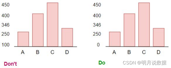
We are Data visualization Horizontal or vertical bar charts are usually used in , Sometimes when we use a simple bar chart for comparison , It does send a message , But vertical or horizontal stacked bars are better . Let's take an example , We have monthly sales figures for women and men , We can use the chart below for comparison , Do not plot positive and negative values on the same side of the chart , It's hard to read the information of the chart .

Multiple colors on the chart
Many people use multiple colors when using charts , This makes the graphics look very strange , Normally , If not to highlight a data , Just use one color for a chart .
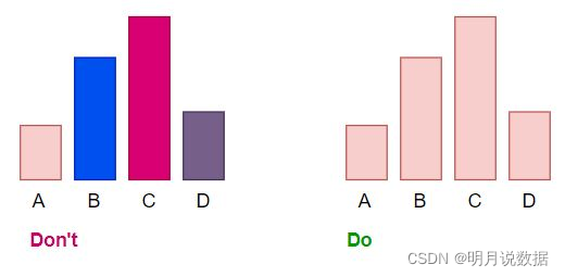
If you have 2 More than one chart , Then it would be a good idea to separate the chart by color , Let's look at the diagram below .

Emphasize data
Sometimes emphasizing the data also makes the chart look good . In the chart below , Only 4 A variable , So this little change in the chart won't be very obvious , But when we use 100 Variables , Highlighting the highest value of the column chart will be of great help .

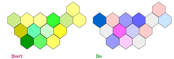
Confusing color choices
typeface 、 Color 、 Axis and other functions are very important when drawing charts , Choosing the color of the chart is a very critical step , Because if there are very bright or very light colors on the chart , Then reading the chart will become very difficult . In this example , We have the following 2 A different chart , Show the highest to lowest sales in this area. The expression in color is different , Let's look at the chart on the left , It's basically hard to tell which is high and which is low . And in the chart on the right , There are blue and pink scales , You can easily distinguish shadows .
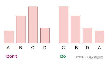
Avoid randomness on the chart
Always arrange in ascending or descending order according to the value of the bar chart , For horizontal bars , Put the maximum at the top , For vertical bars , Put the maximum value on the left , This will help the audience find the highest and lowest values from the chart .
Tell a story or answer at least one question
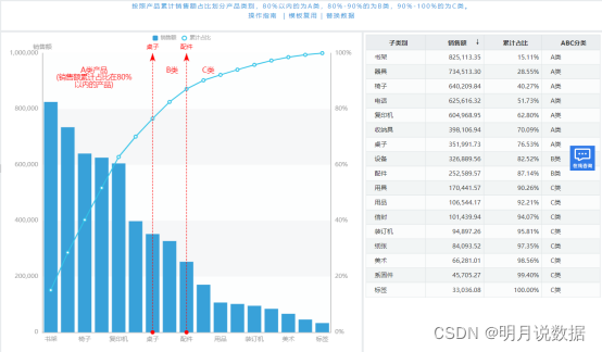
Most initial data visualization tools generate only a single chart , Such as histogram or bar chart , But most of the time, you need to combine multiple charts , Let's see how it is done in intellectual analysis . You can find this case in intelligence analysis . ad locum , I made a for analyzing customers RFM Customer value classification model chart , You can make different charts , Or a bar chart, such as a pie chart , But I put them all together , To summarize and analyze . ad locum , We can see clearly that , Generally, the number of customers retained is the largest , What's the percentage , What are the specific details of the customer name .

Add text as needed
If you think adding other text will help readers better understand the chart , Then just add text . Let's look at a real example , You can find this chart on intelligence analysis , ad locum , I added some text , for example A This category of products represents the cumulative proportion of sales 80% Products within .
Use pie chart
I see a lot of people using pie charts in the wrong way , When using pie charts, remember , The value in the pie chart must not exceed 5 individual . In the following example , We see in the Netflix Proportion of programs watched on , We can see clearly that , Movies are more popular here .

From the above case , We see some common mistakes in the chart , And learned how to overcome these mistakes . Data visualization is an art form , It needs to be mastered over time . Although the tips and techniques of data visualization are not comprehensive , But it will certainly help you get on the right track . Understanding the audience's perspective is the key to creating successful and effective visual effects , No matter what tool you use to create elegant and beautiful charts , It is important to understand the nature behind visual effects .
版权声明
本文为[Mingyue said data]所创,转载请带上原文链接,感谢
https://yzsam.com/2022/04/202204230437436903.html
边栏推荐
- [echart] démarrer avec echart
- [AI vision · quick review of robot papers today, issue 31] Fri, 15 APR 2022
- A heavy sword without a blade is a great skill
- KVM error: Failed to connect socket to ‘/var/run/libvirt/libvirt-sock‘
- AWS eks add cluster user or Iam role
- 补充番外14:cmake实践项目笔记(未完待续4/22)
- 无线充电全国产化电子元件推荐方案
- Detailed explanation of life cycle component of jetpack
- STM32 MCU ADC rule group multi-channel conversion DMA mode
- [echart] Introduction to echart
猜你喜欢

无线充电全国产化电子元件推荐方案

Summary of MySQL de duplication methods
![[AI vision · quick review of today's sound acoustic papers, issue 3] wed, 20 APR 2022](/img/48/0e95841743bada4faf3edfee31cb6a.png)
[AI vision · quick review of today's sound acoustic papers, issue 3] wed, 20 APR 2022
Installation du compilateur croisé de la plateforme zynq
做数据可视化应该避免的8个误区
zynq平台交叉编译器的安装

【时序】基于 TCN 的用于序列建模的通用卷积和循环网络的经验评估

上海航芯技术分享 | ACM32 MCU安全特性概述

win10, mysql-8.0.26-winx64. Zip installation
Recommended scheme of national manufactured electronic components
随机推荐
Basic use of shell WC (counting the number of characters)
Eksctl deploying AWS eks
Interaction of diet gut microbiota on cardiovascular disease
Common string processing functions in C language
MYSQL50道基础练习题
leetcode004--罗马数字转整数
Recommended scheme for national production of electronic components of wireless keyboard
[pytoch foundation] torch Split() usage
数据孤岛是什么?为什么2022年仍然存在数据孤岛?
test
Fusobacterium -- symbiotic bacteria, opportunistic bacteria, oncobacterium
第四章 --- 了解标准设备文件、过滤器和管道
eksctl 部署AWS EKS
Kotlin. The binary version of its metadata is 1.6.0, expected version is 1.1.15.
Chlamydia infection -- causes, symptoms, treatment and Prevention
RC低通滤波器的逆系统
leetcode001--返回和为target的数组元素的下标
[paper reading] [3D object detection] voxel transformer for 3D object detection
三十六计是什么
test