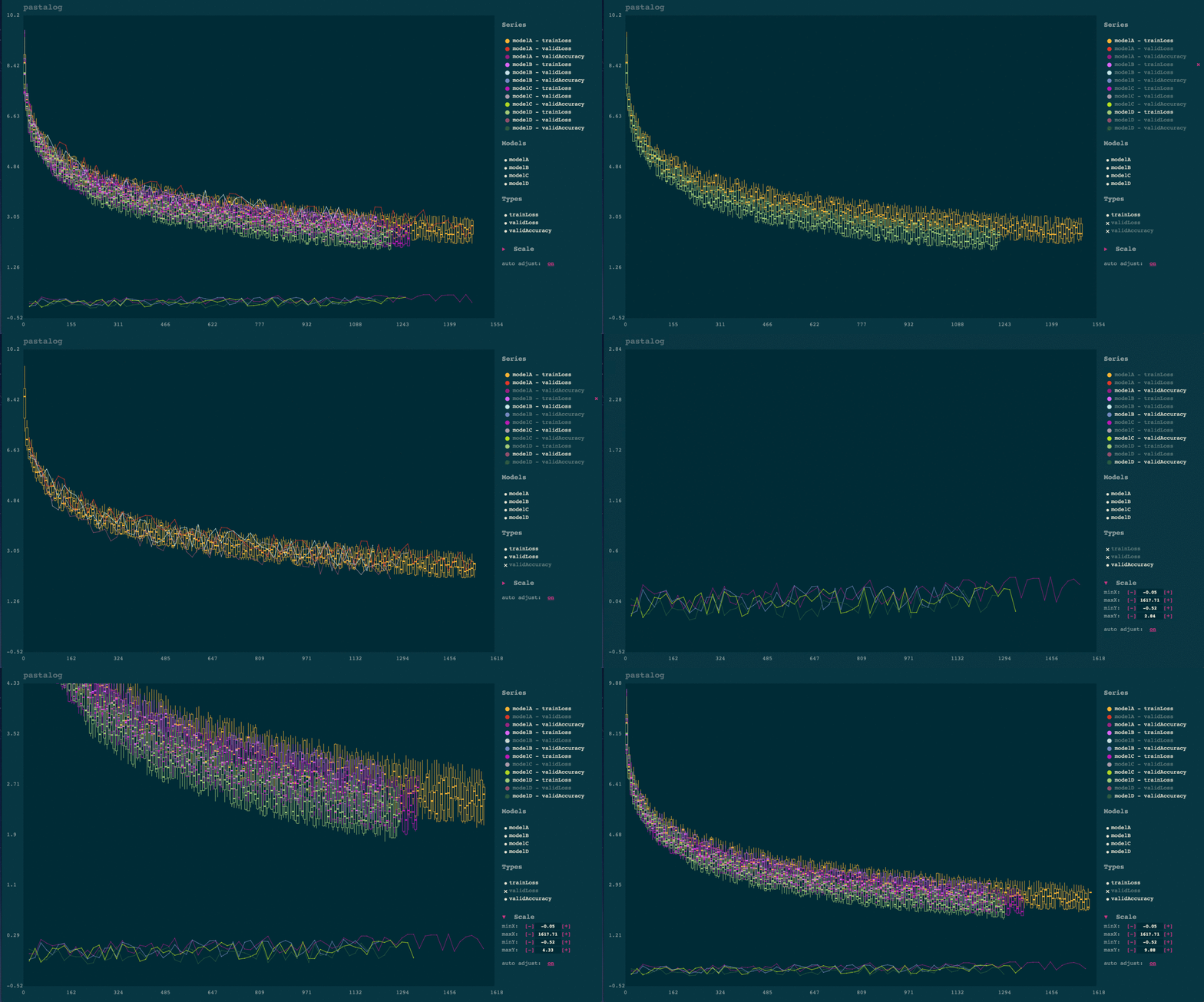
pastalog
Simple, realtime visualization server for training neural networks. Use with Lasagne, Keras, Tensorflow, Torch, Theano, and basically everything else.
Installation
Easiest method for python
The python package pastalog has a node.js server packaged inside python module, as well as helper functions for logging data.
You need node.js 5+:
brew install node
(If you don't have homebrew, download an installer from https://nodejs.org/en/)
pip install pastalog
pastalog --install
pastalog --serve 8120
# - Open up http://localhost:8120/ to see the server in action.
Just node.js server (useful if you don't want the python API)
git clone https://github.com/rewonc/pastalog && cd pastalog
npm install
npm run build
npm start -- --port 8120
# - Open up http://localhost:8120/ to see the server in action.
Logging data
Once you have a server running, you can start logging your progress.
Using Python module
from pastalog import Log

log_a = Log('http://localhost:8120', 'modelA')

# start training

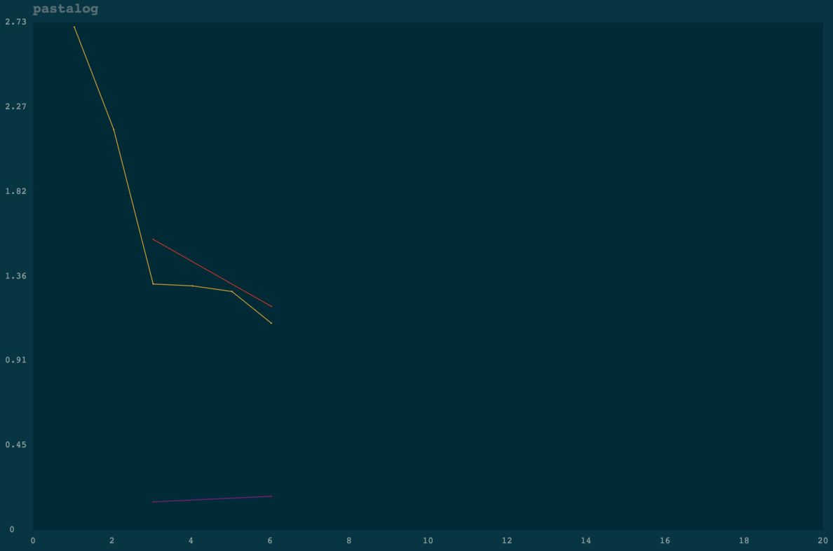
log_a.post('trainLoss', value=2.7, step=1)
log_a.post('trainLoss', value=2.15, step=2)
log_a.post('trainLoss', value=1.32, step=3)
log_a.post('validLoss', value=1.56, step=3)
log_a.post('validAccuracy', value=0.15, step=3)

log_a.post('trainLoss', value=1.31, step=4)
log_a.post('trainLoss', value=1.28, step=5)
log_a.post('trainLoss', value=1.11, step=6)
log_a.post('validLoss', value=1.20, step=6)
log_a.post('validAccuracy', value=0.18, step=6)
Voila! You should see something like the below:
Now, train some more models:
log_b = Log('http://localhost:8120', 'modelB')
log_c = Log('http://localhost:8120', 'modelC')

# ...

log_b.post('trainLoss', value=2.7, step=1)
log_b.post('trainLoss', value=2.0, step=2)
log_b.post('trainLoss', value=1.4, step=3)
log_b.post('validLoss', value=2.6, step=3)
log_b.post('validAccuracy', value=0.14, step=3)

log_c.post('trainLoss', value=2.7, step=1)
log_c.post('trainLoss', value=2.0, step=2)
log_c.post('trainLoss', value=1.4, step=3)
log_c.post('validLoss', value=2.6, step=3)
log_c.post('validAccuracy', value=0.18, step=3)
Go to localhost:8120 and view your logs updating in real time.
Using the Torch wrapper (Lua)
Use the Torch interface, available here: https://github.com/Kaixhin/torch-pastalog. Thanks to Kaixhin for putting it together.
Using a POST request
See more details in the POST endpoint section
curl -H "Content-Type: application/json" -X POST -d '{"modelName":"model1","pointType":"validLoss", "pointValue": 2.5, "globalStep": 1}' http://localhost:8120/data
Python API
pastalog.Log(server_path, model_name)
server_path: The host/port (e.g.http://localhost:8120)model_name: The name of the model as you want it displayed (e.g.resnet_48_A_V5).
This returns a Log object with one method:
Log.post(series_name, value, step)
series_name: typically the type of metric (e.g.validLoss,trainLoss,validAccuracy).value: the value of the metric (e.g.1.56,0.20, etc.)step: whatever quantity you want to plot on the x axis. If you run for 10 epochs of 100 batches each, you could pass tostepthe number of batches have been seen already (0..1000).
Note: If you want to compare models across batch sizes, a good approach is to pass to
stepthe fractional number of times the model has seen the data (number of epochs). In that case, you will have a fairer comparison between a model with batchsize 50 and another with batchsize 100, for example.
POST endpoint
If you want to use pastalog but don't want to use the Python interface or the Torch interface, you can just send POST requests to the Pastalog server and everything will work the same. The data should be json and encoded like so:
{"modelName":"model1","pointType":"validLoss", "pointValue": 2.5, "globalStep": 1}
modelName, pointType, pointValue, globalStep correspond with model_name, series_name, value, step above.
An example with curl:
curl -H "Content-Type: application/json" -X POST -d '{"modelName":"model1","pointType":"validLoss", "pointValue": 2.5, "globalStep": 1}' http://localhost:8120/data
Usage notes
Automatic candlesticking
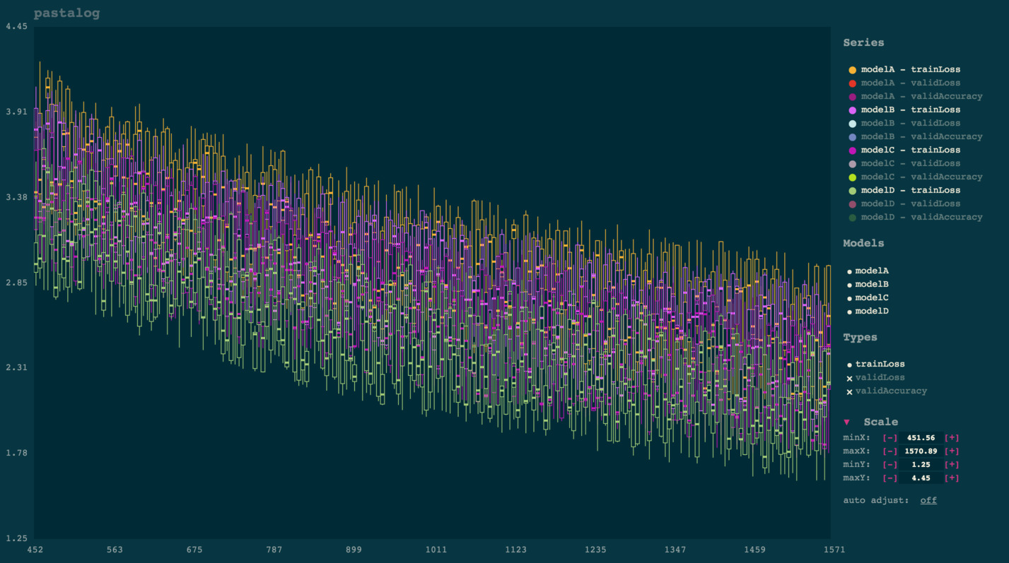
Once you start viewing a lot of points (typically several thousand), the app will automatically convert them into candlesticks for improved visibility and rendering performance. Each candlestick takes a "batch" of points on the x axis and shows aggregate statistics for the y points of that batch:
- Top of line:
max - Top of box:
third quartile - Solid square in middle:
median - Bottom of box:
first quartile - Bottom of line:
min
This tends to be much more useful to visualize than a solid mass of dots. Computationally, it makes the app a lot faster than one which renders each point.
Panning and zooming
Drag your mouse to pan. Either scroll up or down to zoom in or out.
Note: you can also pinch in/out on your trackpad to zoom.
Toggling visibility of lines
Simply click the name of any model under 'series.' To toggle everything from a certain model (e.g. modelA, or to toggle an entire type of points (e.g. validLoss), simply click those names in the legend to the right.
Deleting logs
Click the x next to the name of the series. If you confirm deletion, this will remove it on the server and remove it from your view.
Note: if you delete a series, then add more points under the same, it will act as if it is a new series.
Backups
You should backup your logs on your own and should not trust this library to store important data. Pastalog does keep track of what it sees, though, inside a file called database.json and a directory called database/, inside the root directory of the package, in case you need to access it.
Contributing
Any contributors are welcome.
# to install
git clone https://github.com/rewonc/pastalog
cd pastalog
npm install

# build + watch
npm run build:watch

# dev server + watch
npm run dev

# tests
npm test

# To prep the python module
npm run build
./package_python.sh
Misc
License
MIT License (MIT)
Copyright (c) 2016 Rewon Child
Thanks
This is named pastalog because I like to use lasagne. Props to those guys for a great library!


