当前位置:网站首页>Flutter入门进阶之旅(八)Button Widget
Flutter入门进阶之旅(八)Button Widget
2022-08-09 12:04:00 【谢栋_】
引言
上一篇博文中我们学习了GestureDetector,了解到借助GestureDetector可以赋予某些本身不具备点击回调的widget点击回调能力,完成跟用户的一些简单手势交互并作出相应的逻辑处理,我们还提到了有些widget像RaisedButton和FloatingActionButton控件本身就有onPressed回调,当用户点击控件时触发回调。本篇博客中我们就把上篇博客中提及到的各种Button归类统一说明一下。
Button集合效果图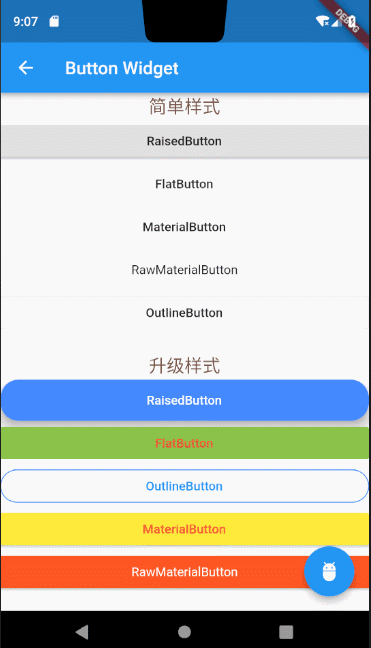
上述RaisedButton、FlatButton、OutlineButton、MaterialButton、还有RawMaterialButton、FloationgActionButton,我分三类给大家讲解,OutlineButton作为一类,RaisedButton、FlatButton、MaterialButton、RawMaterialButton不论是从构造方法还是使用上都很相似,这几个button分为一类,另外FloatingActionButton作为一类。
1.OutlineButton:
OutlineButton默认带有一个边框,我们可以通过属性指定正常状态,跟用户点击状态下的边框颜色。
我们来看下OutlineButton的构造方法,并且对它的相应属性做下使用说明。
const OutlineButton({

    Key key,
    @required VoidCallback onPressed,
    ButtonTextTheme textTheme,  //按钮上字体主题
    Color textColor,  //字体颜色
    Color disabledTextColor, //按钮禁用时候文字的颜色
    Color color,  //按钮背景颜色
    Color highlightColor,//点击或者toch控件高亮的时候显示在控件上面,水波纹下面的颜色
    Color splashColor, //水波纹的颜色
    double highlightElevation,//高亮时候的阴影
    this.borderSide,//按钮边框
    this.disabledBorderColor, //按钮禁用时边框的颜色
    this.highlightedBorderColor,//高亮时边框的颜色
    EdgeInsetsGeometry padding,//边距
    ShapeBorder shape, //设置shape
    Clip clipBehavior = Clip.none,
    Widget child,
  })
上述OutlineButton效果图上两个button的具体代码:
未指定任何样式:
 new OutlineButton(onPressed: () {
    }, child: new Text("OutlineButton")),
效果图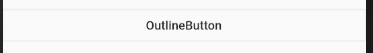
设置边框样式
 new OutlineButton(
           textColor: Colors.blue,
           highlightedBorderColor: Colors.deepOrange,
           shape: RoundedRectangleBorder(borderRadius: BorderRadius.circular(20.0)),
           borderSide: new BorderSide(color: Colors.blueAccent),
           onPressed: () {
    },
           child: new Text("OutlineButton")
         ),
效果图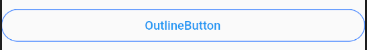
2.FloatingActionButton
FloatingActionButton做过原生安卓开发的读者应该很熟悉这个名字,在Flutter中不光引用了原生安卓的叫法,使用方法也大同小异。
构造方法
const FloatingActionButton({

    Key key,
    this.child,
    this.tooltip,
    this.foregroundColor,
    this.backgroundColor,
    this.heroTag = const _DefaultHeroTag(),
    this.elevation = 6.0,
    this.highlightElevation = 12.0,
    @required this.onPressed,
    this.mini = false,
    this.shape = const CircleBorder(),
    this.clipBehavior = Clip.none,
    this.materialTapTargetSize,
    this.isExtended = false,
  })
由于使用方法跟原生安卓中类似,我就不展开详细讲解了,稍后我会把篇首效果图上的所有代码贴上,大家可参考里面对floatingactionbutton的用法。
3.RaisedButton、FlatButton、OutlineButton、MaterialButton
这几类button十分类似,所以我把他们归为一类做讲解,但是也会有细微的差别,像FlatButton不支持设置手指点击抬起后的颜色,其他常规用法几乎一致,关于具体的细微差别,读者可自行对比构造方法,自行测试,我拿RaisedButton把代码,贴上代码,为大家演示下这几类Button的常用属性配置说明。
 new RaisedButton(
            color: Colors.blueAccent,
            //按钮的背景颜色
            padding: EdgeInsets.all(15.0),
            //按钮距离里面内容的内边距
            textColor: Colors.white,
            //文字的颜色
            textTheme: ButtonTextTheme.normal,
            //按钮的主题
            onHighlightChanged: (bool b) {

              //水波纹高亮变化回调
            },
            disabledTextColor: Colors.black54,
            //按钮禁用时候文字的颜色
            disabledColor: Colors.black54,
            //按钮被禁用的时候显示的颜色
            highlightColor: Colors.green,
            //点击或者toch控件高亮的时候显示在控件上面,水波纹下面的颜色
            splashColor: Colors.amberAccent,
            //水波纹的颜色
            colorBrightness: Brightness.light,
            //按钮主题高亮
            elevation: 10.0,
            //按钮下面的阴影
            highlightElevation: 10.0,
            //高亮时候的阴影
            disabledElevation: 10.0,
            //按下的时候的阴影
            shape: new RoundedRectangleBorder(
                borderRadius: BorderRadius.circular(20.0)),
            //设置形状
            onPressed: () {
    },
            child: new Text("RaisedButton"),
          ),
上述讲解中读者如果有不明白的地方可以参考文章开篇中贴出的各种button的效果图源码做参考,或者留言给我一块探讨,文章开篇中贴出的各种button的效果图源码如下。
import 'package:flutter/material.dart';


void main() {

  runApp(new MaterialApp(home: new ButtonPage()));
}
class ButtonPage extends StatelessWidget {

  @override
  Widget build(BuildContext context) {

    return new Scaffold(
      appBar: new AppBar(
        title: new Text("Button Widget"),
      ),
      floatingActionButton: new FloatingActionButton(
          onPressed: () {
    }, child: new Icon(Icons.adb), tooltip: "点击"),
      body: new ListView(
        children: <Widget>[
          new Text("简单样式",
              textAlign: TextAlign.center,
              style: new TextStyle(color: Colors.brown, fontSize: 20.0)),
          new RaisedButton(onPressed: () {
    }, child: new Text("RaisedButton")),
          new FlatButton(onPressed: () {
    }, child: new Text("FlatButton")),
          new MaterialButton(
              onPressed: () {
    }, child: new Text("MaterialButton")),
          new RawMaterialButton(
              onPressed: () {
    }, child: new Text("RawMaterialButton")),
          new OutlineButton(onPressed: () {
    }, child: new Text("OutlineButton")),
          new SizedBox(height: 20),
          new Text("升级样式",
              textAlign: TextAlign.center,
              style: new TextStyle(color: Colors.brown, fontSize: 20.0)),
          new RaisedButton(
            color: Colors.blueAccent,
            //按钮的背景颜色
            padding: EdgeInsets.all(15.0),
            //按钮距离里面内容的内边距
            textColor: Colors.white,
            //文字的颜色
            textTheme: ButtonTextTheme.normal,
            //按钮的主题
            onHighlightChanged: (bool b) {

              //水波纹高亮变化回调
            },
            disabledTextColor: Colors.black54,
            //按钮禁用时候文字的颜色
            disabledColor: Colors.black54,
            //按钮被禁用的时候显示的颜色
            highlightColor: Colors.green,
            //点击或者toch控件高亮的时候显示在控件上面,水波纹下面的颜色
            splashColor: Colors.amberAccent,
            //水波纹的颜色
            colorBrightness: Brightness.light,
            //按钮主题高亮
            elevation: 10.0,
            //按钮下面的阴影
            highlightElevation: 10.0,
            //高亮时候的阴影
            disabledElevation: 10.0,
            //按下的时候的阴影
            shape: new RoundedRectangleBorder(
                borderRadius: BorderRadius.circular(20.0)),
            //设置形状
            onPressed: () {
    },
            child: new Text("RaisedButton"),
          ),
          new FlatButton(
              color: Colors.lightGreen,
              textColor: Colors.red,
              onPressed: () {
    }, child: new Text("FlatButton")),
          new OutlineButton(
              textColor: Colors.blue,
              highlightedBorderColor: Colors.deepOrange,
              shape: RoundedRectangleBorder(borderRadius: BorderRadius.circular(20.0)),
              borderSide: new BorderSide(color: Colors.blueAccent),
              onPressed: () {
    },
              child: new Text("OutlineButton")
          ),
          MaterialButton(
              color: Colors.yellow,
              textColor: Colors.red,
              onPressed: () {
    },
              child: new Text("MaterialButton")
          ),
          RawMaterialButton(
              fillColor: Colors.deepOrange,
              onPressed: () {
    },
              child: new Text("RawMaterialButton",style: new TextStyle(color: Colors.white),)
          )
        ],
      ),
    );
  }
}
边栏推荐
- MongoDB-查询中$all的用法介绍
- Shell之常用小工具(sort、uniq、tr、cut)
- 26、管道参数替换命令xargs
- LeetCode #101. Symmetric Binary Tree
- WeChat side: what is consistent hashing, usage scenarios, and what problems does it solve?
- Senior told me that the giant MySQL is through SSH connection
- 内网穿透工具ngrok使用教程
- 全面了解什么是TPS、QPS以及两者的区别
- 微信一面:一致性哈希是什么,使用场景,解决了什么问题?
- GPT-3组合DALL·E,60秒内搞定游戏设定和原型动画!网友看后:这游戏想玩
猜你喜欢

你没见过的《老友记》镜头,AI给补出来了|ECCV 2022
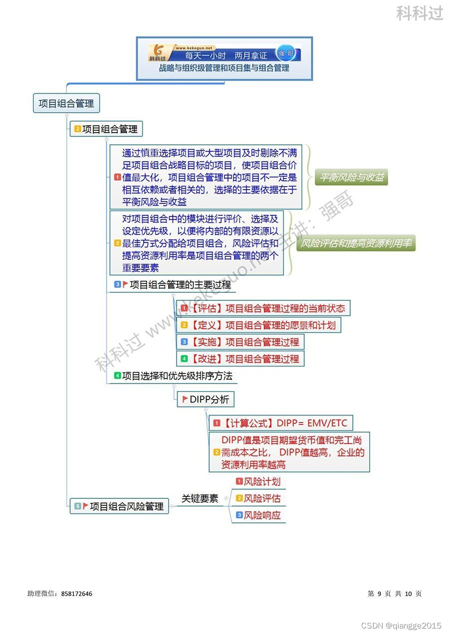
Information system project managers must memorize the core test sites (63) The main process of project portfolio management & DIPP analysis
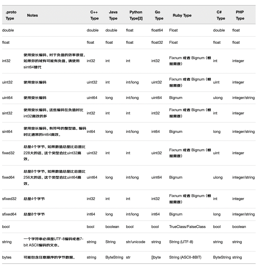
proto3-2 syntax
用皮肤“听”音乐,网友戴上这款装备听音乐会:仿佛住在钢琴里
两分钟录音就可秒变语言通!火山语音音色复刻技术如何修炼而成?
Byte Qiu Zhao confused me on both sides, and asked me under what circumstances would the SYN message be discarded?
2022 Niu Ke Duo School (6) M. Z-Game on grid
AQS Synchronization Component - FutureTask Analysis and Use Cases
箭头函数和普通函数的常见区别

1小时直播招募令:行业大咖干货分享,企业报名开启丨量子位·视点
随机推荐
Gumbel_Softmax 概要
张朝阳对话俞敏洪:一边是手推物理公式,一边是古诗信手拈来
Experiment record: the process of building a network
FFmpeg在win10上编译安装(配置libx264)
阿里云新增三大高性能计算解决方案,助力生命科学行业快速发展
Manchester city launch emotional intelligence scarf can be detected, give the fans
Nature:猪死亡1小时后,器官再次运转
世界第4疯狂的科学家,在103岁生日那天去世了
荣耀携手Blue Yonder,加快企业战略增长
Blazor Server (9) from scratch -- modify Layout
Django cannot link mysql database
Win10 compiles the x264 library (there are also generated lib files)
ARP协议原理
【Untitled】
h264 protocol
字符串转换整数 (atoi)
Here comes the question: Can I successfully apply for 8G memory on a machine with 4GB physical memory?
#物联网征文#小熊派设备开发实战
Web console control edit box
MySQL principle and optimization of Group By optimization techniques