当前位置:网站首页>Jetpack Compose——Button(按钮)的使用
Jetpack Compose——Button(按钮)的使用
2022-08-09 13:12:00 【lplj717】
Button这个组件,官方已经实现了Material Design的效果,一般来说我们直接使用这个即可,另外官方也是给我们封装了不同类型的Button,分别为IconButton、TextButton、OutlinedButton、IconToggleButton
先来看一下简单的使用效果:
       Button(onClick = { println("点击了按钮") }) {
            Icon(Icons.Default.Search, contentDescription = null)
            Text(text = "测试")
        }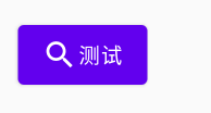
由此可以看到Button中的content内容Icon和Text是按照水平方式排列的(可以认为是Row)
Button构造参数:(简单的直接看注释,对于复杂的做一些介绍)
@Composable
fun Button(
    onClick: () -> Unit,//点击事件响应
    modifier: Modifier = Modifier,//修饰符(后面再研究)
    enabled: Boolean = true,//按钮是否可用
    interactionSource: MutableInteractionSource = remember { MutableInteractionSource() },//状态变化
    elevation: ButtonElevation? = ButtonDefaults.elevation(),//阴影
    shape: Shape = MaterialTheme.shapes.small,//形状
    border: BorderStroke? = null,//边框
    colors: ButtonColors = ButtonDefaults.buttonColors(),// 颜色
    contentPadding: PaddingValues = ButtonDefaults.ContentPadding,//内容内边距
    content: @Composable RowScope.() -> Unit//内容
)modifier的基本属性介绍请参看:Modifier的基本属性简单介绍
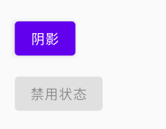
1.elevation 阴影
Button的阴影参数是有有默认值的,我们也可以修改
ButtonDefaults.elevation(defaultElevation,pressedElevation,disabledElevation,hoveredElevation,focusedElevation)
defaultElevation表示默认的阴影
pressedElevation表示按下时的阴影
disabledElevation表示未启用时候的阴影
hoveredElevation表示按钮启用并悬停时要使用的高程
focusedElevation表示按钮启用并聚焦时使用的高程
        Button(
            onClick = { println("点击了按钮") },
            elevation = ButtonDefaults.elevation(4.dp, 10.dp, 0.dp)
        ) {
            Text(text = "阴影")
        }
        Spacer(modifier = Modifier.height(10.dp))
        Button(
            onClick = { println("点击了按钮") },
            elevation = ButtonDefaults.elevation(0.dp),
            enabled = false
        ) {
            Text(text = "禁用状态")
        }
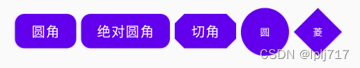
2.shape 形状
Android官方给我们提供了以下四种形状
RoundedCornerShape 圆角形状
CutCornerShape 切角形状
AbsoluteRoundedCornerShape 绝对圆角形状
AbsoluteCutCornerShape 绝对切角形状
RoundedCornerShape和AbsoluteRoundedCornerShape在属性赋值时的属性名不一样之外,视觉上没有差别
            Button(
                onClick = { println("点击了按钮") },
                shape = RoundedCornerShape(//圆角
                    topStart = 10.dp,
                    topEnd = 10.dp,
                    bottomStart = 10.dp,
                    bottomEnd = 10.dp
                )
            ) {
                Text(text = "圆角")
            }
            Spacer(modifier = Modifier.width(10.dp))
            Button(
                onClick = { println("点击了按钮") },
                shape = AbsoluteRoundedCornerShape(//圆角
                    topLeft = 10.dp,
                    topRight = 10.dp,
                    bottomLeft = 10.dp,
                    bottomRight = 10.dp
                )
            ) {
                Text(text = "绝对圆角")
            }
            Spacer(modifier = Modifier.width(10.dp))
            Button(
                onClick = { println("点击了按钮") },
                shape = CutCornerShape(//切角
                    topStart = 10.dp,
                    topEnd = 10.dp,
                    bottomStart = 10.dp,
                    bottomEnd = 10.dp
                )
            ) {
                Text(text = "切角")
            }
            Spacer(modifier = Modifier.width(10.dp))
            Button(
                modifier = Modifier
                    .width(50.dp)
                    .height(50.dp),
                onClick = { println("点击了按钮") },
                shape = RoundedCornerShape(50.dp)
            ) {
                Text(
                    text = "圆",
                    fontSize = 10.sp
                )
            }
            Spacer(modifier = Modifier.width(10.dp))
            Button(
                modifier = Modifier
                    .width(50.dp)
                    .height(50.dp),
                onClick = { println("点击了按钮") },
                shape = CutCornerShape(50.dp)
            ) {
                Text(
                    text = "菱",
                    fontSize = 10.sp
                )
            }
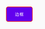
3.border 边框
使用BorderStroke,接收两个参数,宽度及颜色
            Button(
                onClick = { println("点击了按钮") },
                shape = RoundedCornerShape(5.dp),
                border = BorderStroke(1.dp,Color.Red)
            ) {
                Text(
                    text = "边框",
                    fontSize = 10.sp
                )
            }
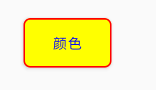
4.colors 颜色
backgroundColor表示设置背景颜色
contentColor 表示设置内容颜色这里比如说是登录文本的颜色
disabledBackgroundColor 表示enable等于false的时候的背景颜色
disabledContentColor 表示enable等于false时候的内容的颜色
            Button(
                onClick = {  },
                shape = RoundedCornerShape(5.dp),
                border = BorderStroke(1.dp, Color.Red),
                colors = ButtonDefaults.buttonColors(
                    backgroundColor = Color.Yellow,
                    contentColor = Color.Blue
                )
            ) {
                Text(
                    text = "颜色",
                    fontSize = 10.sp
                )
            }
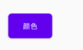
5.contentPadding 内容内边距
contentPadding参数接收一个PaddingValues对象,这个对象的构造方法如下:
PaddingValues(all) //上下左右内边距
PaddingValues(horizontal: Dp, vertical: Dp) //水平边距,垂直边距
PaddingValues(start: Dp = 0.dp,top: Dp = 0.dp,end: Dp = 0.dp,bottom: Dp = 0.dp) //左内边距,上内边距,右内边距,下内边距
            Button(
                onClick = {  },
                shape = RoundedCornerShape(5.dp),
                contentPadding = PaddingValues(10.dp)
            ) {
                Text(
                    text = "颜色",
                    fontSize = 10.sp
                )
            }
6.interactionSource 状态变化
这个主要是用来按钮的状态说明,类似selector的xml文件给按钮设置样式
interactionSource是一个接口,我们需要使用其的实现类MutableInteractionSource
MutableInteractionSource 中提供了三个属性用来获取状态
collectIsPressedAsState 按压状态
collectIsDraggedAsState 拖动状态
collectIsFocusedAsState 焦点状态
        val myInteractionSource = remember {
            MutableInteractionSource()
        }
        val pressState = myInteractionSource.collectIsPressedAsState()
        //如果是按压状态则是红色,否则则是蓝色
        val myShape = if (pressState.value) ButtonDefaults.buttonColors(backgroundColor = Color.Red) else ButtonDefaults.buttonColors(backgroundColor = Color.Blue)
        Button(
            onClick = {},
            //设置定义的shape
            colors = myShape,
            //设置创建的MutableInteractionSource对象
            interactionSource = myInteractionSource
        ) {
            Text(
                text = "按钮状态",
                fontSize = 10.sp
            )
        }
效果如图(需要按住才有效果)

这些都是基础Button,其他的那些IconButton、TextButton、OutlinedButton、IconToggleButton后面有时间在来研究,今天就先到这里,代码路漫漫啊
边栏推荐
猜你喜欢
随机推荐
pytest 与 unittest 的区别
openharmony容器组件之GridContainer
puzzle(016.5)逻辑电路
面试攻略系列(二)-- 秒杀系统
蓝桥杯线上模拟赛——Flex 经典骰子布局
PO、DO、TO、VO、DO、DTO、DAO、POJO都是什么?
群组行动控制--自动队列化实现策略
Draw a histogram with plot_hist_numeric()
技嘉显卡 RGBFusion 不能调光解决方法
NC161 二叉树的中序遍历
Spark Sql之join on and和where
Unity3d_API_Gyroscope 陀螺仪的接口
【面试高频题】可逐步优化的链表高频题
IDEA Gradle 常遇问题(二)(持续更新)
X264性能优化
Unity3d_API_GPS_LocationService
01_iTween_第一天--小球抛物线
ArcEngine(十)创建矢量图层
32位机器和64位机器基本数据类型长度
力扣学习路径