当前位置:网站首页>练习电影卡片、过渡、动画、变形、旋转,练习时钟、立方体、缩放
练习电影卡片、过渡、动画、变形、旋转,练习时钟、立方体、缩放
2022-08-09 07:42:00 【Xiaoweidumpb】
<!DOCTYPE html>
<html lang="en">
<head>
<meta charset="UTF-8">
<meta name="viewport" content="width=device-width, initial-scale=1.0">
<meta http-equiv="X-UA-Compatible" content="ie=edge">
<title>Document</title>
<link rel="stylesheet" href="./css/reset.css">
<link rel="stylesheet" href="./fa/css/all.css">
<style> /* 设置外层容器 */ .outer{
width: 240px; margin: 100px auto; /* 设置阴影 */ box-shadow: 0 0 10px rgba(0, 0, 0, .3); } /* .img-wrapper{ border: 1px red solid; } */ /* 设置图片 */ .img-wrapper img{
width: 100%; vertical-align: bottom; } .info{
padding: 0 18px; color: #acaaaa; font-size: 14px; } /* 设置标题 */ .info .title{
color: #717171; font-size: 18px; margin: 13px 0 15px 0; } .info .category i{
margin-left: 4px; margin-right: 7px; } /* 设置简介的样式 */ .info .intro{
margin: 18px 4px; line-height: 20px; } /* 设置下边的内容 */ .star-wrapper{
height: 46px; line-height: 46px; border-top: 1px solid #e9e9e9; color: #ddd; padding: 0 16px; } /* 设置星星的样式 */ .star-wrapper .star{
float: left; } .star-wrapper .light{
color: #b9cb41; } .star-wrapper .weibo{
float: right; } </style>
</head>
<body>
<!-- 创建一个外层容器 -->
<div class="outer">
<!-- 创建图片容器 -->
<div class="img-wrapper">
<!-- 设置图片 -->
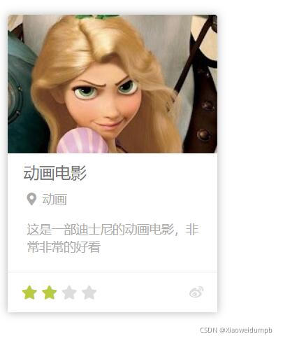
<img src="./img/10/1.jpg" alt="">
</div>
<!-- 创建内容区容器 -->
<div class="info">
<h2 class="title">
动画电影
</h2>
<h3 class="category">
<i class="fas fa-map-marker-alt"></i>动画
</h3>
<p class="intro">
这是一部迪士尼的动画电影,非常非常的好看
</p>
</div>
<!-- 创建评分的容器 -->
<div class="star-wrapper">
<!-- 创建星星 -->
<ul class="star">
<li class="fas fa-star light"></li>
<li class="fas fa-star light"></li>
<li class="fas fa-star"></li>
<li class="fas fa-star"></li>
</ul>
<!-- 创建 -->
<ul class="weibo">
<li class="fab fa-weibo"></li>
</ul>
</div>
</div>
</body>
</html>
<!DOCTYPE html>
<html lang="en">
<head>
    <meta charset="UTF-8">
    <meta name="viewport" content="width=device-width, initial-scale=1.0">
    <meta http-equiv="X-UA-Compatible" content="ie=edge">
    <title>Document</title>

    <style> *{
       margin: 0; padding: 0; } .box1{
       width: 800px; height: 800px; background-color: silver; overflow: hidden; } .box1 div{
       width: 100px; height: 100px; margin-bottom: 100px; margin-left: 0; } .box2{
       background-color: #bfa; /* margin-left: auto; */ /* transition:all 2s; */ /* 过渡(transition) - 通过过渡可以指定一个属性发生变化时的切换方式 - 通过过渡可以创建一些非常好的效果,提升用户的体验 */ /* transition-property: 指定要执行过渡的属性 多个属性间使用,隔开 如果所有属性都需要过渡,则使用all关键字 大部分属性都支持过渡效果,注意过渡时必须是从一个有效数值向另外一个有效数值进行过渡 */ /* transition-property: height , width; */ /* transition-property: all; */ /* transition-duration: 指定过渡效果的持续时间 时间单位:s 和 ms 1s = 1000ms */ /* transition-duration: 100ms, 2s; */ /* transition-duration: 2s; */ /* transition-timing-function: 过渡的时序函数 指定过渡的执行的方式 可选值: ease 默认值,慢速开始,先加速,再减速 linear 匀速运动 ease-in 加速运动 ease-out 减速运动 ease-in-out 先加速 后减速 cubic-bezier() 来指定时序函数 https://cubic-bezier.com steps() 分步执行过渡效果 可以设置一个第二个值: end , 在时间结束时执行过渡(默认值) start , 在时间开始时执行过渡 */ /* transition-timing-function: cubic-bezier(.24,.95,.82,-0.88); */ /* transition-timing-function: steps(2, start); */ /* transition-delay: 过渡效果的延迟,等待一段时间后在执行过渡 */ /* transition-delay: 2s; */ /* transition 可以同时设置过渡相关的所有属性,只有一个要求,如果要写延迟,则两个时间中第一个是持续时间,第二个是延迟 */ transition:2s margin-left 1s cubic-bezier(.24,.95,.82,-0.88); } .box3{
       background-color: orange; transition-property: all; transition-duration: 2s; } .box1:hover div{
       /* width: 200px; height: 200px; */ /* background-color: orange; */ margin-left: 700px; } </style>

</head>
<body>

    <div class="box1">
        <div class="box2"></div>
        <div class="box3"></div>
    </div>

</body>
</html>
动画
<!DOCTYPE html>
<html lang="en">

<head>
    <meta charset="UTF-8">
    <meta name="viewport" content="width=device-width, initial-scale=1.0">
    <meta http-equiv="X-UA-Compatible" content="ie=edge">
    <title>Document</title>

    <style> * {
       margin: 0; padding: 0; } .box1 {
       width: 800px; height: 800px; background-color: silver; overflow: hidden; } .box1 div {
       width: 100px; height: 100px; margin-bottom: 100px; margin-left: 10px; } .box2 {
       background-color: #bfa; /* 设置box2的动画 */ /* animation-name: 要对当前元素生效的关键帧的名字 */ /* animation-name: test; */ /* animation-duration: 动画的执行时间 */ /* animation-duration: 4s; */ /* 动画的延时 */ /* animation-delay: 2s; */ /* animation-timing-function: ease-in-out; */ /* animation-iteration-count 动画执行的次数 可选值: 次数 infinite 无限执行 */ /* animation-iteration-count: 1; */ /* animation-direction 指定动画运行的方向 可选值: normal 默认值 从 from 向 to运行 每次都是这样 reverse 从 to 向 from 运行 每次都是这样 alternate 从 from 向 to运行 重复执行动画时反向执行 alternate-reverse 从 to 向 from运行 重复执行动画时反向执行 */ /* animation-direction: alternate-reverse; */ /* animation-play-state: 设置动画的执行状态 可选值: running 默认值 动画执行 paused 动画暂停 */ /* animation-play-state: paused; */ /* animation-fill-mode: 动画的填充模式 可选值: none 默认值 动画执行完毕元素回到原来位置 forwards 动画执行完毕元素会停止在动画结束的位置 backwards 动画延时等待时,元素就会处于开始位置 both 结合了forwards 和 backwards */ /* animation-fill-mode: both; */ animation: test 2s 2 1s alternate; } .box1:hover div {
       animation-play-state: paused; } /* 动画 动画和过渡类似,都是可以实现一些动态的效果, 不同的是过渡需要在某个属性发生变化时才会触发 动画可以自动触发动态效果 设置动画效果,必须先要设置一个关键帧,关键帧设置了动画执行每一个步骤 */ @keyframes test {
       /* from表示动画的开始位置 也可以使用 0% */ from {
       margin-left: 0; background-color: orange; } /* to动画的结束位置 也可以使用100%*/ to {
       background-color: red; margin-left: 700px; } } </style>

</head>

<body>

    <div class="box1">
        <div class="box2"></div>
        <!-- <div class="box3"></div> -->
    </div>

</body>

</html>
练习奔跑
<!DOCTYPE html>
<html lang="en">
<head>
    <meta charset="UTF-8">
    <meta name="viewport" content="width=device-width, initial-scale=1.0">
    <meta http-equiv="X-UA-Compatible" content="ie=edge">
    <title>Document</title>
    <style> .box1{
       width: 256px; height: 256px; margin: 0 auto; background-image: url('./img/12/bg2.png'); animation: run 1s steps(6) infinite; } /* 创建关键帧 */ @keyframes run {
       from{
       background-position: 0 0; } to{
       background-position: -1536px 0; } } </style>
</head>
<body>
    <div class="box1"></div>
</body>
</html>
动画
<!DOCTYPE html>
<html lang="en">
<head>
    <meta charset="UTF-8">
    <meta name="viewport" content="width=device-width, initial-scale=1.0">
    <meta http-equiv="X-UA-Compatible" content="ie=edge">
    <title>Document</title>
    <style> .outer{
       height: 500px; border-bottom: 10px black solid; margin: 50px auto; overflow: hidden; } .outer div{
       float: left; width: 100px; height: 100px; border-radius: 50%; background-color: #bfa; animation: ball .5s forwards linear infinite alternate; } div.box2{
       background-color: orange; animation-delay: .1s; } div.box3{
       background-color: yellow; animation-delay: .2s; } div.box4{
       background-color: yellowgreen; animation-delay: .3s; } div.box5{
       background-color: blue; animation-delay: .4s; } div.box6{
       background-color: pink; animation-delay: .5s; } div.box7{
       background-color: tomato; animation-delay: .6s; } div.box8{
       background-color: skyblue; animation-delay: .7s; } div.box9{
       background-color: chocolate; animation-delay: .8s; } /* 创建小球下落的动画 */ @keyframes ball {
       from{
       margin-top: 0; } to{
       margin-top: 400px; } /* 2 to{ margin-top: 400px; animation-timing-function: ease-in; } 40%{ margin-top: 100px; } 80%{ margin-top: 200px; } */ } </style>
</head>
<body>

    <div class="outer">
        <div class="box1"></div>
        <div class="box2"></div>
        <div class="box3"></div>
        <div class="box4"></div>
        <div class="box5"></div>
        <div class="box6"></div>
        <div class="box7"></div>
        <div class="box8"></div>
        <div class="box9"></div>
    </div>

</body>
</html>
变形
<!DOCTYPE html>
<html lang="en">
<head>
    <meta charset="UTF-8">
    <meta name="viewport" content="width=device-width, initial-scale=1.0">
    <meta http-equiv="X-UA-Compatible" content="ie=edge">
    <title>Document</title>
    <style> body{
       background-color: rgb(236, 236, 236); } .box1{
       width: 200px; height: 200px; background-color: #bfa; margin: 0 auto; margin-top: 200px; /* 变形就是指通过CSS来改变元素的形状或位置 - 变形不会影响到页面的布局 - transform 用来设置元素的变形效果 - 平移: translateX() 沿着x轴方向平移 translateY() 沿着y轴方向平移 translateZ() 沿着z轴方向平移 - 平移元素,百分比是相对于自身计算的 */ /* transform: translateY(-100px); */ transform: translateX(100%); } /* .box2{ width: 200px; height: 200px; background-color: orange; margin: 0 auto; } */ .box3{
       background-color: orange; position: absolute; /* 这种居中方式,只适用于元素的大小确定 top: 0; left: 0; bottom: 0; right: 0; margin: auto; */ left: 50%; top: 50%; transform: translateX(-50%) translateY(-50%); } .box4, .box5{
       width: 220px; height: 300px; background-color: #fff; float: left; margin: 0 10px; transition:all .3s; } .box4:hover,.box5:hover{
       transform: translateY(-4px); box-shadow: 0 0 10px rgba(0, 0, 0, .3) } </style>
</head>
<body>

    <div class="box1"></div>

    <div class="box2"></div>

    <!-- <div class="box3"> aaaa </div> -->

    <div class="box4">

    </div>

    <div class="box5">

        </div>

</body>
</html>
z轴平移
<!DOCTYPE html>
<html lang="en">
<head>
    <meta charset="UTF-8">
    <meta name="viewport" content="width=device-width, initial-scale=1.0">
    <meta http-equiv="X-UA-Compatible" content="ie=edge">
    <title>Document</title>
    <style> html{
       /* 设置当前网页的视距为800px,人眼距离网页的距离 */ perspective: 800px; } body{
       border: 1px red solid; background-color: rgb(241, 241, 241); } .box1{
       width: 200px; height: 200px; background-color: #bfa; margin: 200px auto; /* z轴平移,调整元素在z轴的位置,正常情况就是调整元素和人眼之间的距离, 距离越大,元素离人越近 z轴平移属于立体效果(近大远小),默认情况下网页是不支持透视,如果需要看见效果 必须要设置网页的视距 */ transition:2s; } body:hover .box1{
       transform: translateZ(800px); } </style>
</head>
<body>

    <div class="box1"></div>

</body>
</html>
旋转
<!DOCTYPE html>
<html lang="en">
<head>
    <meta charset="UTF-8">
    <meta name="viewport" content="width=device-width, initial-scale=1.0">
    <meta http-equiv="X-UA-Compatible" content="ie=edge">
    <title>Document</title>
    <style> html{
       perspective: 800px; } body{
       border: 1px red solid; background-color: rgb(241, 241, 241); } .box1{
       width: 320px; height: 320px; background-color: #bfa; margin: 200px auto; transition:2s; } body:hover .box1{
       /* 通过旋转可以使元素沿着x y 或 z旋转指定的角度 rotateX() rotateY() rotateZ() */ /* transform: rotateZ(.25turn); */ /* transform: rotateY(180deg) translateZ(400px); */ /* transform: translateZ(400px) rotateY(180deg) ; */ transform: rotateY(180deg); /* 是否显示元素的背面 */ backface-visibility: hidden; } </style>
</head>
<body>

    <div class="box1">
        <img src="an.jpg" alt="">
    </div>

</body>
</html>
练习时钟
<!DOCTYPE html>
<html lang="en">

<head>
    <meta charset="UTF-8">
    <meta name="viewport" content="width=device-width, initial-scale=1.0">
    <meta http-equiv="X-UA-Compatible" content="ie=edge">
    <title>Document</title>
    <style> * {
       margin: 0; padding: 0; } /* 设置表的样式 */ .clock {
       width: 500px; height: 500px; margin: 0 auto; margin-top: 100px; border-radius: 50%; /* border: 10px solid black; */ position: relative; background-image: url(./img/13/bg3.jpg); background-size: cover; } .clock>div {
       position: absolute; top: 0; left: 0; bottom: 0; right: 0; margin: auto; } /* 设置时针 */ .hour-wrapper {
       height: 70%; width: 70%; animation: run 7200s linear infinite; } .hour {
       height: 50%; width: 6px; background-color: #000; margin: 0 auto; } /* 设置分针 */ .min-wrapper {
       height: 80%; width: 80%; animation: run 600s steps(60) infinite; } .min {
       height: 50%; width: 4px; background-color: #000; margin: 0 auto } /* 设置秒针 */ .sec-wrapper {
       height: 90%; width: 90%; animation: run 10s steps(60) infinite; } .sec {
       height: 50%; width: 2px; background-color: #f00; margin: 0 auto } /* 旋转的关键帧 */ @keyframes run {
       from {
       transform: rotateZ(0); } to {
       transform: rotateZ(360deg); } } </style>
</head>

<body>

    <!-- 创建表的容器 -->
    <div class="clock">
        <!-- 创建时针 -->
        <div class="hour-wrapper">
            <div class="hour"></div>
        </div>

        <!-- 创建分针 -->
        <div class="min-wrapper">
            <div class="min"></div>
        </div>

        <!-- 创建秒针 -->
        <div class="sec-wrapper">
            <div class="sec"></div>
        </div>

    </div>


</body>

</html>
立方体
<!DOCTYPE html>
<html lang="en">

<head>
    <meta charset="UTF-8">
    <meta http-equiv="X-UA-Compatible" content="IE=edge">
    <meta name="viewport" content="width=device-width, initial-scale=1.0">
    <title>Document</title>
    <style> html {
       perspective: 800px; } .cube {
       width: 200px; height: 200px; /* background-color: #bfa; */ margin: 100px auto; /* 设置3d变形效果 */ transform-style: preserve-3d; /* transform: rotateX(45deg) rotateZ(45deg); */ animation: rotate 20s infinite linear; /* transform:rotateY(45deg) scaleZ(2); */ } .cube>div {
       width: 200px; height: 200px; opacity: 0.7; position: absolute; } .img {
       vertical-align: top; } .box1 {
       transform: rotateY(90deg) translateZ(100px); } .box2 {
       transform: rotateY(-90deg) translateZ(100px); } .box3 {
       transform: rotateX(90deg) translateZ(100px); } .box4 {
       transform: rotateX(-90deg) translateZ(100px); } .box5 {
       transform: rotateY(180deg) translateZ(100px); } .box6 {
       transform: rotateY(0deg) translateZ(100px); } @keyframes rotate {
       form {
       transform: rotateX(0) rotateZ(0) } to {
       transform: rotateX(1turn) rotateZ(1turn) } } </style>
</head>

<body>
    <div class="cube">
        <!-- 引入图片 -->
        <div class="box1">
            <img src="./img/14/1.jpg">
        </div>

        <div class="box2">
            <img src="./img/14/2.jpg">
        </div>

        <div class="box3">
            <img src="./img/14/3.jpg">
        </div>

        <div class="box4">
            <img src="./img/14/4.jpg">
        </div>

        <div class="box5">
            <img src="./img/14/5.jpg">
        </div>

        <div class="box6">
            <img src="./img/14/6.jpg">
        </div>
    </div>
</body>

</html>
<!DOCTYPE html>
<html lang="en">
<head>
    <meta charset="UTF-8">
    <meta name="viewport" content="width=device-width, initial-scale=1.0">
    <meta http-equiv="X-UA-Compatible" content="ie=edge">
    <title>Document</title>
    <style> html{
       perspective:800px; } .box1{
       width: 100px; height: 100px; background-color: #bfa; transition:2s; margin: 100px auto; /* 变形的原点 默认值 center*/ /* transform-origin:20px 20px; */ } .box1:hover{
       /* 对元素进行缩放的函数: scaleX() 水平方向缩放 scaleY() 垂直方向缩放 scale() 双方向的缩放 */ transform:scale(2) } .img-wrapper{
       width: 200px; height: 200px; border: 1px red solid; overflow: hidden; } img{
       transition: .2s; } .img-wrapper:hover img{
       transform:scale(1.2); } </style>
</head>
<body>

    <div class="box1"></div>

    <div class="img-wrapper">
        <img src="an.jpg" width="100%">
    </div>


</body>
</html>
边栏推荐
猜你喜欢
随机推荐
接口测试概念
MVN 中配置flyway mysq
Codeforces Round #359 (Div. 2) C. Robbers' watch 暴力枚举
Lottie系列四:使用建议
力扣208,实现Trie(前缀树)
数据库索引原理
浅识微服务架构
MUV LUV EXTRA 2019CCPC Qinhuangdao Station J Question KMP
list与string转换
Oracle 限制时将空值排除
web自动化测试有哪些工具和框架?
Snake game, C language
HDU - 3183 A Magic Lamp Segment Tree
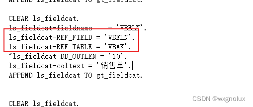
SAP ALV 数据导出被截断的bug
LeetCode:876. 链表的中间结点————简单
Anaconda 使用代理
Anaconda replaces the default virtual environment
Codeforces Round #359 (Div. 2) C. Robbers' watch Violent Enumeration
工信部等四部门推动绿色智能家居产品下乡
金九银十即将到来,求职套路多,面试指南我来分享~