当前位置:网站首页>Jetpack Compose - simply the basic attributes of Modifier is introduced
Jetpack Compose - simply the basic attributes of Modifier is introduced
2022-08-09 14:18:00 【lplj717】
首先来看一个简单的例子:
    Column {
        Box(
            Modifier
                .size(100.dp)
                .background(Color.Green)
                .padding(16.dp)
        )
        Box(
            Modifier
                .size(100.dp)
                .padding(16.dp)
                .background(Color.Green)
        )
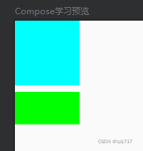
效果如图:
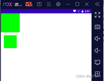
Modifiercan be seen in the designmodifierDifferent order will result in different effects
如果先设置背景,然后设置padding,那么paddingon a green background
如果是先设置padding,Then setting the background color is forpaddingAfter the layout is set
宽度,高度,边距(Size类)
size
size(size: Dp)//同时设置宽高
size(width: Dp, height: Dp)//设置宽高
size(size: DpSize)//Set the width and height properties
width:单独设置宽度
width(width: Dp)hegiht:单独设置高度
hegiht(hegiht: Dp)defaultMinSize:Sets the minimum default width and height
defaultMinSize(
    minWidth: Dp = Dp.Unspecified,
    minHeight: Dp = Dp.Unspecified
)
sizeIn:设置宽高的最小值和最大值,宽度在minWidth~maxWidth之间,高度在minHeight~maxHeight之间
sizeIn(
    minWidth: Dp = Dp.Unspecified,
    minHeight: Dp = Dp.Unspecified,
    maxWidth: Dp = Dp.Unspecified,
    maxHeight: Dp = Dp.Unspecified
)
也有单独给宽度或高度设置的方法
widthIn(min: Dp = Dp.Unspecified, max: Dp = Dp.Unspecified)
heightIn(min: Dp = Dp.Unspecified, max: Dp = Dp.Unspecified)
fillMaxSize:宽高都填充满父布局(相当于原生xml中的match_parent),默认是1f,代表填充满父布局,如果设置为0.5f,则是填满父布局的0.5(即一半)
fillMaxSize(fraction: Float = 1f)除此之外,也有单独给宽度或高度方法
fillMaxWidth(fraction: Float = 1f)
fillMaxHegiht(fraction: Float = 1f)
wrapContentSize:组件的控件宽高若是小与定义的最小宽高,会将组件进行排列的设置
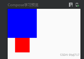
    Column {
        Box(
            Modifier
                .sizeIn(minWidth = 40.dp, minHeight = 40.dp)
                .size(20.dp)//设置的size小于最小宽高,最终渲染出来的就是40*40的
                .background(Color.Blue)
        )
        Box(
            Modifier
                .sizeIn(minWidth = 40.dp, minHeight = 40.dp)
                .wrapContentSize(Alignment.TopCenter)//设置wrapContentSize
                .size(20.dp)//设置的size小于最小宽高,最终渲染出来的就是20*20的,对齐方式为TopCenter
                .background(Color.Red)
        )
    }
效果如图:
There are also ways to set the width and height separately:
//设置宽度
wrapContentWidth(
align: Alignment.Horizontal = Alignment.CenterHorizontally,
unbounded: Boolean = false
)
//设置高度
wrapContentHeight(
align: Alignment.Vertical = Alignment.CenterVertically,
unbounded: Boolean = false
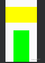
) Box(
Modifier
.sizeIn(minWidth = 40.dp, minHeight = 40.dp)
.wrapContentHeight(Alignment.CenterVertically)//设置wrapContentSize
.height(20.dp)//高20,宽40,垂直居中
.background(Color.Yellow)
)
Box(
Modifier
.sizeIn(minWidth = 40.dp, minHeight = 40.dp)
.wrapContentWidth(Alignment.CenterHorizontally)//设置wrapContentSize
.width(20.dp)//宽20,高40,水平居中
.background(Color.Green)
)如图:
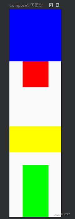
综合:
Column {
Box(
Modifier
.sizeIn(minWidth = 40.dp, minHeight = 40.dp)
.size(20.dp)//设置的size小于最小宽高,最终渲染出来的就是40*40的
.background(Color.Blue)
)
Box(
Modifier
.sizeIn(minWidth = 40.dp, minHeight = 40.dp)
.wrapContentSize(Alignment.TopCenter)//设置wrapContentSize
.size(20.dp)//设置的size小于最小宽高,最终渲染出来的就是20*20的,对齐方式为TopCenter
.background(Color.Red)
)
        Box(
            Modifier
                .sizeIn(minWidth = 40.dp, minHeight = 40.dp)
                .wrapContentHeight(Alignment.CenterVertically)//设置wrapContentSize
                .height(20.dp)//高20,宽40,垂直居中
                .background(Color.Yellow)
        )
        Box(
            Modifier
                .sizeIn(minWidth = 40.dp, minHeight = 40.dp)
                .wrapContentWidth(Alignment.CenterHorizontally)//设置wrapContentSize
                .width(20.dp)//宽20,高40,水平居中
                .background(Color.Green)
        )
}效果如图:
padding:边距,You can directly view the construction parameters(有四种),这里不多做介绍了
padding(all: Dp)

padding(
    horizontal: Dp = 0.dp,
    vertical: Dp = 0.dp
)

padding(
    start: Dp = 0.dp,
    top: Dp = 0.dp,
    end: Dp = 0.dp,
    bottom: Dp = 0.dp
)

padding(paddingValues: PaddingValues)
点击 双击 长按(事件类)
clickable:点击事件(其中onClickLabel和roleMainly properties for blind people)
clickable(
enabled: Boolean = true,//Controls the enabled state
onClickLabel: String? = null,//可访问性标签
role: Role? = null,//The type of user interface element
onClick: () -> Unit//点击回调
)
clickable(
interactionSource: MutableInteractionSource,//Determine the click state of the button
indication: Indication?,//Draw water ripples or click to highlight the effect
enabled: Boolean = true,
onClickLabel: String? = null,
role: Role? = null,
onClick: () -> Unit
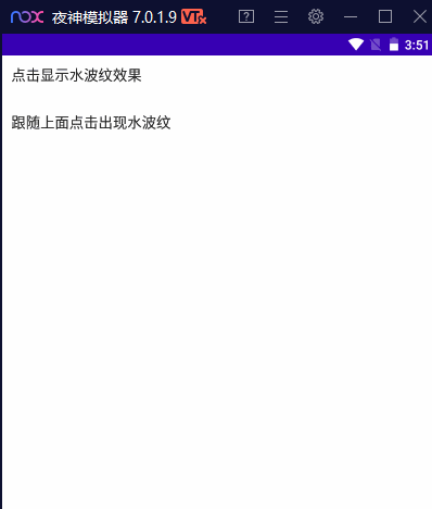
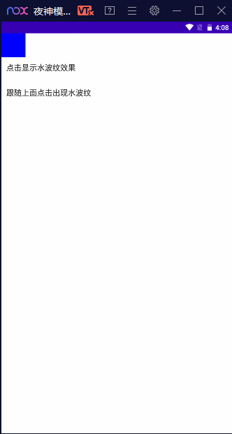
)使用:
    Column {
        Text(
            text = "Click to display the water ripple effect",
            modifier = Modifier
                .clickable(
                    interactionSource = interactionSourceM,
                    indication = rememberRipple()
                ) { }
                .padding(10.dp)
        )
        Spacer(modifier = Modifier.requiredHeight(10.dp))
        Text(
            text = "Follow the above click to appear water ripples", modifier = Modifier
                .indication(
                    interactionSourceM,
                    LocalIndication.current
                )
                .padding(10.dp)
        )
    }
效果如图:
combinedClickable是实验性的API随时可能删除
@ExperimentalFoundationApi
fun Modifier.combinedClickable(
    enabled: Boolean = true,
    onClickLabel: String? = null,
    role: Role? = null,
    onLongClickLabel: String? = null,
    onLongClick: (() -> Unit)? = null,
    onDoubleClick: (() -> Unit)? = null,
    onClick: () -> Unit
)
使用:
        Box(
            Modifier
                .size(50.dp)
                .background(Color.Blue)
                .combinedClickable(
                    onLongClick = {
                        Toast
                            .makeText(context, "长按", Toast.LENGTH_SHORT)
                            .show()
                    },
                    onDoubleClick = {
                        Toast
                            .makeText(context, "双击", Toast.LENGTH_SHORT)
                            .show()
                    },
                    onClick = {
                        Toast
                            .makeText(context, "点击", Toast.LENGTH_SHORT)
                            .show()
                    })
        )
效果:
shape(形状),border(边框),background(背景)
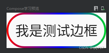
关于shape可以查看之前写的Button中有详细介绍,这里介绍一下border
border:
border(width: Dp, brush: Brush, shape: Shape)
border(border: BorderStroke, shape: Shape = RectangleShape)
border(width: Dp, color: Color, shape: Shape = RectangleShape)
val gradientBrush = Brush.horizontalGradient(
colors = listOf(Color.Red, Color.Blue, Color.Green),
startX = 0.0f,
endX = 350.0f,
tileMode = TileMode.Repeated
)
Text(
text = "I am testing borders",
modifier = Modifier
.border(width = 2.dp, brush = gradientBrush, shape = CircleShape)
.padding(10.dp)
)效果如图:
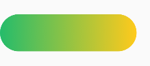
background:设置背景及背景形状
background(
    color: Color,
    shape: Shape = RectangleShape
)
background(
    brush: Brush,
    shape: Shape = RectangleShape,
    /*@FloatRange(from = 0.0, to = 1.0)*/
    alpha: Float = 1.0f
)
        val colorList = arrayListOf(Color(0xFF25BC6B), Color(0xFFFFCA1C))
        Box(
            modifier = Modifier
                .width(220.dp)
                .height(60.dp)
                .background(
                    brush = Brush.horizontalGradient(colorList),
                    shape = RoundedCornerShape(50)
                )
                .padding(10.dp)

        )
效果如图:
滑动效果
Compose没有Scrollview,要想Row或Column实现滚动效果,就得使用modifier来实现,如果不加verticalScroll,Column是无法向下滚动的
verticalScroll:
verticalScroll(
state: ScrollState,//滚动状态
enabled: Boolean = true,//Whether to enable scrolling by touch input
flingBehavior: FlingBehavior? = null,
reverseScrolling: Boolean = false//false默认顶部,true自动滚动到底部
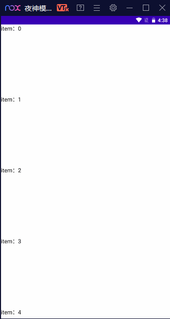
) Column(Modifier.verticalScroll(rememberScrollState())) {
repeat(10){
Box(
Modifier
.fillMaxWidth()
.height(200.dp)
){
Text(text = "item:$it")
}
}
}效果如图:
Column + verticalScroll Achieve vertical scrolling effect
Row + horizontalScroll Achieve horizontal scrolling effect
horizontalScroll和verticalScrollThe parameters and usage are basically similar,Records are not repeated here
horizontalScroll(
    state: ScrollState,
    enabled: Boolean = true,
    flingBehavior: FlingBehavior? = null,
    reverseScrolling: Boolean = false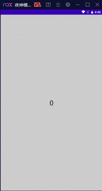
) scrollable:in a single directionUIElement configuration touch scroll and throw
scrollable(
    state: ScrollableState,
    orientation: Orientation,
    enabled: Boolean = true,
    reverseDirection: Boolean = false,
    flingBehavior: FlingBehavior? = null,
    interactionSource: MutableInteractionSource? = null
)
val offset = remember { mutableStateOf(0f) }
Box(
Modifier
.size(150.dp)
.scrollable(
orientation = Orientation.Vertical,
// state for Scrollable, describes how consume scroll amount
state = rememberScrollableState { delta ->
offset.value = offset.value + delta // update the state
delta // indicate that we consumed all the pixels available
}
)
.background(Color.LightGray),
contentAlignment = Alignment.Center
) {
Text(offset.value.roundToInt().toString(), style = TextStyle(fontSize = 32.sp))
}效果如图:
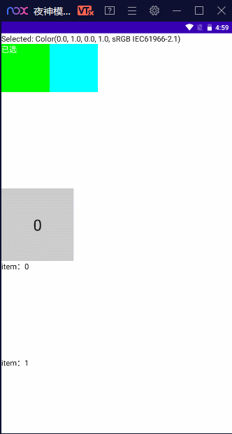
selectable:实现单选功能
        val option1 = Color.Green
        val option2 = Color.Cyan
        var selectedOption by remember { mutableStateOf(option1) }
        Column {
            Text("Selected: $selectedOption")
            Row {
                listOf(option1, option2).forEach { color ->
                    val selected = selectedOption == color
                    Box(
                        Modifier
                            .size(140.dp)
                            .background(color = color)
                            .selectable(
                                selected = selected,
                                onClick = { selectedOption = color }
                            )
                    ) {
                        if (selected) Text(text = "已选", color = Color.White)
                    }
                }
            }
        }
效果如图:
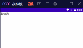
toggleable类似复选框的勾选及不勾选
        var checked by remember { mutableStateOf(false) }
        Text(
            modifier = Modifier.toggleable(value = checked, onValueChange = { checked = it }),
            text = if(checked) "勾选" else "unchecked"
        )
效果如图:
aspectRatio:纵横比
    Column {
        Box(
            Modifier
                .size(100.dp)
                .background(Color.Cyan)
        )
        Spacer(modifier = Modifier.requiredHeight(10.dp))
        Box(
            Modifier
                .width(100.dp)
                .aspectRatio(2f)
                .background(Color.Green)
        )
    }
效果如图:
rotate:组件沿中心顺时针旋转,最高支持360°
        Box(
            Modifier
                .rotate(45f)
                .background(Color.Blue)
                .size(100.dp, 100.dp)
        )
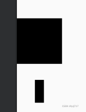
scale:缩放
        Box(
            Modifier
                .background(Color.Black)
                .size(100.dp, 100.dp)
        )
        Spacer(modifier = Modifier.requiredHeight(10.dp))
        Box(
            Modifier.scale(scaleX = 0.2f, scaleY = 0.5f)
                .background(Color.Black)
                .size(100.dp, 100.dp)
        )
效果如图:
持续奋斗....
边栏推荐
猜你喜欢

随机推荐
Jetpack Compose——Button(按钮)的使用
记一次 ERROR scheduler.AsyncEventQueue: Dropping event from queue shared导致OOM
openharmony容器组件之Counter
浅谈CQRS模式
搭建大型分布式服务(四)Docker搭建开发环境安装Mysql
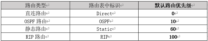
ensp如何正确配置静态路由
目标检测基础
操作系统迁移实战之在openEuler上部署MySQL数据库
Q_06_02 类型模型
NC7 买卖股票的最好时机(一)
The sword refers to Offer 56 - II. Number of occurrences of a number in an array II (bit operation)
缓存和数据库一致性问题
企业公众号开通微信支付
pytest 之 fixture的调用
Q_04_05 使用Qubits
音视频录入的pts和dts问题
X264性能优化
对百度的内容进行修改
【瑞吉外卖】day05:增、删、改、查分类以及公共字段自动填充
PO、DO、TO、VO、DO、DTO、DAO、POJO都是什么?