当前位置:网站首页>Further study of data visualization
Further study of data visualization
2022-04-23 17:03:00 【Eli-sun】
Highcharts
Highcharts It's a pure JavaScript Write a chart Library .
Highstock
Highstock It's pure use JavaScript Write the stock chart control , You can develop stock trend or timeline chart with large amount of data .
Highmaps
highmaps It's based on HTML5 Excellent map components .
echarts
<!DOCTYPE html>
<html lang="en">
<head>
    <meta charset="UTF-8">
    <meta http-equiv="X-UA-Compatible" content="IE=edge">
    <meta name="viewport" content="width=device-width, initial-scale=1.0">
    <title>Document</title>
    <script src="https://cdn.jsdelivr.net/npm/[email protected]/dist/echarts.js"></script>
</head>
<style>
    #chart{
        width: 800px;
        height: 400px;
    }
</style>
<body>
    <!--  Draw multiple figures in one coordinate system  -->
    <div id="chart"></div>
    <script>
        const chartDom = document.getElementById('chart')
        const chart = echarts.init(chartDom, 'dark',{render:'svg'}) // dom  The main body   Render as svg
        chart.setOption({
            title:{
                text:'echarts Introductory cases '
            },
            xAxis:{
                data:[' First quarter ',' The two quarter ',' third quater ',' In the fourth quarter ']
            },// x Axis
            yAxis:{

            },// y Axis
            series:[{
                type:'pie',
                center:['70%',60],
                radius:35,
                data:[
                    {
                        name:' classification 1',
                        value: 50
                    },
                    {
                        name:' classification 2',
                        value: 60
                    },
                    {
                        name:' classification 3',
                        value: 55
                    },
                    {
                        name:' classification 4',
                        value: 70
                    }
                ]
            },{
                type:'line',
                data:[100,120,96,123]
            },{
                type:'bar',
                data:[79,81,88,72]
            }] //  Chart type and data
        })

    </script>
</body>
</html>
dataset Use

<!DOCTYPE html>
<html lang="en">
<head>
    <meta charset="UTF-8">
    <meta http-equiv="X-UA-Compatible" content="IE=edge">
    <meta name="viewport" content="width=device-width, initial-scale=1.0">
    <title>Document</title>
    <script src="https://cdn.jsdelivr.net/npm/[email protected]/dist/echarts.js"></script>
</head>
<style>
    #chart{
        width: 800px;
        height: 400px;
    }
</style>
<body>
    <!--  Draw multiple figures in one coordinate system  -->
    <div id="chart"></div>
    <script>
        const chartDom = document.getElementById('chart')
        const chart = echarts.init(chartDom, 'dark',{render:'svg'}) // dom  The main body   Render as svg
        chart.setOption({
            dataset:{
                source:[
                    [' First quarter ',100,79,' Category one ',50],
                    [' The two quarter ',112,81,' Category two ',60],
                    [' third quater ',96,88,' Category three ',55],
                    [' In the fourth quarter ',123,82, ' Category 4 ',70]
                ]
            },
            title:{
                text:'echarts Introductory cases '
            },
            xAxis:{
                data:[' First quarter ',' The two quarter ',' third quater ',' In the fourth quarter ']
            },// x Axis
            yAxis:{

            },// y Axis
            series:[{
                type:'pie',
                center:['70%',60],
                radius:35,
                encode:{itemName:3,value:4}
            },{
                type:'line',
                encode:{x:0,value:1}
            },{
                type:'bar',
                encode:{x:0,y:2}
            }] //  Chart type and data
        })

    </script>
</body>
</html>
echarts Components

<!DOCTYPE html>
<html lang="en">
<head>
    <meta charset="UTF-8">
    <meta http-equiv="X-UA-Compatible" content="IE=edge">
    <meta name="viewport" content="width=device-width, initial-scale=1.0">
    <title>Document</title>
    <script src="https://cdn.jsdelivr.net/npm/[email protected]/dist/echarts.js"></script>
</head>
<style>
    #chart{
        width: 800px;
        height: 400px;
    }
</style>
<body>
    <!--  Draw multiple figures in one coordinate system  -->
    <div id="chart"></div>
    <script>
        const chartDom = document.getElementById('chart')
        const chart = echarts.init(chartDom, 'dark',{render:'svg'}) // dom  The main body   Render as svg
        chart.setOption({
            dataset:{
                source:[
                    [' First quarter ',100,79,' Category one ',50],
                    [' The two quarter ',112,81,' Category two ',60],
                    [' third quater ',96,88,' Category three ',55],
                    [' In the fourth quarter ',123,82, ' Category 4 ',70]
                ]
            },
            title:{
                text:'echarts Introductory cases ',
                subtext:' Data visualization case ' //  Subtitle

            },
            xAxis:{
                data:[' First quarter ',' The two quarter ',' third quater ',' In the fourth quarter ']
            },// x Axis
            yAxis:{

            },// y Axis
            legend:{
                // data:[' classification ',' Broken line diagram ',' Histogram ']
                data:[{
                    name:' classification ',
                    icon:'circle',
                    textStyle:{
                        color:"red"
                    }
                },' Broken line diagram ',' Histogram '],
                left:300
            },//  legend
            toolbox:{
                feature:{
                    dataZoom:{
                        yAxisIndex:false
                    },
                    restore:{},
                    saveAsImage:{}
                }
            },//  Area zoom  、 Region restore   Refresh and download
            dataZoom:[
                {
                    show:true,
                    start:0,
                    end:100
                }
            ],//  The horizontal brace below
            series:[{
                name:' classification ',
                type:'pie',
                center:['70%',60],
                radius:35,
                encode:{itemName:3,value:4}
            },{
                name:' Broken line diagram ',
                type:'line',
                encode:{x:0,value:1}
            },{
                name:' Histogram ',
                type:'bar',
                encode:{x:0,y:2}
            }] //  Chart type and data
        })

    </script>
</body>
</html>
ECharts location
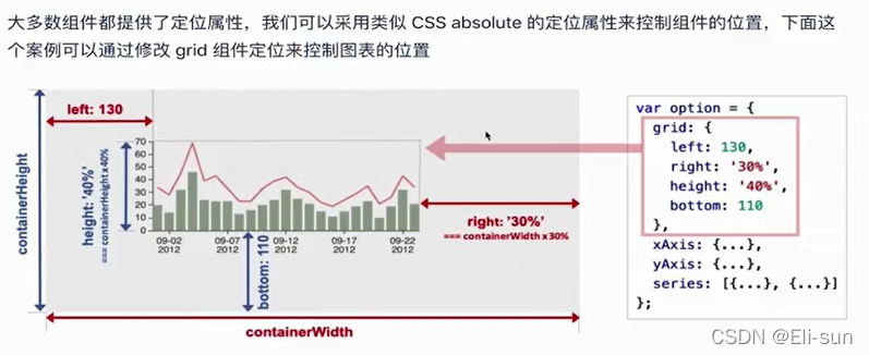
Can be adjusted by grid To solve the display position of the diagram , It can be a tree value or a percentage
grid:{
                top:100,
                left:'10%',
                right:10,
                bottom:100
            },//  location
The overall code :
<!DOCTYPE html>
<html lang="en">
<head>
    <meta charset="UTF-8">
    <meta http-equiv="X-UA-Compatible" content="IE=edge">
    <meta name="viewport" content="width=device-width, initial-scale=1.0">
    <title>Document</title>
    <script src="https://cdn.jsdelivr.net/npm/[email protected]/dist/echarts.js"></script>
</head>
<style>
    #chart{
        width: 800px;
        height: 400px;
    }
</style>
<body>
    <!--  Draw multiple figures in one coordinate system  -->
    <div id="chart"></div>
    <script>
        const chartDom = document.getElementById('chart')
        const chart = echarts.init(chartDom, 'dark',{render:'svg'}) // dom  The main body   Render as svg
        chart.setOption({
            dataset:{
                source:[
                    [' First quarter ',100,79,' Category one ',50],
                    [' The two quarter ',112,81,' Category two ',60],
                    [' third quater ',96,88,' Category three ',55],
                    [' In the fourth quarter ',123,82, ' Category 4 ',70]
                ]
            },
            title:{
                text:'echarts Introductory cases ',
                subtext:' Data visualization case ' //  Subtitle

            },
            xAxis:{
                data:[' First quarter ',' The two quarter ',' third quater ',' In the fourth quarter ']
            },// x Axis
            yAxis:{

            },// y Axis
            legend:{
                // data:[' classification ',' Broken line diagram ',' Histogram ']
                data:[{
                    name:' classification ',
                    icon:'circle',
                    textStyle:{
                        color:"red"
                    }
                },' Broken line diagram ',' Histogram '],
                left:300
            },//  legend
            grid:{
                top:100,
                left:'10%',
                right:10,
                bottom:100
            },//  location
            toolbox:{
                feature:{
                    dataZoom:{
                        yAxisIndex:false
                    },
                    restore:{},
                    saveAsImage:{}
                }
            },//  Area zoom  、 Region restore   Refresh and download
            dataZoom:[
                {
                    show:true,
                    start:0,
                    end:100
                }
            ],//  The horizontal brace below
            series:[{
                name:' classification ',
                type:'pie',
                center:['70%',60],
                radius:35,
                encode:{itemName:3,value:4}
            },{
                name:' Broken line diagram ',
                type:'line',
                encode:{x:0,value:1}
            },{
                name:' Histogram ',
                type:'bar',
                encode:{x:0,y:2}
            }] //  Chart type and data
        })

    </script>
</body>
</html>
ECharts Coordinate system
Common but coordinate system scatter plot case
<!DOCTYPE html>
<html lang="en">
<head>
    <meta charset="UTF-8">
    <meta http-equiv="X-UA-Compatible" content="IE=edge">
    <meta name="viewport" content="width=device-width, initial-scale=1.0">
    <title>Document</title>
    <script src="https://cdn.jsdelivr.net/npm/[email protected]/dist/echarts.js"></script>
</head>
<style>
    #chart{
        width: 800px;
        height: 400px;
    }
</style>
<body>
    <div id="chart"></div>
    <script>
         const chartDom = document.getElementById('chart')
        const chart = echarts.init(chartDom)
        chart.setOption({
            xAxis:{},
            yAxis:{},
            dataset:{
                source:[
                [
                   13,44
                ],
                [34,77],
                [44,78],
                [22,34],
                [12,55]
                ]
            },
            series:[{
                type:'scatter',
                encode:{x:0,y:1}
            }]
        })
    </script>
</body>
</html>
Scatter diagram double coordinate system case

ECharts Multiple coordinate systems
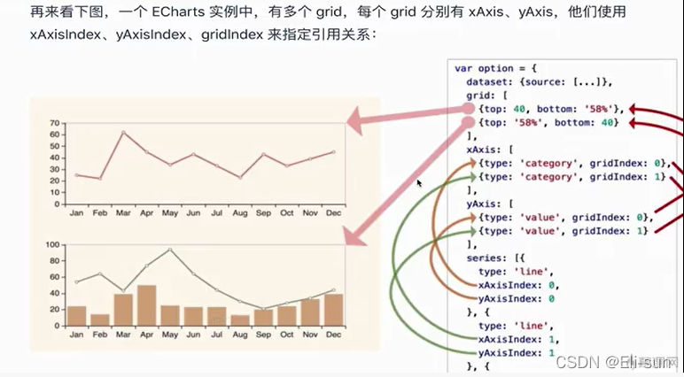
<!DOCTYPE html>
<html lang="en">
<head>
    <meta charset="UTF-8">
    <meta http-equiv="X-UA-Compatible" content="IE=edge">
    <meta name="viewport" content="width=device-width, initial-scale=1.0">
    <title>Document</title>
    <script src="https://cdn.jsdelivr.net/npm/[email protected]/dist/echarts.js"></script>
</head>
<style>
    #chart{
        width: 800px;
        height: 400px;
    }
</style>
<body>
    <div id="chart"></div>
    <script>
         const chartDom = document.getElementById('chart')
        const chart = echarts.init(chartDom)
        chart.setOption({
            xAxis:[{
                type:'category',
                gridIndex:0
            },{
                type:'category',
                gridIndex:1
            }],
            yAxis:[{
                min:0,
                max:100,
                gridIndex:0
            },
            {
                splitLine:{
                show:false
            },
            gridIndex:0
            },
            {
                min:0,
                max:150,
                gridIndex:1
            }

        ],
        grid:[{
            bottom:'55%'
        },{
            top:'55%'
        }],
            dataset:{
                source:[
                ['product','2012','2013','2014','2015'],
                ['Matcha Latte',41.1,30.4,65.1,53.3],
                ['Milk Tea',86.5,92.1,85.7,83.1]
                ]
            },
            series:[{
                type:'bar',
                seriesLayoutBy:'row',
                xAxisIndex:0,
                yAxisIndex:0
            },
            {
                type:'line',
                seriesLayoutBy:'row',
                xAxisIndex:0,
                yAxisIndex:1
            },
            {
                type:'bar',
                seriesLayoutBy:'row',
                xAxisIndex:1,
                yAxisIndex:2
            }
        ]
        })
    </script>
</body>
</html>
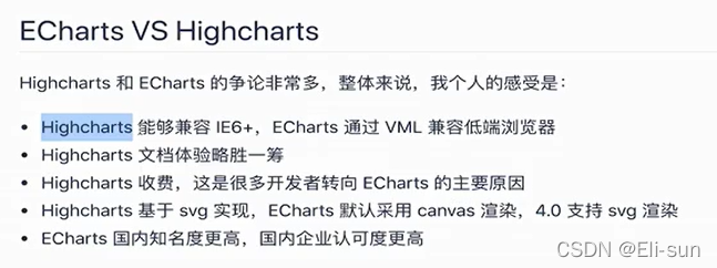
Technology selection


版权声明
本文为[Eli-sun]所创,转载请带上原文链接,感谢
https://yzsam.com/2022/04/202204230554289926.html
边栏推荐
- Customize my_ Strcpy and library strcpy [analog implementation of string related functions]
- Deeply understand the relevant knowledge of 3D model (modeling, material mapping, UV, normal), and the difference between displacement mapping, bump mapping and normal mapping
- [markdown notes]
- MySQL modify master database
- RTKLIB 2.4.3源码笔记
- CentOS MySQL multi instance deployment
- PostgreSQL column storage and row storage
- New keyword learning and summary
- Lock锁
- Promise (I)
猜你喜欢
vscode如何比较两个文件的异同
STM32__03—初识定时器

Zhongang Mining: Fluorite Flotation Process
Modify the test case name generated by DDT
1-4 configuration executable script of nodejs installation
Nacos + aspnetcore + Ocelot actual combat code
Rtklib 2.4.3 source code Notes

【PIMF】OpenHarmony啃论文俱乐部—在ACM Survey闲逛是什么体验
org. apache. parquet. schema. InvalidSchemaException: A group type can not be empty. Parquet does not su
RTKLIB 2.4.3源码笔记
随机推荐
Calculate pie chart percentage
手写事件发布订阅框架
Shell script -- shell programming specification and variables
Idea of batch manufacturing test data, with source code
TypeError: set_ figure_ params() got an unexpected keyword argument ‘figsize‘
Construction of promtail + Loki + grafana log monitoring system
About stream flow, write it down briefly------
Read a blog, re understand closures and tidy up
[registration] tf54: engineer growth map and excellent R & D organization building
VLAN advanced technology, VLAN aggregation, super VLAN, sub VLAN
Shell脚本——Shell编程规范及变量
Go language RPC communication
Bytevcharts visual chart library, I have everything you want
Get the column name list of the table quickly in Oracle
Interface document yaml
Derivation of Σ GL perspective projection matrix
织梦DEDECMS安全设置指南
Tencent resolves the address according to the IP address
ByteVCharts可视化图表库,你想要的我都有
[problem solving] [show2012] random tree