当前位置:网站首页>Flex layout
Flex layout
2022-04-23 20:31:00 【Different 213】
List of articles
- flex Layout
-
- 1.flex Layout principle
- 2. Common parent properties
-
- (1)flex-direction Set the direction of the spindle
- (2)justify-content attribute —— Set the arrangement of sub elements on the spindle
- (3)flex-wrap —— Set whether the child element should wrap
- (4)align-items Set the arrangement of child elements on the side axis ( A single )
- (5)align-content —— Set the arrangement of child elements on the side axis ( Multiple lines )
- (6)flex-flow attribute
- 3. Common child properties
flex Layout
1.flex Layout principle
flex The layout is flexible Box Abbreviation , Meaning for :” Elastic layout “, To provide maximum flexibility for box models , Any container can be specified as flex Layout .
- When we set the box to flex After the layout , The child element float、 clear and vertical-align Property will fail .
- Telescoping layout = Elastic layout = Expansion box layout = Elastic box layout = flex Layout .
use flex Elements of layout , be called flex Containers (flex container), abbreviation “ Containers ” . All its child elements automatically become container members , be called flex project (flex item), abbreviation “ project ”.
summary :
By adding... To the parent box flex attribute , To control the position and arrangement of the boxes .
2. Common parent properties
| flex-direction | Set the direction of the spindle ( The default is x Axis ) |
|---|---|
| justify-content | Set the arrangement of sub elements on the spindle |
| flex-warp | Set whether the child element should wrap |
| align-content | Set the arrangement of child elements on the side axis ( Multiple lines ) |
| align-items | Set the arrangement of child elements on the side axis ( A single ) |
| flex-flow | Compound attribute , It's equivalent to setting flex-direction and flex-warp |
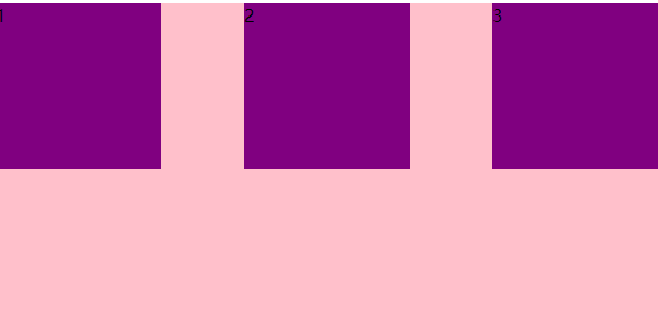
(1)flex-direction Set the direction of the spindle
Be careful : take X Axis or Y The axis is set to the rear of the spindle , The other axis will default to the side axis .
Property value :
| row | The default value is From left to right |
|---|---|
| row-reverse | From right to left |
| column | From top to bottom |
| column-reverse | From bottom to top |
<!DOCTYPE html>
<html lang="en">

<head>
  <meta charset="UTF-8">
  <meta http-equiv="X-UA-Compatible" content="IE=edge">
  <meta name="viewport" content="width=device-width, initial-scale=1.0">
  <title>flex_direction</title>
  <style> .container {
      display: flex; width: 600px; height: 400px; background-color: pink; justify-content: center; /* flex-direction Set the direction of the spindle   The default is x Axis  * row : The default value is  X Axis  * row-reverse:  From right to left  * column: From top to bottom  (Y Axis ) * column-reverse: From bottom to top  */ flex-direction: column; } .container span {
      width: 150px; height: 150px; background-color: purple; margin: 10px; } </style>
</head>

<body>
  <div class="container">
    <span>1</span><span>2</span><span>3</span>
  </div>
</body>

</html>
This example shows setting the main axis of the container to Y Axis . The effect is shown below :

(2)justify-content attribute —— Set the arrangement of sub elements on the spindle
Property value :
| flex-start | The default value is From the head If the spindle is X Axis , From left to right |
|---|---|
| flex-end | From the tail |
| center | Align in the center of the spindle ( If the spindle is X The axis is centered horizontally ) |
| space-around | Divide the remaining space equally |
| space-between | We'll stick the edges on both sides first , Divide the rest of the space equally ( a key ) |
<!DOCTYPE html>
<html lang="en">

<head>
  <meta charset="UTF-8">
  <meta http-equiv="X-UA-Compatible" content="IE=edge">
  <meta name="viewport" content="width=device-width, initial-scale=1.0">
  <title>justify-content attribute </title>
  <style> .container {
      display: flex; width: 600px; height: 400px; background-color: pink; /* justify-content  Set the arrangement of sub elements on the spindle  * flex-start: The default value is   From the head  * flex-end: Start with the tail  * center: Align in the center of the spindle ( If the spindle is X The axis is centered horizontally ) * space-around: Divide the remaining space equally  * space-between: We'll stick the edges on both sides first , Divide the rest of the space equally  */ justify-content: space-between; } .container span {
      width: 150px; height: 150px; background-color: purple; } </style>
</head>

<body>
  <div class="container">
    <span>1</span><span>2</span><span>3</span>
  </div>
</body>

</html>
The above code example shows :space-between Effect of attribute value , As shown in the figure below :
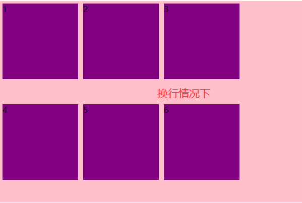
(3)flex-wrap —— Set whether the child element should wrap
Property value :
| nowrap | The default value is Don't wrap |
|---|---|
| wrap | Line break |
As shown in the following example code :
<title>flex-warp attribute </title>
  <style> .container {
      display: flex; width: 600px; height: 400px; background-color: pink; /* flex-wrap  Set whether the child element should wrap  * nowrap: The default value is   Don't wrap  * wrap: Line break  */ flex-wrap: wrap; } .container span {
      width: 150px; height: 150px; background-color: purple; margin: 5px; } </style>
</head>

<body>
  <div class="container">
    <span>1</span><span>2</span><span>3</span>
    <span>4</span><span>5</span><span>6</span>
  </div>
</body>
As shown in the figure below : The first one is the line feed effect , The second is the effect of no line break .

(4)align-items Set the arrangement of child elements on the side axis ( A single )
Property value :
| flex-start | The default value is From top to bottom |
|---|---|
| flex-end | From bottom to top |
| center | Huddled together in the middle ( Vertical center ) |
| stretch | The tensile |
<title>align-items attribute </title>
  <style> .container {
      display: flex; width: 600px; height: 400px; background-color: pink; /* align-items  Set the arrangement of sub elements on the side axis ( Single line content ) * flex-start: The default value is   From top to bottom  * flex-end: From bottom to top  * center: Huddled together in the middle ( Vertical center ) * stretch: The tensile  */ align-items: center; } .container span {
      width: 150px; height: 150px; background-color: purple; margin: 5px; } </style>
</head>

<body>
  <div class="container">
    <span>1</span><span>2</span><span>3</span>
  </div>
</body>
As shown in the figure below align-items by center The effect of the .

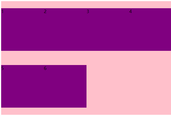
(5)align-content —— Set the arrangement of child elements on the side axis ( Multiple lines )
Property value :
| flex-start | The default value is Start at the head of the side axis |
|---|---|
| flex-end | Start at the end of the side axis |
| center | Show... In the middle of the side axis |
| space-around | Children divide the remaining space equally on the side axis |
| space-between | The subitems are first distributed at both ends on the side axis , In bisecting the remaining space |
| stretch | Sets the height of the child element and bisects the height of the parent element |
Be careful : This property only takes effect in the case of multiple lines , Or just add flex-wrap The attribute is wrap Value in the case of .
The sample code is as follows :
<!DOCTYPE html>
<html lang="en">

<head>
  <meta charset="UTF-8">
  <meta http-equiv="X-UA-Compatible" content="IE=edge">
  <meta name="viewport" content="width=device-width, initial-scale=1.0">
  <title>align-content attribute </title>
  <style> .container {
      display: flex; width: 600px; height: 400px; background-color: pink; /* align-content  Set the arrangement of sub elements on the side axis ( Multiple lines ) * flex-start: The default value is   Start at the head of the side axis  * flex-end: Start at the end of the side axis  * center: Show... In the middle of the side axis  * space-around: Children divide the remaining space equally on the side axis  * space-between: The subitems are first distributed at both ends on the side axis , Divide the rest of the space equally  * stretch: Sets the height of the child element and bisects the height of the parent element  */ flex-wrap: wrap; align-content: space-around } .container span {
      width: 150px; height: 150px; background-color: purple; } </style>
</head>

<body>
  <div class="container">
    <span>1</span><span>2</span><span>3</span>
    <span>4</span><span>5</span><span>6</span>
  </div>
</body>

</html>
As shown in the figure below align-content The property value is :space-around The effect of the :
(6)flex-flow attribute
flex-flow The attribute is flex-direction and flex-wrap The composite attribute of the zodiac .
The sample code is as follows :
<!DOCTYPE html>
<html lang="en">

<head>
  <meta charset="UTF-8">
  <meta http-equiv="X-UA-Compatible" content="IE=edge">
  <meta name="viewport" content="width=device-width, initial-scale=1.0">
  <title>flex-flow attribute </title>
  <style> .container {
      display: flex; width: 600px; height: 400px; background-color: pink; /* flex-flow attribute   Equate to   Use at the same time  flex-direction Properties and  flex-wrap attribute  */ flex-flow: wrap column; } .container span {
      width: 150px; height: 150px; background-color: purple; margin: 5px; } </style>
</head>

<body>
  <div class="container">
    <span>1</span><span>2</span><span>3</span>
    <span>4</span><span>5</span><span>6</span>
  </div>
</body>

</html>
The effect is shown below :

3. Common child properties
- flex Number of copies of sub items
- align-self Controls how the subitems are arranged on the side
- order Property defines the order in which children are arranged ( The order before and after )
(1)flex Number of copies of sub items
flex Property defines the remaining space allocated by the subproject , use flex To show how many copies .
The sample code is as follows :
<!DOCTYPE html>
<html lang="en">

<head>
  <meta charset="UTF-8">
  <meta http-equiv="X-UA-Compatible" content="IE=edge">
  <meta name="viewport" content="width=device-width, initial-scale=1.0">
  <title>lex children flex Additional copies </title>
  <style> .container {
      display: flex; width: 600px; height: 150px; margin: 0 auto; background-color: pink; } /*  Divide the width of the parent element into 6 Share   first div Occupy 3 Share , The second one is 1 Share , The third account 2 Share  */ .container div:nth-child(1) {
      height: 150px; width: 100px; background-color: purple; flex: 3; } .container div:nth-child(2) {
      background-color: orange; flex: 1; } .container div:nth-child(3) {
      height: 150px; width: 100px; background-color: greenyellow; flex: 2; } </style>
</head>

<body>
  <div class="container">
    <div>1</div>
    <div>2</div>
    <div>3</div>
  </div>
</body>

</html>
The effect is shown below :

(2)algin-self attribute Controls how the subitems themselves are arranged on the side axis
align-self Property allows a single item to have a different alignment than other items , covering align-items attribute 、 The default is auto, Represents the... That inherits the parent element align-items attribute , If there is no parent element , Is equivalent to stretch.
| auto | Set as parent element align-items value , If the element has no parent element , Set it to stretch |
|---|---|
| flex-start | On your side shaft Head alignment |
| flex-end | On your side shaft Tail alignment |
| center | flex The element will be aligned to The middle of the side shaft , If the element is wider than the container, it will overflow equally in both directions |
| baseline | be-all flex The elements are aligned along the baseline |
| stretch | flex The element will be stretched based on the width and height of the container |
<!DOCTYPE html>
<html lang="en">

<head>
  <meta charset="UTF-8">
  <meta http-equiv="X-UA-Compatible" content="IE=edge">
  <meta name="viewport" content="width=device-width, initial-scale=1.0">
  <title>align-self attribute </title>
  <style> .container {
      display: flex; width: 600px; height: 400px; background-color: pink; align-items: flex-start; } .container span {
      width: 150px; height: 150px; background-color: purple; } /* align-self  Controls how the subitems themselves are arranged on the side axis  * auto:  Follow the parent's  algin-items Property style , If the element has no parent element , Set it to  stretch * flex-start: The default value is   From the head  * flex-end: Start with the tail  * center: Align in the center of the side axis ( * baseline: Baseline alignment  * stretch: The tensile  */ .container span:nth-child(3) {
      align-self: flex-end; } </style>
</head>

<body>
  <div class="container">
    <span>1</span><span>2</span><span>3</span>
  </div>
</body>

</html>

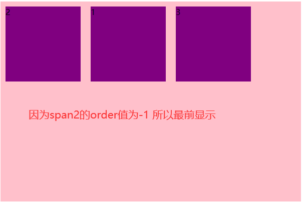
(3) order Property defines the order in which items are arranged
The smaller the numerical , The further up the line , The default is 0.
Be careful : This attribute and
z-indexDissimilarity
<!DOCTYPE html>
<html lang="en">

<head>
  <meta charset="UTF-8">
  <meta http-equiv="X-UA-Compatible" content="IE=edge">
  <meta name="viewport" content="width=device-width, initial-scale=1.0">
  <title> subprojects order attribute </title>
  <style> .container {
      display: flex; width: 600px; height: 400px; background-color: pink; } .container span {
      width: 150px; height: 150px; background-color: purple; margin: 10px; } .container span:nth-child(2) {
      /* order attribute :  The default value is 0 , The smaller the numerical , The element balance is at the top  */ order: -1; } </style>
</head>

<body>
  <div class="container">
    <span>1</span><span>2</span><span>3</span>
  </div>
</body>

</html>
版权声明
本文为[Different 213]所创,转载请带上原文链接,感谢
https://yzsam.com/2022/04/202204210550450480.html
边栏推荐
- Experience of mathematical modeling in 18 year research competition
- 【问题解决】‘ascii‘ codec can‘t encode characters in position xx-xx: ordinal not in range(128)
- Scripy tutorial - (2) write a simple crawler
- Click an EL checkbox to select all questions
- 缓存淘汰算法初步认识(LRU和LFU)
- 【PTA】L1-006 连续因子
- Azkaban recompile, solve: could not connect to SMTP host: SMTP 163.com, port: 465 [January 10, 2022]
- GO語言開發天天生鮮項目第三天 案例-新聞發布系統二
- Case of the third day of go language development fresh every day project - news release system II
- [PTA] l1-006 continuity factor
猜你喜欢
What is the difference between a host and a server?

Plato Farm元宇宙IEO上线四大,链上交易颇高
Installation and use of NVM
Automatically fill in body temperature and win10 task plan
【PTA】L1-002 打印沙漏
Some basic configurations in interlij idea
Livego + ffmpeg + RTMP + flvjs to realize live video
Devexpress 14.1 installation record
Handwritten Google's first generation distributed computing framework MapReduce
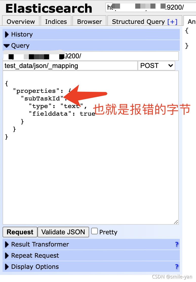
Es keyword sorting error reason = fielddata is disabled on text fields by default Set fielddata = true on keyword in order
随机推荐
[PTA] get rid of singles
What is the difference between a host and a server?
Devexpress 14.1 installation record
JDBC tool class jdbcconutil gets the connection to the database
Linux64Bit下安装MySQL5.6-不能修改root密码
Sqoop imports data from Mysql to HDFS using lzop compression format and reports NullPointerException
ABAQUS script email auto notification
Leetcode 1337. Row K with the weakest combat effectiveness in the matrix
Commit and rollback in DCL of 16 MySQL
Leetcode 74. Search two-dimensional matrix
Numpy Index & slice & iteration
Thirty What are VM and VC?
Leetcode 232, queue with stack
Leetcode 542, 01 matrix
Matlab analytic hierarchy process to quickly calculate the weight
Solve the Chinese garbled code of URL in JS - decoding
Some basic knowledge of devexpress report development
Es error: request contains unrecognized parameter [ignore_throttled]
Es index (document name) fuzzy query method (database name fuzzy query method)
Async function ------ ES6